Pantone revolutionized design by creating a standardized color system that improves communication, accuracy, and consistency across projects. You now have a reliable way to match and specify colors, ensuring your work looks the same on every medium. This system helps maintain brand integrity and sparks creativity within industry guidelines. If you continue exploring, you’ll discover how Pantone’s influence shapes trends and elevates visual coherence in countless design fields.
Key Takeaways
- Pantone revolutionized color communication by establishing a standardized system, replacing subjective descriptions with precise codes.
- The Pantone Matching System (PMS) ensures consistent color reproduction across various media and materials.
- Its influence is crucial for maintaining brand identity, enabling accurate color matching in packaging, digital, and print.
- Pantone’s annual Color of the Year and guides inspire industry trends and foster innovation in design and manufacturing.
- The system enhances collaboration, reduces errors, and elevates the quality and professionalism of creative projects.
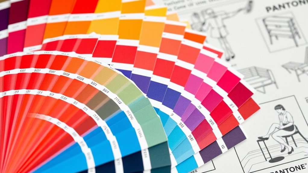
Pantone has revolutionized the way designers communicate and select colors, establishing itself as an industry standard. This shift has made it easier for you to achieve consistent results across various projects by embracing color standardization. Before Pantone, designers relied on subjective descriptions like “bright red” or “soft blue,” which often led to discrepancies when reproducing colors across different materials or printing processes. Now, with the Pantone Matching System (PMS), you have a precise and universally understood color language. This standardization guarantees that everyone involved in a project, from designers and printers to manufacturers, is on the same page, reducing errors and saving time. You no longer need to worry about colors shifting or appearing differently from one medium to another because Pantone provides a specific code for each shade, guaranteeing accuracy.
Pantone’s system ensures color consistency and accuracy across all your projects and materials.
This consistency plays a essential role in branding. When you’re developing a brand identity, maintaining branding consistency is crucial to building recognition and trust. Pantone’s system allows you to select and specify brand colors with confidence, knowing they’ll look the same whether on packaging, digital assets, or promotional materials. It helps you protect your brand’s visual integrity across multiple platforms and geographic locations, reinforcing your identity wherever your brand appears. With Pantone, you can communicate exact colors to your team or vendors, ensuring that your brand’s palette remains intact no matter who’s handling the production. This level of control is fundamental for businesses aiming to establish a strong, recognizable presence in the market.
Furthermore, Pantone’s influence extends beyond just color matching. It has shaped industry standards that support innovation in design. From fashion and interior decor to graphic design and product manufacturing, Pantone’s colors inspire creativity while maintaining consistency. You benefit from a structured system that allows for experimentation within a reliable framework, enabling you to push boundaries without sacrificing cohesion. Over the years, Pantone’s color guides and annual Color of the Year selections have also influenced trends, helping designers anticipate and set new standards in style and aesthetics. An understanding of color standardization and its role in industry can help you stay ahead of design trends and improve your project outcomes.
In essence, Pantone’s contribution to color standardization and branding consistency empowers you to create work that’s visually coherent and professionally aligned. It streamlines collaboration, minimizes miscommunication, and elevates your designs with precision and confidence. By adopting Pantone’s system, you’re not just choosing colors—you’re ensuring your work is unified, impactful, and true to your creative vision.

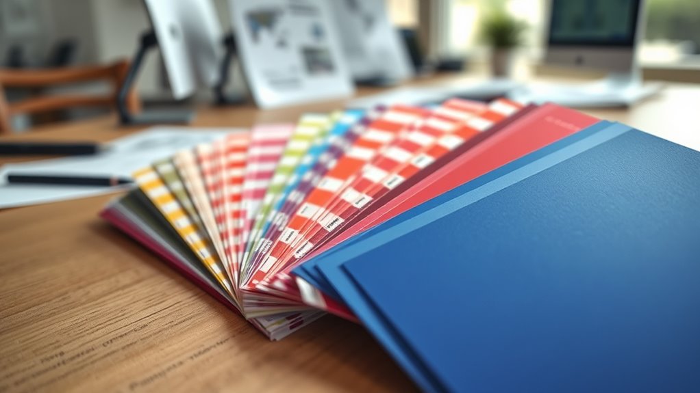
Pantone Formula Guide – Coated & Uncoated | Professional PMS Color Matching System for Print, Packaging & Graphic Design | GP1601B
INDUSTRY-STANDARD PANTONE COLOR BOOK The essential Pantone color book for accurate color communication—trusted by designers, agencies, and print…
As an affiliate, we earn on qualifying purchases.
As an affiliate, we earn on qualifying purchases.
Frequently Asked Questions
How Does Pantone Choose Its Color Palette Annually?
You participate in Pantone’s annual palette development by engaging in their color selection process, which involves analyzing trends, cultural influences, and market insights. Pantone’s experts collaborate, review current and future design needs, and consider societal shifts to curate a diverse, impactful color palette. This process guarantees the annual palette resonates with global design trends, inspiring creatives and guiding industries in choosing colors that reflect the upcoming year’s vibe.
What Industries Benefit Most From Pantone’s Color Systems?
Imagine stepping into a world where color is king—fashion, interior design, and branding industries benefit most from Pantone’s systems. You’ll find that these sectors rely on Pantone for branding consistency and to harness color psychology effectively. By using standardized colors, you guarantee your brand’s message stays uniform across platforms and products, making your visual identity memorable and impactful—much like how a vintage vinyl still resonates in a digital age.
How Has Digital Technology Impacted Pantone’s Color Matching?
Digital technology has greatly improved Pantone’s color matching by enabling precise screen calibration and enhancing color accuracy. You can now rely on digital tools to accurately reproduce Pantone colors across various devices, reducing discrepancies between digital and print outputs. This integration allows designers like you to achieve consistent color results, streamline workflows, and ensure your projects look exactly as intended, no matter the medium or platform you’re working on.
Are Pantone Colors Consistent Across Different Materials?
You’ll find Pantone colors generally consistent across different materials, but material variability can affect color matching. Factors like texture, finish, and fabric type influence how a color appears, so it’s vital to test colors on each material to guarantee accuracy. While Pantone endeavors for uniformity, understanding these differences helps you achieve the best possible color consistency across various applications.
What Future Trends Might Influence Pantone’s Color Development?
You can expect future Pantone color development to be influenced by AI-generated palettes and sustainable pigments. AI helps forecast emerging trends, providing you with innovative shades, while sustainable pigments guarantee eco-friendly choices. These trends push Pantone to create colors that reflect technological advances and environmental consciousness. As a result, you’ll see more dynamic, eco-aware palettes that stay ahead of design demands and resonate with global sustainability efforts.
Pantone Formula Guide – Coated & Uncoated | Professional PMS Color Matching System for Print, Packaging & Graphic Design | GP1601B
INDUSTRY-STANDARD PANTONE COLOR BOOK The essential Pantone color book for accurate color communication—trusted by designers, agencies, and print…
As an affiliate, we earn on qualifying purchases.
As an affiliate, we earn on qualifying purchases.
Conclusion
Understanding Pantone’s history and influence reminds you that “the devil is in the details.” By mastering color consistency and inspiring creativity, Pantone shapes your design world. Its legacy shows how a simple idea can transform industries and spark innovation. So, embrace the colors that define your work, knowing they’re rooted in a rich history. In the end, your designs reflect not just style, but the timeless power of color itself.
Pantone Formula Guide – Coated & Uncoated | Professional PMS Color Matching System for Print, Packaging & Graphic Design | GP1601B
INDUSTRY-STANDARD PANTONE COLOR BOOK The essential Pantone color book for accurate color communication—trusted by designers, agencies, and print…
As an affiliate, we earn on qualifying purchases.
As an affiliate, we earn on qualifying purchases.

Ultimate 3-in-1 Color Tool, Updated 3rd Edition: – 24 Color Cards with Numbered Swatches – 5 Color Plans for each Color – 2 Value Finders Red & Green … CMYK, RGB & HEX Formula (Reference Guide)
Features numbered swatches
As an affiliate, we earn on qualifying purchases.
As an affiliate, we earn on qualifying purchases.