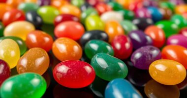
To understand additive versus subtractive color mixing, imagine how colors blend in light and pigments. In additive mixing, red, green, and blue light combine to create brighter colors like yellow and white. In subtractive mixing, pigments like cyan, magenta, and yellow absorb parts of light, darkening as they mix. Recognizing these differences helps you predict color outcomes in digital screens or painting. Keep exploring to discover how these processes impact your visual creations in animated guides.
Key Takeaways
- Additive mixing combines red, green, and blue light to create brighter colors, ending in white when all are combined.
- Subtractive mixing uses cyan, magenta, and yellow pigments to produce darker hues, approaching black when all are mixed.
- Additive colors build brightness through light addition, while subtractive colors reduce reflected light, darkening the result.
- Animated GIFs can visually demonstrate how primary colors blend differently in additive versus subtractive methods.
- Understanding both processes helps in digital displays (additive) and painting/printing (subtractive) to predict color outcomes.

Color mixing is fundamental to how we perceive and create visual images, but it operates differently depending on whether you’re working with light or pigments. When you understand the core principles of additive and subtractive color mixing, you can better grasp how colors combine in various mediums, from digital screens to painting. The foundation of this understanding lies in color theory, which explains how colors interact and influence your visual perception. Recognizing these differences helps you predict the results of mixing colors and creates more effective visual compositions.
In additive color mixing, you’re working with light. Think of how your computer or smartphone screen displays images. Here, colors are created by combining different intensities of red, green, and blue light—commonly called RGB. When you blend these colors, the light adds together, increasing brightness until you reach white. For example, combining red and green light yields yellow, while red and blue make magenta. In this process, your visual perception interprets the combined light as new colors, with the mixture becoming brighter as more light is added. The key point is that in additive mixing, the primary colors are red, green, and blue, and combining all three results in white or the lightest possible color. This method is essential in digital displays because it directly manipulates light to produce vivid images. Additionally, understanding color spaces helps in accurately representing colors across different devices.
Conversely, subtractive color mixing involves pigments, inks, or dyes. When you work with paints or printing, you’re dealing with subtractive mixing. Your primary colors here are cyan, magenta, and yellow. These pigments absorb certain wavelengths of light and reflect others. When you mix them, they subtract specific wavelengths from the light hitting the surface. For example, combining magenta and yellow pigments produces red, while cyan and magenta create blue. As you mix more pigments, they absorb more light, making the resulting color darker and approaching black. This process is fundamental in painting and printing because it relies on subtracting wavelengths to produce the desired hues. Your visual perception perceives the combined pigments as new colors, but unlike additive mixing, the mixture darkens with more colors added.
Understanding the distinction between additive and subtractive color mixing allows you to anticipate how colors will behave in different contexts. Whether you’re designing digital graphics or mixing paints, knowing how light and pigments combine ensures your results align with your creative intent. Recognizing the roles of color theory in these processes enhances your ability to manipulate and interpret colors effectively, leading to more accurate and impactful visual work.
Frequently Asked Questions
How Do Lighting Conditions Affect Additive and Subtractive Color Mixing?
Lighting conditions play a key role in how you perceive colors through additive and subtractive mixing. Ambient light influences the brightness and hue of colors, making them appear more vivid or muted. Shadow effects can alter the perceived color by reducing light or creating contrast, especially in additive mixing where light sources matter. In subtractive mixing, different lighting can change how pigments absorb and reflect light, affecting the overall color outcome.
Can Digital Screens Accurately Reproduce Subtractive Color Mixing?
Did you know that digital screens cover about 72% of the visible color gamut? They can’t fully reproduce subtractive colors because of limitations in color calibration and the RGB color model, which is designed for light emission. While screens excel at additive mixing, they struggle with subtractive colors, like those in printing. So, no, digital screens can’t accurately reproduce subtractive color mixing, but careful calibration helps improve color fidelity.
What Are Common Mistakes When Mixing Colors in Printing Versus Digital Displays?
When mixing colors in printing versus digital displays, you often make mistakes like neglecting proper color calibration, which causes colors to appear differently than intended. In printing, you might over-apply ink layering, leading to muddy or oversaturated colors. On screens, poor calibration can result in inaccurate color reproduction. Always calibrate your devices and understand how ink layering affects printed colors to make certain of consistent, vibrant results across both mediums.
How Do Colorblind Individuals Perceive Additive and Subtractive Color Mixing?
Imagine seeing a world where colors blend differently—this is how colorblind individuals perceive additive and subtractive color mixing. Due to perception differences in color vision, they often struggle to distinguish certain hues, especially reds and greens. Their perception varies, making some colors appear muted or indistinct. You should understand that their experience emphasizes the importance of designing with inclusive color choices, ensuring everyone can appreciate the visual harmony.
Are There Specific Tools or Software Recommended for Practicing Color Mixing?
You’re wondering about the best color mixing tools and software recommendations. To practice effectively, try digital options like Adobe Photoshop, which offers customizable color palettes, or free tools like GIMP and Krita. Color mixing software with intuitive interfaces helps you experiment with additive and subtractive mixing. These tools provide real-time feedback, making it easier to understand how colors blend and improve your skills efficiently.
Conclusion
Now that you’ve glimpsed the vibrant dance of colors, imagine yourself wielding a painter’s brush or a digital screen’s glow. Whether blending light or pigments, you hold the power to create endless hues—like painting the sky at sunset or crafting a neon cityscape. Embrace these techniques, and watch your world fill with stunning shades and radiant life. Your imagination is the palette—let it burst with color, vivid and alive.