

The rule of thirds can limit your creative options, so split-spectrum composition offers a fresh alternative. By using color segmentation, dynamic color flow, and strategic visual weight, you can create more engaging, energetic images that guide the viewer naturally through your scene. Embracing asymmetry and experimenting with these techniques help develop a unique visual language. If you want to explore how to craft vibrant, compelling compositions beyond traditional rules, this approach is worth mastering.
Key Takeaways
- Split-spectrum composition emphasizes color segmentation and spectral contrast over traditional grid-based rules like the Rule of Thirds.
- It uses dynamic asymmetrical arrangements and color flow to create energy and guide viewer attention naturally.
- Moving beyond symmetry, it balances visual weight with color harmony and visual cues for more engaging layouts.
- This approach encourages experimentation, breaking conventional rules to develop unique, vibrant visual stories.
- Practical techniques include uneven spacing, strategic color contrast, and subtle visual cues to craft compelling compositions.
Understanding the Limitations of the Rule of Thirds

While the rule of thirds is a popular guideline for composing images, it has its limitations. It encourages placing key elements along gridlines, but this can restrict your creative freedom. It relies heavily on a visual framework that may constrain more innovative compositions. Relying solely on it might lead to compositions that feel predictable or lack harmony. Understanding color harmony is essential, as it helps you create balanced visuals beyond simple grid placement. Additionally, focusing on compositional symmetry can produce striking, stable images that the rule of thirds might overlook. By recognizing these limitations, you gain flexibility to experiment with different arrangements. This opens opportunities to craft images that evoke emotion and depth, rather than just following a formula. Ultimately, knowing when to step outside the rule of thirds allows you to develop a more personalized, compelling photographic style.
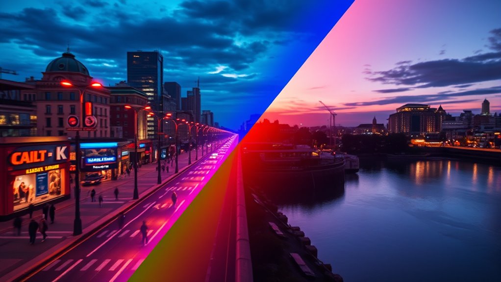
The Foundations of Split‑Spectrum Composition

You can start by exploring how color segmentation techniques help organize visual elements effectively. Balancing visual weight guarantees that no part of your composition overwhelms the rest. Mastering these foundations sets the stage for creating compelling split-spectrum images. Incorporating space optimization strategies can further enhance the clarity and harmony of your design.
Color Segmentation Techniques
Have you ever wondered how digital images distinguish different colors so precisely? Color segmentation techniques use algorithms to analyze and separate hues, creating distinct color zones within an image. This process enhances color contrast, making elements pop and guiding viewer focus. Hue segmentation divides images based on color nuances, enabling split‑spectrum composition to emphasize specific areas. Imagine this visual:
| Bright Red | Deep Blue | Soft Green |
|---|---|---|
| Warm Tones | Cool Tones | Pastel Tones |
| Sharp Edges | Smooth Gradients | Blended Colors |
This table illustrates how segmentation isolates hues, transforming how you perceive depth and harmony. By leveraging these techniques, you craft dynamic compositions that move beyond traditional rules, emphasizing color relationships for powerful visual storytelling. Understanding color contrast helps in creating more compelling and vivid images.
Balancing Visual Weight
Balancing visual weight is essential for creating compelling split-spectrum compositions, as it guides the viewer’s eye and establishes harmony within the image. To achieve this, consider how color harmony influences perception—bright, intense hues draw attention, while muted tones recede. Distributing visual elements thoughtfully across the split spectrum maintains compositional rhythm, preventing any one side from overpowering the other. You can use contrasting colors or varying saturation levels to create equilibrium, ensuring that both sides complement each other seamlessly. When you balance visual weight effectively, your composition feels unified and engaging, encouraging viewers to explore the entire image rather than focusing on a single point. Mastering this balance helps cultivate a dynamic, visually satisfying split-spectrum work. Additionally, leveraging AI security technologies can assist artists and designers in analyzing visual data to optimize balance and harmony in their compositions.
Techniques for Implementing Split‑Spectrum in Your Work
Implementing split-spectrum techniques begins with understanding how to divide your data or signals into distinct frequency bands effectively. Start by analyzing the different spectral components of your image or signal, ensuring each band highlights specific details. To achieve compelling results, focus on establishing clear visual hierarchy by assigning different spectrum ranges to elements that require emphasis or subtlety. Incorporate color harmony within each spectral band to create cohesive, engaging visuals. Use contrast between bands to guide viewers’ attention naturally, emphasizing focal points without overwhelming the overall composition. Experiment with blending techniques that interchange between spectral segments smoothly, maintaining balance. Additionally, understanding the beneficial ingredients in eye patches can help you select the most effective products for your needs. Ultimately, mastering these techniques enhances depth and clarity, allowing your work to communicate more effectively through strategic spectral separation.
Comparing Traditional and Split‑Spectrum Approaches

Traditional approaches to image and signal processing often rely on uniform techniques that treat all spectral information equally, aiming for broad accuracy across the entire spectrum. This method emphasizes symmetry in composition, creating balanced and predictable visuals. However, it can limit your ability to achieve nuanced color harmony, as it doesn’t prioritize specific spectral features. Split-spectrum techniques, by contrast, focus on distinct spectral ranges, allowing you to enhance or suppress particular colors. This targeted approach offers more creative control, enabling you to craft compositions that highlight unique spectral interactions. While traditional methods favor consistency and symmetry, split-spectrum approaches foster dynamic and vibrant visuals, pushing the boundaries of how you manipulate spectral data to evoke emotion and visual interest. Additionally, understanding spectral resolution can help you optimize the effectiveness of these techniques for different imaging applications.
Case Studies: Split‑Spectrum in Action

Split-spectrum techniques have been effectively applied across various fields to achieve striking visual results. You’ll see how artists and designers use this approach to create dynamic images that attract attention through intentional color harmony and visual tension. For example, in landscape photography, split-spectrum enhances sky and land contrast, emphasizing mood. In branding, it balances bold color blocks for memorable impact. Fashion designers combine contrasting hues to evoke energy and sophistication. Finally, digital artists manipulate spectrum shifts to guide viewers’ focus and evoke emotion. These case studies show how split-spectrum transforms compositions from ordinary to extraordinary, emphasizing key elements and creating a sense of depth. Additionally, understanding financial analysis can help artists and designers make informed decisions about resource allocation for their projects, ensuring sustainable creative endeavors. By understanding these real-world applications, you’ll see how this method elevates your creative projects beyond traditional rules.
Tips for Developing Your Own Dynamic Framing Skills

To develop your dynamic framing skills, start by embracing asymmetrical balance to create visual interest. Experiment with color flow to guide the viewer’s eye naturally across your composition. Pay attention to visual weight, balancing elements to enhance harmony and impact in your images. Incorporating biodiversity considerations into your framing can also add depth and context, enriching the storytelling aspect of your photographs.
Embrace Asymmetrical Balance
While symmetrical compositions can feel balanced, embracing asymmetrical balance adds energy and visual interest to your frames. It creates a dynamic harmony contrast that guides the viewer’s eye naturally. To develop this skill, consider these tips:
- Use uneven elements to build a sense of movement and flow.
- Play with composition rhythm by spacing objects irregularly.
- Balance visual weight by contrasting large and small subjects.
- Break traditional rules to find unique, engaging layouts.
- Incorporate drivetrain components to subtly influence the overall visual weight and balance within your compositions.
Experiment With Color Flow
Ever wondered how colors can influence the energy and movement within your compositions? Experimenting with color flow is a powerful way to create dynamic framing. Focus on establishing strong color harmony by choosing hues that complement or contrast intentionally, guiding the viewer’s eye through the scene. Play with visual rhythm by varying the saturation, brightness, and placement of colors to produce a sense of movement and momentum. Use color progressions to lead the eye seamlessly from one element to another, enhancing the overall flow. Don’t be afraid to break traditional rules—let your color choices evoke emotion and energy. By consciously experimenting with color flow, you develop your own visual language that keeps viewers engaged and creates a vibrant, compelling composition. Additionally, understanding how visual content creation can be optimized with AI tools allows you to explore new creative possibilities and refine your techniques more efficiently.
Focus on Visual Weight
Focusing on visual weight allows you to craft compositions that feel balanced and dynamic. By understanding visual hierarchy, you can guide the viewer’s eye to the most important elements. Use color segmentation to emphasize certain areas and create contrast, making focal points stand out. Consider how different shapes and sizes influence perceived weight; larger or more complex objects often feel heavier. Balance these elements across your frame to avoid visual clutter. Pay attention to negative space, which can offset visual weight and enhance harmony. Experiment with contrasting colors to draw attention or soften sections for subtlety. Developing your skills in managing visual hierarchy and color segmentation will help you create engaging, well-balanced images that carry a strong sense of motion and purpose.
Frequently Asked Questions
How Does Split‑Spectrum Differ From Other Compositional Techniques?
Split-spectrum composition differs from other techniques by using contrasting color harmony to create visual interest and guide your eye to the focal emphasis. Instead of relying on traditional grids, it divides the image into sections with distinct color palettes, making your subject pop. This approach emphasizes the interplay of colors, helping you craft dynamic, eye-catching images that direct attention naturally, unlike more conventional compositional methods.
Can Split‑Spectrum Be Applied to Both Photography and Video?
Did you know that 78% of photographers and videographers use split-spectrum techniques? You can definitely apply split-spectrum to both photography and video. It enhances your work through creative framing and innovative color blending, creating striking visuals. Whether capturing stills or dynamic scenes, this technique helps you experiment with color and composition, making your images more compelling and unique across different mediums.
What Are Common Mistakes When Adopting Split‑Spectrum Composition?
When adopting split‑spectrum composition, you often make mistakes like causing color mismatch, which distracts viewers, or overusing the split effect, making your work look unbalanced. You might also rely too heavily on contrasting colors without considering harmony, leading to visual clutter. To avoid these pitfalls, verify your color choices complement each other and use split‑spectrum techniques sparingly to enhance, rather than overpower, your visual storytelling.
How Does Viewer Perception Change With Split‑Spectrum Framing?
You’ll notice that split-spectrum framing alters your perception of color and visual balance. The contrasting spectrum divides the image, drawing your eye to specific areas and creating a dynamic sense of depth. This technique challenges your usual expectations, making you more aware of how color perception shifts and how visual balance can be manipulated intentionally. Ultimately, it engages you to see beyond traditional compositions, emphasizing mood and focus through innovative framing choices.
Is Split‑Spectrum Suitable for All Genres of Visual Storytelling?
Imagine you’re stepping into a new era, like the Renaissance, where split-spectrum framing can evoke fresh color harmony and emotional impact. You might wonder if it suits all genres; the answer is no. While it excels in abstract, experimental, or emotional storytelling, it may distract or confuse in traditional narratives. Use it selectively, understanding that its power lies in pushing boundaries and highlighting mood, not fitting every story.
Conclusion
Don’t just accept the rule of thirds blindly—question it. Split-spectrum composition challenges traditional norms, offering you more dynamic, engaging frames. By experimenting and trusting your eye, you’ll discover that creative freedom often leads to stronger images. So, test the theory yourself. Break the rules, explore new perspectives, and see how your work transforms. After all, innovation begins where rules end. Are you ready to redefine your visual storytelling?