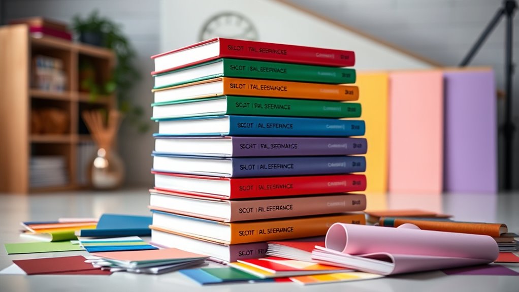

When searching for color reference books for designers, the challenge lies in balancing comprehensive color data with usability. The best picks, like The Pocket Complete Color Harmony, offer extensive palettes for inspiration, while The Pantone Book of Color provides authoritative standards used across industries. However, buyers must decide whether they need in-depth technical details, cultural context, or a focus on practical palettes. Tradeoffs often include price, level of detail, and ease of use. Continue reading for a detailed breakdown of the top options to help you choose the right book for your needs.

Get the latest gadgets delivered free with Prime
- Fast, free delivery on millions of items
- Prime Video, Amazon Music and more included
- Member-only deals all year
Complete the kit
Key Takeaways
- The most versatile books combine large palettes with clear color codes for easy application.
- High-end options like Pantone provide industry-standard color matching but come at a premium price.
- Practical guides with cultural and historical context add depth for creative projects.
- Compact and affordable books are ideal for on-the-go reference, but may lack detailed technical data.
- All top picks balance usability with comprehensive color information, but differ in their focus on technical standards, inspiration, or cultural relevance.
| The Pocket Complete Color Harmony: 1,500+ Color Palettes for Designers, Artists, Architects, Makers, and Educators |  | Best for Comprehensive Palette Inspiration | Number of Palettes: 1,500+ | Intended Audience: Designers, artists, educators | Format: Printed book | VIEW ON AMAZON | See Our Full Breakdown |
| The Pantone Book of Color: Over 1000 Color Standards |  | Best for Accurate Color Matching | Number of Colors: Over 1000 | Standards Included: Pantone Color Guides | Intended Audience: Designers, manufacturers, artists | VIEW ON AMAZON | See Our Full Breakdown |
| The Complete Color Harmony, Pantone Edition: Expert Color Information for Professional Results |  | Best for Professional Color Harmony Guidance | Content Focus: Color harmony and application | Standards Used: Pantone | Audience: Advanced designers and artists | VIEW ON AMAZON | See Our Full Breakdown |
| The Designer’s Dictionary of Color: Practical, example-filled guide to thirty key colors, their histories, and persuasive design uses |  | Best for Color Histories and Practical Applications | Number of Colors Covered: 30 | Content Type: Color histories and applications | Focus: Practical and historical insights | VIEW ON AMAZON | See Our Full Breakdown |
| Color Index XL: More than 1,100 New Palettes with CMYK and RGB Formulas for Designers and Artists |  | Best for Technical Palette Resources | Number of Palettes: Over 1,100 | Color Formats: CMYK and RGB | Content Type: Color palettes with formulas | VIEW ON AMAZON | See Our Full Breakdown |
| Palette Perfect for Graphic Designers and Illustrators: Colour Combinations, Meanings and Cultural References |  | Best for Cultural Context and Deep Color Meaning | Focus: Color meanings and cultural references | Intended audience: Graphic designers and illustrators | Content type: Theoretical insights, cultural context | VIEW ON AMAZON | See Our Full Breakdown |
| Color Choices: Making Color Sense Out of Color Theory |  | Best for Beginners and Practical Guidance | Focus: Fundamental color theory concepts | Audience: Beginners, students, amateur designers | Content type: Explanatory text, practical guidance | VIEW ON AMAZON | See Our Full Breakdown |
| A Dictionary of Color Combinations Vol 1 (Japanese Edition) | 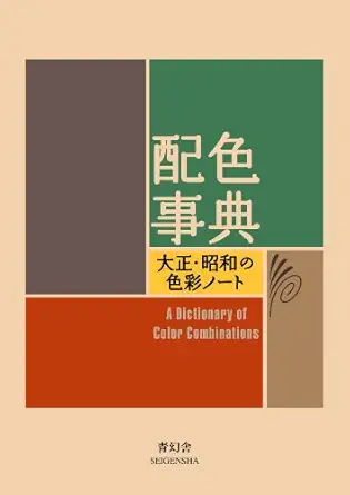 | Best for Extensive Palette Exploration | Focus: Color palettes and combinations | Edition: Japanese edition | Content type: Color schemes, design ideas | VIEW ON AMAZON | See Our Full Breakdown |
| Color Harmony Compendium: A Complete Color Reference for Designers of All Types, 25th Anniversary Edition |  | Best for Comprehensive Color Mastery | Focus: Color harmony and palettes | Edition: 25th Anniversary | Content type: Practical examples, detailed palettes | VIEW ON AMAZON | See Our Full Breakdown |
| Pantone: The Twentieth Century in Color |  | Best for Historical and Cultural Color Insights | Focus: Historical color evolution | Content type: Visual history, cultural insights | Audience: Color and design enthusiasts | VIEW ON AMAZON | See Our Full Breakdown |
| color reference books for designer | Content Type | Focus | Format | Edition |
|---|---|---|---|---|
| The Pocket Complete Color Harm | Color palettes | — | Printed book | Latest |
| The Pantone Book of Color: Ove | — | — | Book | Latest |
| The Complete Color Harmony | — | — | Book | Latest |
| The Designer’s Dictionary of C | Color histories and applications | Practical and historical insights | Book | — |
| Color Index XL: More than 1,10 | Color palettes with formulas | — | Book | — |
| Palette Perfect for Graphic De | Theoretical insights, cultural context | Color meanings and cultural references | — | — |
| Color Choices: Making Color Se | Explanatory text, practical guidance | Fundamental color theory concepts | — | — |
| A Dictionary of Color Combinat | Color schemes, design ideas | Color palettes and combinations | — | Japanese edition |
| Color Harmony Compendium: A Co | Practical examples, detailed palettes | Color harmony and palettes | — | 25th Anniversary |
| Pantone: The Twentieth Century | Visual history, cultural insights | Historical color evolution | — | — |
More Details on Our Top Picks
The Pocket Complete Color Harmony: 1,500+ Color Palettes for Designers, Artists, Architects, Makers, and Educators
This book stands out for its vast collection of over 1,500 color palettes, making it a go-to resource for those who need quick inspiration across a variety of fields. Compared with The Color Index XL, which offers more technical palettes with CMYK and RGB values, this book emphasizes visual harmony and variety, making it ideal for brainstorming. The portability is a clear advantage, but the sheer volume can be overwhelming, and it lacks tutorials or guidance on palette creation. It’s best suited for professionals or students who want rapid access to diverse color schemes without detailed technical data.
Pros:- Extensive collection of color palettes across creative fields
- Compact, portable size for easy reference
- Ideal for quick inspiration and brainstorming
Cons:- No instructional content or guidance on creating palettes
- Can be overwhelming due to the sheer number of options
Best for: Designers and educators who need a broad array of ready-made color palettes for quick reference.
Not ideal for: Users seeking technical color specifications or in-depth color theory education, as this book focuses primarily on visual palettes.
- Number of Palettes:1,500+
- Intended Audience:Designers, artists, educators
- Format:Printed book
- Size:Pocket-sized
- Content Type:Color palettes
- Edition:Latest
Our verdict“This pick makes the most sense for creatives who want a wide-ranging, portable palette resource without technical details.”
The Pantone Book of Color: Over 1000 Color Standards
This book is the definitive resource for precise color standards, offering over 1,000 Pantone colors with clear guidelines, making it essential for branding, fashion, and product design. Unlike The Complete Color Harmony, Pantone Edition, which emphasizes harmony principles, this guide concentrates on accurate color identification and reproduction. It’s particularly useful for professionals who need consistent color matching across materials. However, the lack of detailed edition info and potentially high cost might deter casual users. It’s best suited for those who require dependable, standardized color references for print and manufacturing.
Pros:- Comprehensive collection of Pantone colors
- Provides clear, standardized color guidelines
- Useful for consistent color matching in professional workflows
Cons:- Limited information on edition specifics or updates
- Can be costly for casual or infrequent use
Best for: Fashion designers, product developers, and branding specialists needing precise color standards.
Not ideal for: Beginners or hobbyists who may find the technical focus and cost prohibitive, or those seeking inspiration rather than standards.
- Number of Colors:Over 1000
- Standards Included:Pantone Color Guides
- Intended Audience:Designers, manufacturers, artists
- Format:Book
- Edition:Latest
- Purpose:Color standards and matching
Our verdict“This resource is perfect for professionals who need exact color standards for consistent output across media.”
The Complete Color Harmony, Pantone Edition: Expert Color Information for Professional Results
This book offers in-depth guidance on achieving color harmony using Pantone standards, making it ideal for seasoned designers seeking precise control over color relationships. Unlike The Pantone Book of Color, which lists standards, this edition dives into practical applications and harmony principles, suited for those aiming for consistent, professional results. Its detailed information helps avoid miscommunication in color reproduction, but the absence of physical details or customer reviews might leave some questions unanswered. This pick is best for professionals who want to deepen their understanding of color harmony within Pantone frameworks.
Pros:- Provides expert guidance on color harmony
- Uses Pantone standards for consistency
- Includes detailed color information and practical tips
Cons:- Lacks specific product features or physical specs
- No customer ratings or reviews available
Best for: Experienced designers and artists focused on mastering color relationships for branding or product design.
Not ideal for: Beginners or casual users who need simple palettes or quick references, as this is more technical and detailed.
- Content Focus:Color harmony and application
- Standards Used:Pantone
- Audience:Advanced designers and artists
- Format:Book
- Edition:Latest
- Purpose:Professional color matching and harmony
Our verdict“This resource is ideal for professionals who want to refine their color harmony skills with Pantone standards.”
The Designer’s Dictionary of Color: Practical, example-filled guide to thirty key colors, their histories, and persuasive design uses
This book excels in providing rich histories and practical insights for thirty essential colors, making it perfect for designers who want a deeper understanding of color symbolism and cultural context. Compared with Color Index XL, which offers extensive palettes with formulas, this book emphasizes storytelling and application, ideal for adding depth to design concepts. Its limitation to thirty colors might restrict broader palette exploration, and the lack of user ratings or pricing details makes it harder to gauge its overall value. It’s best suited for designers seeking to incorporate meaningful colors with historical and practical insights.
Pros:- Rich historical and contextual color insights
- Includes practical usage tips
- Enhances understanding of color in design storytelling
Cons:- Limited to thirty colors, restricting variety
- No details on pricing or user ratings
Best for: Branding and editorial designers interested in color symbolism and contextual use.
Not ideal for: Those needing a broad palette resource or technical color formulas, as this focuses on selected key colors and their stories.
- Number of Colors Covered:30
- Content Type:Color histories and applications
- Focus:Practical and historical insights
- Audience:Branding and editorial designers
- Format:Book
- Purpose:Deepen color knowledge with stories
Our verdict“This pick makes sense for designers wanting to deepen their understanding of color histories and meaningful application.”
Color Index XL: More than 1,100 New Palettes with CMYK and RGB Formulas for Designers and Artists
This book offers an impressive collection of over 1,100 new color palettes, complete with CMYK and RGB formulas, making it highly practical for designers and artists who need precise color reproduction. Compared with The Pocket Complete Color Harmony, which emphasizes visual palettes, Color Index XL provides technical details essential for print and digital projects. Its extensive palette library and detailed formulas are ideal for professionals requiring accuracy, but the lack of available pricing or user ratings might be a downside for budget-conscious or casual users. This choice is best for those who want a large, technically detailed palette library for precise color matching.
Pros:- Over 1,100 new color palettes
- Includes CMYK and RGB formulas for accuracy
- Great for print and digital design workflows
Cons:- No pricing details available
- No customer ratings provided
Best for: Graphic and digital designers needing accurate CMYK and RGB formulas for professional projects.
Not ideal for: Users seeking visual inspiration or broad color theory guidance, as this is focused on technical color data.
- Number of Palettes:Over 1,100
- Color Formats:CMYK and RGB
- Content Type:Color palettes with formulas
- Audience:Graphic and digital designers
- Format:Book
- Purpose:Accurate color matching
Our verdict“This resource is ideal for professionals requiring extensive, technically precise palettes for accurate color reproduction.”
Palette Perfect for Graphic Designers and Illustrators: Colour Combinations, Meanings and Cultural References
This book stands out for its focus on the cultural significance and meanings behind various color combinations, making it especially valuable for graphic designers and illustrators who want to imbue their work with cultural depth. Unlike Color Choices, which emphasizes practical application and technical understanding, this guide delves into the symbolic and historical aspects of color, adding richness to creative projects. However, its lack of detailed format or edition info and absence of customer feedback limit its usability as a reference. It offers a unique perspective that enhances conceptual design but may fall short for those seeking technical palettes or visual examples.
Pros:- Provides in-depth insights into cultural and symbolic meanings of colors
- Enhances understanding of how color influences perception and context
- Useful for adding conceptual depth to creative work
Cons:- Lacks specific details on format, edition, or visual content
- No customer reviews or ratings available for assessment
Best for: Graphic designers and illustrators interested in cultural symbolism and color meanings
Not ideal for: Designers needing detailed technical palettes or comprehensive visual examples
- Focus:Color meanings and cultural references
- Intended audience:Graphic designers and illustrators
- Content type:Theoretical insights, cultural context
Our verdict“This book is best suited for designers seeking to deepen their understanding of color symbolism and cultural references, rather than technical color palettes.”
Color Choices: Making Color Sense Out of Color Theory
This pick makes the most sense for those new to color theory, offering clear, straightforward explanations that demystify fundamental concepts. Compared with A Dictionary of Color Combinations, which provides extensive palettes, Color Choices emphasizes grasping the reasoning behind color decisions and applying them confidently. Its simplicity and accessibility are advantages, but it lacks detailed technical information or visual examples, which could limit in-depth understanding. It’s ideal for beginners who want a solid foundation without getting overwhelmed by complexity.
Pros:- Clear, easy-to-understand explanations of core color theory concepts
- Practical advice that helps develop a confident color sense
- Accessible language suitable for newcomers
Cons:- Lacks detailed technical data or advanced guidance
- No included visuals or detailed examples in the description
Best for: Beginners or students seeking an accessible introduction to color theory
Not ideal for: Experienced designers needing advanced technical details or complex palettes
- Focus:Fundamental color theory concepts
- Audience:Beginners, students, amateur designers
- Content type:Explanatory text, practical guidance
Our verdict“This book is perfect for beginners who want to build a strong, practical understanding of color theory basics.”
A Dictionary of Color Combinations Vol 1 (Japanese Edition)
This book excels with its vast collection of color palettes, making it a valuable resource for artists and designers seeking inspiration across diverse styles. Its focus on color combinations is more comprehensive than Color Harmony Compendium, which offers a broader overview but fewer specific palettes. The Japanese edition adds a unique cultural perspective, appealing to those interested in international design trends. However, because it concentrates solely on color combinations, it may not serve as a complete reference for all project types, especially those requiring detailed technical info or visual demonstrations.
Pros:- Offers an extensive variety of color palettes for diverse projects
- Provides inspiration and practical color combinations
- Japanese edition introduces unique cultural nuances
Cons:- Limited to color combinations, lacking in technical or contextual info
- May not be suitable for projects requiring detailed specifications
Best for: Artists and designers looking for extensive palette ideas and cultural insights
Not ideal for: Professionals needing detailed technical data or comprehensive design guidelines
- Focus:Color palettes and combinations
- Edition:Japanese edition
- Content type:Color schemes, design ideas
Our verdict“This book is ideal for users seeking a broad range of color palettes and cultural perspectives for creative inspiration.”
Color Harmony Compendium: A Complete Color Reference for Designers of All Types, 25th Anniversary Edition
This comprehensive guide offers an extensive array of palettes and detailed examples, making it a go-to resource for designers across disciplines. Unlike A Dictionary of Color Combinations, which is more like a palette catalog, the Color Harmony Compendium emphasizes understanding the principles of color harmony with practical applications. While its lack of pricing info and customer ratings might make it harder to evaluate its current value, its broad scope and detailed palettes make it suitable for professionals who want an all-in-one reference. It’s a reliable choice for those aiming to master color relationships in their work.
Pros:- Extensive range of color palettes for diverse projects
- Includes practical examples and detailed harmonies
- Suitable for a wide variety of design disciplines
Cons:- No price or customer ratings available, limiting quick assessment
- Could be overwhelming for casual users or those seeking quick tips
Best for: Creative professionals seeking an all-encompassing, detailed color reference
Not ideal for: Beginners or casual users who need quick, simple guides rather than deep technical insights
- Focus:Color harmony and palettes
- Edition:25th Anniversary
- Content type:Practical examples, detailed palettes
Our verdict“This book is best for experienced designers who want an authoritative, detailed reference for mastering color harmony.”
Pantone: The Twentieth Century in Color
This visually stunning book traces the evolution of color through the 20th century via Pantone’s iconic palette, making it a compelling choice for design enthusiasts and color aficionados. Unlike technical reference books like The Complete Color Harmony, Pantone Edition, which focus on precise color standards, this volume offers a rich historical narrative paired with vibrant imagery. Its limited textual content makes it less practical as a technical resource but perfect as a coffee table piece that sparks inspiration and discussion about cultural shifts reflected through color. It’s ideal for those interested in the story behind the colors rather than technical accuracy.
Pros:- Beautiful visual presentation and historical storytelling
- Showcases influential design eras and cultural movements
- Great for inspiring creative discussions and aesthetic appreciation
Cons:- Limited detailed specifications or technical info
- Not suitable as a technical color reference
Best for: Design lovers and color enthusiasts interested in historical trends and cultural shifts
Not ideal for: Professional designers needing technical color standards or precise palettes
- Focus:Historical color evolution
- Content type:Visual history, cultural insights
- Audience:Color and design enthusiasts
Our verdict“This book makes sense for enthusiasts who want to explore the cultural history of color in the 20th century visually and narratively.”

How We Picked
Our evaluation focused on the breadth and accuracy of color data, usability, and relevance for professional design work. We prioritized books that offer extensive palettes, clear color codes (Pantone, CMYK, RGB), and practical insights. The balance between technical detail and visual inspiration was key, as was the overall build quality and ease of navigation. Books that catered to both beginners and experienced designers were rated higher, with a preference for those that serve multiple purposes—whether as a quick reference or a deep resource. The ranking reflects a combination of these factors, emphasizing versatility and industry relevance.| color reference books for designer | Format | Audience | Focus |
|---|---|---|---|
| The Pocket Complete Color Harm | Printed book | — | — |
| The Pantone Book of Color: Ove | Book | — | — |
| The Complete Color Harmony | Book | Advanced designers and artists | — |
| The Designer’s Dictionary of C | Book | Branding and editorial designers | Practical and historical insights |
| Color Index XL: More than 1,10 | Book | Graphic and digital designers | — |
| Palette Perfect for Graphic De | — | — | Color meanings and cultural references |
| Color Choices: Making Color Se | — | Beginners, students, amateur designers | Fundamental color theory concepts |
| A Dictionary of Color Combinat | — | — | Color palettes and combinations |
| Color Harmony Compendium: A Co | — | — | Color harmony and palettes |
| Pantone: The Twentieth Century | — | Color and design enthusiasts | Historical color evolution |
Factors to Consider When Choosing Color Reference Books For Designers
Choosing the right color reference book involves understanding your specific needs and how you plan to use it. Consider how much technical detail you require, whether you need cultural or historical context, and if portability matters. Budget is also a factor, as prices vary widely from comprehensive industry standards to more affordable, compact guides. The following factors will help clarify what to look for:Scope of Content
Assess whether you need a broad palette collection or detailed standards like Pantone. Some books focus on practical color combinations, while others delve into color theory and history. A larger scope often means a heftier price and more complex navigation, so match the scope with your project needs.
Color Accuracy and Standards
Look for books that include precise color codes—Pantone, CMYK, RGB—and verify if they align with your industry standards. For professional work, validated color matching is crucial to ensure consistency across print and digital media. Cheaper guides might lack precise data, leading to mismatched colors in your projects.
Usability and Format
Consider whether the book’s layout supports quick reference. Spiral-bound and pocket-sized formats are ideal for on-the-fly lookups, while larger, hardcover editions suit detailed study sessions. A well-organized index and clear visual presentation improve efficiency, especially during busy projects.
Cultural and Contextual Content
Some books offer insights into the cultural meanings and historical background of colors, which can be invaluable for branding and storytelling. If your work involves cultural sensitivity or storytelling, choose a guide that emphasizes these aspects over pure technical data.
Price and Value
Prices range from affordable pocket guides to high-end industry standards. Balance your budget with the level of detail and accuracy you need. Investing in a premium book like Pantone may be worthwhile for professionals requiring exact color matching, while hobbyists or students might prefer more affordable options.
Frequently Asked Questions
Can I rely on a color reference book for digital work?
Yes, many color reference books include RGB and HEX codes suitable for digital design. However, be aware that physical color samples may vary slightly from digital displays due to printing processes and lighting conditions. For critical digital projects, always verify colors with calibration tools and digital swatches in addition to your reference book.
Are Pantone books worth the investment for small design studios?
For small studios that require precise color matching, investing in Pantone books can be highly beneficial. They provide standardized color references recognized across industries, ensuring consistency in print and branding. However, if your work is mostly digital or less color-critical, more affordable alternatives might suffice.
Should I buy a color book with cultural insights or technical data?
This depends on your project focus. If storytelling, branding, or cultural sensitivity is key, choose a book with cultural and historical context. Conversely, for technical accuracy in print or digital media, prioritize books with precise color codes and industry standards. Many guides combine both, so select based on your primary needs.
How often should I update my color reference materials?
Color standards evolve, especially with new printing techniques and digital displays. It’s advisable to review your references annually or whenever you start a new project requiring high precision. Investing in the latest editions ensures compatibility with current industry standards and new color palettes.
Can I use these books for interior or fashion design?
Absolutely, many color reference books include palettes and color meanings applicable to interior, fashion, and other creative fields. Look for guides that feature cultural and contextual information if your projects involve storytelling or branding. For purely technical color matching, focus on books with detailed color codes and standards.
Conclusion
The best overall choice for most professional designers is The Pocket Complete Color Harmony due to its extensive palette collections and user-friendly layout. For those prioritizing industry-standard accuracy, The Pantone Book of Color remains essential, especially in print and branding. Beginners or casual users can find value in more affordable, compact guides like Color Index XL. The ideal pick ultimately depends on your specific needs: professionals needing accuracy, creatives seeking inspiration, or students looking for a versatile starter. Consider your budget, project scope, and whether technical detail or cultural context matters most to make the best choice.
As an affiliate, we earn on qualifying purchases.Halloween Picks
halloween