The science behind color blocking fashion trends lies in how your brain perceives color interactions based on principles from color theory and visual perception. Bold, contrasting blocks grab attention and evoke strong emotional responses, while harmonious tones create a calming effect. Bright hues energize, cool tones soothe, and balanced combinations communicate mood and style. Understanding these scientific effects helps you craft visually striking outfits that make a lasting impression—if you keep exploring, you’ll discover how to master this vibrant art form.
Key Takeaways
- Color blocking leverages color theory principles, such as complementary and analogous color schemes, to create visually striking outfits.
- Bold, contrasting blocks enhance visual perception by creating dynamic, energetic effects that capture attention quickly.
- Warm hues like red and yellow energize and attract attention, while cool tones like blue and green evoke calmness, influencing emotional responses.
- Sharp color boundaries and contrast reduce visual noise, guiding focus and emphasizing style statements through scientific understanding of perception.
- Scientific insights into how colors affect mood and perception enable designers to craft fashion that is both stylish and psychologically engaging.
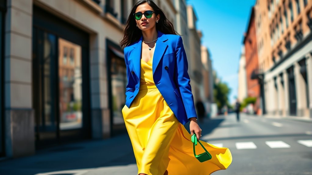
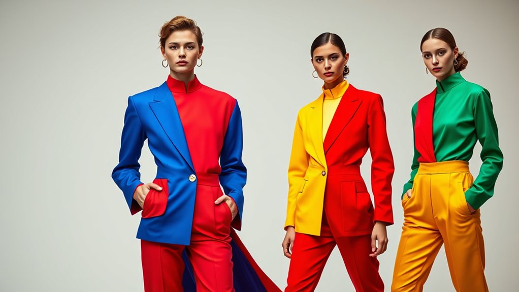
Have you noticed the bold, eye-catching look of color blocking trending in fashion lately? It’s more than just a style statement; it’s a clever play with color theory and visual perception that makes an outfit stand out. When you choose contrasting or harmonious hues and combine them in solid blocks, you’re tapping into how our brains interpret color to create striking visual effects. This isn’t accidental—it’s rooted in scientific principles that influence how we perceive and respond to different color combinations.
Color theory provides the foundation for understanding how colors interact. It explains why certain hues, when paired, evoke specific feelings or reactions. For example, pairing complementary colors like blue and orange creates a vibrant contrast that grabs attention, while analogous colors such as blue and green produce a more harmonious, soothing look. When you apply this knowledge to fashion, you’re intentionally manipulating visual perception to produce desired effects—whether that’s eye-catching vibrancy or subtle sophistication. Color blocking leverages these principles to craft outfits that are visually stimulating and emotionally resonant.
Color pairing influences feelings and reactions, creating vibrant contrast or soothing harmony in fashion.
Your visual perception is how your brain processes the colors you see, and it plays a *vital* role in how color blocking works. When you wear bold, solid blocks of contrasting colors, your eyes are naturally drawn from one hue to another, creating a dynamic flow. This effect is amplified by the sharp boundaries that define each block, making the separation clear and impactful. Your brain picks up on these distinctions quickly, and the result is an outfit that feels energetic and intentional. The simplicity of solid blocks also reduces visual noise, allowing the eye to focus on the interplay of colors rather than details or patterns. Additionally, understanding how visual perception works can help you choose combinations that enhance your personal style and make your outfits stand out even more.
Moreover, understanding how color influences perception helps you make more strategic choices. Bright or warm hues like red, yellow, and orange tend to energize and draw attention, while cooler tones such as blue and green evoke calmness and stability. When you combine these thoughtfully based on color theory, you can craft looks that communicate specific moods or messages. For instance, a bold red top paired with a cool blue skirt creates a striking balance of warmth and coolness, engaging viewers’ senses and making a memorable impact.
In essence, color blocking isn’t just about mixing shades—it’s about understanding the science behind how colors affect perception. By applying principles from color theory and considering how your visual perception works, you can confidently create outfits that are not only stylish but also psychologically engaging. So next time you pick your wardrobe, think about the science behind your choices, and let it guide you in making bold, visually compelling statements.

WIHOLL St Patricks Day Shirt Women Fall Outfits for Women 2026 Crewneck Long Sleeve Shirts Dressy Casual Tops Winter Sweaters Trendy Maternity Clothes Color Block Green L
Material: The fall sweater is lightweight and super soft, comfortable to wear. It almost feels like a chenille…
As an affiliate, we earn on qualifying purchases.
As an affiliate, we earn on qualifying purchases.
Frequently Asked Questions
How Does Color Psychology Influence Color Blocking Choices?
Color psychology influences your color blocking choices by shaping how you perceive colors and their emotional effects. When you pick bold, contrasting hues, you’re often aiming to evoke specific emotional responses, like confidence or excitement. Your color perception guides you in selecting shades that resonate with your mood or message. Ultimately, understanding this connection helps you create striking outfits that communicate your personality and influence how others perceive you.
What Are the Environmental Impacts of Dyeing Multiple Colors?
When you dye multiple colors, you can substantially impact the environment. Traditional dyes often contain harmful chemicals, but eco-friendly dyes help reduce pollution. Using eco dyes minimizes water pollution, and practicing water conservation during dyeing processes further lessens environmental harm. By choosing sustainable options, you help lower water usage and lessen chemical runoff, making your fashion choices more eco-conscious and supporting a healthier planet.
How Do Different Cultures Interpret Color Blocking?
When you explore how different cultures interpret color blocking, you see it’s deeply tied to cultural symbolism and traditional attire. In some societies, bold color blocking represents social status or spiritual beliefs, while others see it as a form of artistic expression. You’ll notice that colors and patterns convey meaning, reflecting history and identity. By understanding these cultural nuances, you gain a richer appreciation for how color blocking connects to tradition and cultural identity worldwide.
Can Color Blocking Enhance Mood or Productivity?
Color blocking can definitely boost your mood and productivity through color therapy and mood regulation. When you wear bright, contrasting colors, you stimulate positive feelings and energy, helping you stay focused and motivated. By intentionally choosing colors that evoke happiness or calmness, you influence your emotional state, making it easier to tackle tasks and feel more upbeat throughout the day. So, your wardrobe choices can actively support your mental well-being.
What Are the Technological Advances Aiding Color Blocking Design?
Think of technological advances as a painter’s palette, expanding your creative horizons. You utilize cutting-edge fabric technology to create vibrant, durable materials, while digital printing brings your bold color combinations to life with precision. These innovations allow you to experiment fearlessly with color blocking, ensuring your designs are both eye-catching and sustainable. With these tools, you’re not just designing, you’re transforming ideas into vivid reality.

Ladyful Color Block Shift Dress Cotton Linen Sleeveless Crew Neck Mini Dresses 60s Party Vacation Sundresses Red,XL
Bold Colorblock: This mini shift dress boasts a striking color block pattern with a retro 60s-inspired twist, super…
As an affiliate, we earn on qualifying purchases.
As an affiliate, we earn on qualifying purchases.
Conclusion
Now that you understand the science behind color blocking, you can confidently experiment with bold hues to elevate your style. Did you know that studies show wearing bright, contrasting colors can boost your confidence and mood? So, go ahead—mix and match with purpose, and let your wardrobe reflect your vibrant personality. Color blocking isn’t just trendy; it’s a scientifically backed way to express yourself and feel empowered every day.
Harmonizing Outfit Colors: A Guide to Perfecting Your Style
As an affiliate, we earn on qualifying purchases.
As an affiliate, we earn on qualifying purchases.

Color Collective's Palette Perfect: Color Combinations Inspired by Fashion, Art and Style
As an affiliate, we earn on qualifying purchases.
As an affiliate, we earn on qualifying purchases.