
Duotone design revitalizes vintage photos by pairing two contrasting colors, creating bold and emotionally impactful images. By choosing hues that reflect the era or evoke specific moods, you can add authenticity while capturing attention. This technique simplifies visuals but demands careful color selection to guarantee harmony and storytelling power. If you explore further, you’ll discover how to effectively apply duotone principles to enhance your vintage projects and evoke deeper nostalgia.
Key Takeaways
- Use contrasting colors to create striking, vintage-inspired duotone effects that enhance visual appeal.
- Select a color palette that reflects the photo’s era for authenticity and storytelling depth.
- Limit colors to maintain visual harmony and avoid distraction, ensuring a cohesive vintage look.
- Consider color psychology to evoke specific emotions and strengthen the photo’s narrative.
- Pay attention to detail in color application to preserve authenticity and enhance overall project impact.
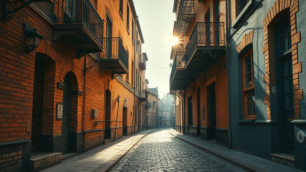
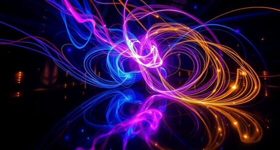
Have you ever noticed how duotone design can instantly elevate the look of a visual project? It’s a powerful technique that combines two contrasting colors to create striking images, often giving a vintage or cinematic feel. When you’re working with vintage photos, choosing the right color palette is essential. The colors you select can transform an ordinary photo into something eye-catching, but it’s equally important to contemplate historical accuracy. If your goal is to evoke a specific time period, sticking to colors that align with that era ensures authenticity and adds credibility to your work.
The beauty of duotone design lies in its simplicity, yet it demands careful attention to detail. You’re not just picking any two colors. Instead, you need to think about the emotional impact and visual harmony they produce. For example, using sepia tones can evoke a warm, nostalgic vibe that fits well with early 20th-century imagery. Alternatively, a stark black-and-white duotone can lend a timeless, classic quality. When selecting your color palette, think about the mood you want to convey. Bright, vibrant hues can energize a vintage scene, while muted tones might emphasize a somber or reflective tone.
Maintaining historical accuracy is also about understanding the context of the original photos. Many vintage images were originally captured in black and white, but the colors you choose to add should reflect the era’s typical hues. For instance, if you’re working with a 1920s photo, consider colors that would have been common or possible at the time, such as earthy browns, faded reds, or soft pastels. This attention to detail helps in preserving the authenticity and storytelling power of your images. Additionally, it shows respect for the subject matter, making your work more genuine and engaging.
Choosing era-appropriate colors preserves authenticity and enhances storytelling in vintage images.
You also want to keep consistency in your duotone application. The color palette you pick should complement the overall theme of your project. Mixing too many contrasting colors or using overly saturated shades can distract viewers and dilute the vintage feel. Instead, opt for a limited, harmonious palette that enhances the photograph’s original essence. This approach reinforces the mood and ensures your images resonate with viewers on an emotional level.
Furthermore, understanding color psychology can help you select hues that evoke specific feelings or responses from viewers, strengthening your visual storytelling. In the end, duotone design isn’t just about making photos look pretty; it’s about thoughtfully combining colors to honor the history behind each image. By carefully selecting your color palette and respecting the historical accuracy of your photos, you can breathe new life into vintage images—transforming them into captivating pieces of visual storytelling that connect past and present seamlessly.
![WavePad Free Audio Editor – Create Music and Sound Tracks with Audio Editing Tools and Effects [Download]](https://m.media-amazon.com/images/I/B1HPw+BmlXS._SL500_.png)
WavePad Free Audio Editor – Create Music and Sound Tracks with Audio Editing Tools and Effects [Download]
Easily edit music and audio tracks with one of the many music editing tools available.
As an affiliate, we earn on qualifying purchases.
As an affiliate, we earn on qualifying purchases.
Frequently Asked Questions
What Are the Best Software Tools for Creating Duotone Effects?
When you’re looking to create duotone effects, the best software tools allow for precise color grading and tonal adjustments. Programs like Adobe Photoshop and Lightroom give you control over color choices and contrast, making it easy to craft striking duotones. Affinity Photo and GIMP are great free alternatives that also support these features. With these tools, you can effortlessly transform your images into vibrant, vintage-inspired visuals.
How Does Duotone Design Impact Photo Storytelling?
Imagine this: duotone design delivers dramatic depth and distinction to your photos. You’ll see how it enhances emotional depth and visual contrast, making your storytelling more striking and significant. By simplifying color schemes, duotones focus viewer attention, evoking emotions and emphasizing key elements. This powerful technique transforms ordinary images into evocative visual stories, engaging your audience on a deeper level and ensuring your message resonates vividly and memorably.
Can Duotone Be Applied to Colored Vintage Photos?
You can definitely apply duotone to colored vintage photos, enhancing their visual impact. This technique offers effective color enhancement, giving your images a fresh, artistic look while maintaining their nostalgic charm. It’s a modern approach to vintage colorization, adding depth and mood with just two tones. So, if you want to breathe new life into old photos, duotone can be a creative and striking choice for colored vintage images.
What Color Combinations Work Best in Duotone Photography?
Think of duotone photography as painting with light—your color choices set the mood. You’ll find that complementary colors, like blue and orange, create striking contrast, making images pop. Monochromatic schemes, such as various shades of blue, offer a harmonious, calming effect. Experiment with these combinations to find the perfect balance that enhances your vintage photos, bringing new depth and emotion to timeless images.
How Does Duotone Influence Viewer Perception and Mood?
You might notice that duotone influences your perception by creating a strong emotional impact and enhancing visual harmony. The limited color palette guides your focus, evokes specific moods, and sets the tone of the image. When used thoughtfully, duotone can make viewers feel nostalgic, dramatic, or calm, shaping their emotional response. It’s a powerful tool that transforms simple photos into compelling visuals that resonate deeply with viewers.
vintage photo colorization kit
As an affiliate, we earn on qualifying purchases.
As an affiliate, we earn on qualifying purchases.
Conclusion
Just like a master chef transforms simple ingredients into a delicious dish, duotone design breathes new life into vintage photos, turning the old into something fresh and mesmerizing. It’s your secret spice, adding depth and emotion where there once was only nostalgia. Embrace this art, and your images will whisper stories anew—inviting viewers to see the past through a vibrant, modern lens. With duotone, you’re not just preserving history; you’re reimagining it.
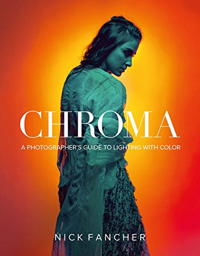
Chroma: A Photographer's Guide to Lighting with Color
As an affiliate, we earn on qualifying purchases.
As an affiliate, we earn on qualifying purchases.
Photo Editor
Color : exposure, brightness, contrast, saturation, temperature, tint and hue
As an affiliate, we earn on qualifying purchases.
As an affiliate, we earn on qualifying purchases.