Spectral power distribution (SPD) charts show how much energy a light source emits at each wavelength. Spikes in these charts indicate specific wavelengths where the light is very strong, often highlighting dominant colors. Sharp peaks suggest certain colors may be overly emphasized, which can affect color accuracy, while broader peaks signal more balanced spectral output. Understanding these spikes helps you evaluate light quality and color rendering—if you want to learn how to interpret these features further, keep exploring.
Key Takeaways
- Spikes in SPD charts indicate dominant wavelengths where the light emits more energy.
- Sharp peaks suggest specific spectral emissions, affecting color rendering and perceived hue.
- Excessive or uneven spikes can cause color distortion and reduce light efficiency.
- Broad, smooth peaks reflect a balanced spectrum promoting accurate color reproduction.
- Analyzing spike positions and shapes helps assess a light source’s spectral quality and suitability.

VBR-100 Quantum PAR Meter 6000umol/(㎡s), RGB PAR Breakdown, PPFD Distribution Mapping, Bluetooth Free App, Sensor Name(VBR-100 Plus), No Spectrum Selection
Accurate PAR Test or Any Spectrum. Measure PAR (400–700nm) and PPFD accurately under various light sources. VBR-100 reads…
As an affiliate, we earn on qualifying purchases.
As an affiliate, we earn on qualifying purchases.
Understanding Spectral Power Distribution Charts

Spectral Power Distribution (SPD) charts visually represent how a light source emits energy across different wavelengths of the visible spectrum. To interpret these charts accurately, spectral calibration is essential; it guarantees the data reflects true energy levels at each wavelength. This calibration helps you compare different light sources reliably. Additionally, understanding light uniformity is vital—how evenly the light spreads across a space. A consistent SPD promotes uniform illumination, reducing areas of uneven brightness or color shifts. By analyzing the shape and features of the SPD chart, you gain insight into the light’s color rendering capabilities and spectral balance. Mastering spectral calibration and light uniformity allows you to select lighting that meets your specific needs, ensuring optimal performance and visual comfort. Incorporating spectral calibration techniques can significantly improve the accuracy of SPD analysis and lighting decisions.

Glendan Light Box Photography, 10"x10" Photo Box with 88 High Color Rendering Index LED Lights, 6 Color PVC Backdrops, 4 Reflection Boards and 1 Diffuser for Jewelry and Small Item Product Photography
【Stepless Dimming & High CRI】Integrate 88 high-quality LED Light Beads with Dimmable Range 0-100, You can easily adjust…
As an affiliate, we earn on qualifying purchases.
As an affiliate, we earn on qualifying purchases.
The Significance of Peaks and Dips in SPD

Peaks and dips in an SPD chart reveal which wavelengths are most and least emitted by a light source, substantially impacting its color accuracy and energy efficiency. A peak at certain wavelengths enhances color rendering, making objects appear more vibrant and true to life. Conversely, a dip indicates minimal emission, potentially reducing color fidelity. Additionally, sharp peaks can signify energy wastage, lowering efficiency. Understanding these features helps you select lighting that balances vividness and performance. Recognizing the spectral distribution patterns guides you to better lighting choices for accurate color and energy savings. Here’s a visual overview:
| Feature | Impact on Color | Impact on Efficiency |
|---|---|---|
| Peak | Improves color accuracy | Can reduce energy efficiency if excessive |
| Dip | Limits color fidelity | Indicates wasted energy at other wavelengths |
| Balance | Ensures natural appearance | Optimizes energy consumption |
spectral calibration tools for lighting
As an affiliate, we earn on qualifying purchases.
As an affiliate, we earn on qualifying purchases.
How to Read a Spectral Power Distribution Graph

When you look at a spectral power distribution graph, you’ll want to identify the peaks at specific wavelengths to understand which colors are most prominent. Pay attention to how these peaks influence the overall color balance of the light source. By analyzing these features, you can better interpret the light’s characteristics and how it will affect your environment. Additionally, understanding the dog breeds associated with specific traits can help in selecting lighting that enhances visual clarity and comfort.
Interpreting Wavelength Peaks
To interpret wavelength peaks on a spectral power distribution (SPD) graph, focus on the high points where the curve rises to its maximum values. These spectral peaks indicate the wavelengths where the light source emits the most energy, making wavelength interpretation clearer. By identifying these peaks, you can determine the dominant wavelengths that influence the color appearance of the light. The position of the spectral peaks reveals whether the source is rich in shorter wavelengths (blues and greens) or longer wavelengths (reds and oranges). Understanding these peaks helps you assess the light’s color quality and spectral makeup. Remember, sharp peaks suggest specific wavelengths are strongly emitted, while broader peaks indicate a wider spread of wavelengths contributing to the overall spectrum. Recognizing the significance of spectral peaks enhances your ability to evaluate light sources for your backyard greenhouse and optimize plant growth conditions.
Analyzing Color Balance
Analyzing color balance on a spectral power distribution (SPD) graph involves examining how various wavelengths combine to produce the overall spectrum. You look at the distribution’s shape and peaks to understand how much red, green, and blue light are present. Spectral analysis helps you identify imbalances that can affect color accuracy. For example, a spike in the blue region might make colors appear cooler, while a dip in the red range could dull warm tones. By evaluating these details, you determine whether the light source produces a balanced spectrum suitable for accurate color reproduction. This process allows you to interpret how well a light source maintains color fidelity, ensuring that the colors you see are true to life based on the spectral data. Understanding color fidelity is essential for assessing how well a projector or display reproduces images accurately.
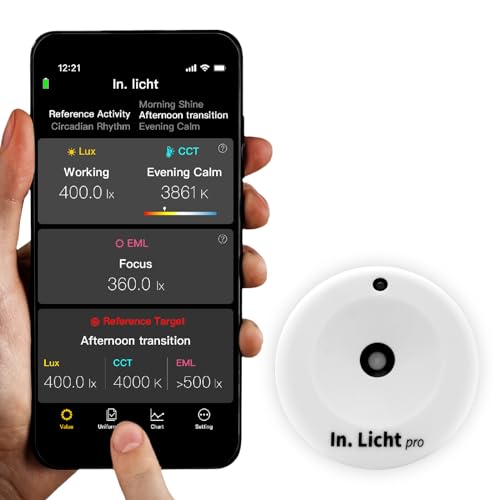
In. Licht Pro Handheld EML Light Meter Sensor Lumens Lux Color Temperature CCT Contrast Uniformity Measurement for Architecture Interior Lighting Design Well
[World's First Handheld EML Meter & Sensor] Designed for professionals like architects, lighting designers,and horticulturists. You can measure…
As an affiliate, we earn on qualifying purchases.
As an affiliate, we earn on qualifying purchases.
Common Types of Light Sources and Their SPDs

Different types of light sources emit distinct spectral power distributions (SPDs), which describe how their energy spreads across wavelengths. For example, LED technology produces a narrow, spike-like SPD, focusing energy in specific bands, resulting in efficient and targeted illumination. Incandescent bulbs, on the other hand, emit a smooth, continuous SPD with a broad spectrum, closely resembling natural sunlight. These differences influence color rendering and light quality. Understanding these SPDs helps you choose lighting that suits your needs. Here’s a comparison:
| Light Source | SPD Characteristics |
|---|---|
| LED Technology | Narrow peaks, energy concentrated in bands |
| Incandescent Bulbs | Continuous, broad spectrum resembling sunlight |
| Fluorescent | Multiple spikes, uneven distribution |
Additionally, recent AI discoveries have advanced the design of lighting systems by analyzing spectral data to optimize energy efficiency and color accuracy.
What Spikes Reveal About Light Quality

Spikes in a spectral power distribution chart can reveal key details about light quality, such as the dominant wavelengths that define its color. They can also highlight gaps in the spectrum that might affect color rendering or consistency. By recognizing these spikes, you can better assess how suitable a light source is for your specific needs. Additionally, understanding the spectral distribution can help identify potential issues with light performance and support optimal lighting choices.
Identifying Dominant Wavelengths
When examining spectral power distribution charts, the prominent peaks—known as dominant wavelengths—stand out as key indicators of a light source’s color quality. These peaks reveal the wavelength dominance, showing which specific wavelengths contribute most to the light’s perceived color. By analyzing spectral intensity at these peaks, you can determine how much each wavelength influences the overall color output. A sharp, high spike indicates strong wavelength dominance, suggesting a narrow spectral focus. Conversely, broader, lower peaks imply a more balanced distribution. Recognizing these dominant wavelengths helps you understand the light’s hue and color rendering capabilities. This analysis allows you to compare different light sources quickly and assess their suitability for various applications, based on how their spectral intensity is distributed across the visible spectrum.
Detecting Color Gaps
Have you ever noticed gaps or dips in a spectral power distribution chart? These are clear signs of color gaps or spectral anomalies, which reveal missing or weak wavelengths in the light source. Such gaps can affect color rendering, making some hues appear dull or distorted. When sharp dips appear between spikes, it indicates the light lacks certain parts of the visible spectrum, reducing its ability to reproduce colors accurately. Recognizing these spectral anomalies helps you assess light quality more precisely. Understanding spectral output can help you identify whether a light source provides a balanced spectrum. If a chart shows significant color gaps, it suggests the light source may not provide a full, balanced spectrum needed for true color rendering. Detecting these gaps allows you to choose lighting that offers a more uniform spectral output, ensuring better visual clarity and color fidelity.
Assessing Light Consistency
What do sharp spikes in a spectral power distribution chart tell you about a light source’s quality? These spikes indicate uneven spectral consistency, which can compromise light uniformity. When a light shows pronounced peaks, it suggests that certain wavelengths dominate while others are lacking, leading to inconsistent color rendering. This variability can cause visible color shifts and reduce visual comfort. Evaluating light consistency through these spikes helps you identify sources that may produce flickering or uneven illumination. Uniform spectral distribution ensures balanced light quality, promoting better color perception and visual stability. Recognizing these spikes allows you to select lighting that maintains consistent spectral output across the entire spectrum, guaranteeing ideal light uniformity and overall light quality in your space.
Interpreting the Color Rendering Index (CRI) and SPD

Understanding the relationship between the Color Rendering Index (CRI) and Spectral Power Distribution (SPD) is essential for evaluating lighting quality. CRI measures how accurately a light source reveals colors, directly linked to its spectral makeup. When analyzing SPD, look for spikes at specific wavelengths, which influence both color temperature and color fidelity. A balanced SPD with smooth, continuous peaks tends to produce better color rendering, while sharp spikes can distort color perception. Higher CRI values generally indicate more natural color reproduction, especially in environments where true color display matters. Additionally, understanding spectral distribution patterns can help identify potential issues with color rendering and color shifts under different lighting conditions. By examining SPD charts alongside CRI ratings, you can determine if a light source will deliver the accurate, vibrant colors you need, avoiding lighting that skews hues or diminishes visual clarity.
Practical Applications of SPD Analysis

Analyzing the spectral power distribution (SPD) of a light source helps you select lighting that meets specific practical needs. By examining spectral signatures, you can identify how well a light source reproduces colors and supports visual tasks. For example, uniform light distribution ensures consistent spectral signatures across a space, enhancing overall light quality. SPD analysis guides you in choosing fixtures that provide the right balance of wavelengths, improving color accuracy and reducing visual fatigue. It also helps you assess light uniformity, ensuring even illumination without unwanted hotspots or dim areas. Understanding color rendering is essential for evaluating how accurately a light source displays colors and supports visual clarity. This detailed understanding allows you to optimize lighting for various environments, from retail displays to workspaces, ensuring that the chosen light source aligns with your goals for visual comfort, color fidelity, and energy efficiency.
Tips for Comparing Different Light Sources Using SPDs

When comparing different light sources using their spectral power distributions, focus on their spectral signatures to identify how each source renders colors and supports visual tasks. Pay close attention to the color temperature, which influences perceived warmth or coolness, and the spectral bandwidth, indicating how broad or narrow the emitted spectrum is. To make effective comparisons:
- Check the peaks and spikes in the SPD to see which wavelengths are emphasized.
- Evaluate the spectral bandwidth to determine if the light covers a broad spectrum for natural color rendering or a narrow one for specific tasks.
- Compare the color temperatures to assess how the light mood aligns with your needs and preferences.
These steps help you select the most suitable light source based on spectral characteristics and visual performance.
Frequently Asked Questions
How Do Environmental Factors Affect Spectral Power Distribution Readings?
Environmental factors substantially impact spectral power distribution readings by causing spectral variability. Changes in lighting conditions, temperature, and humidity can skew measurements if not properly accounted for. You should perform environmental calibration regularly to minimize these effects. This calibration helps guarantee your readings accurately reflect true spectral properties, reducing the influence of external factors and maintaining consistent, reliable data over time.
Can SPDS Predict the Longevity of a Light Source?
Sure, spectral power distribution charts can provide clues about light aging and spectral shifts, but they can’t precisely predict a light source’s longevity. You see, as lights age, their spectra subtly shift, revealing signs of wear. However, predicting exact lifespan requires considering factors like usage, environment, and quality. So, while SPDs help monitor changes, they aren’t foolproof fortune-tellers for how long your light will last.
Are There Standards for SPD Measurement Accuracy?
You should know that standards for SPD measurement accuracy do exist. They emphasize measurement calibration and data reproducibility to guarantee consistent results across different instruments and labs. Organizations like CIE and ASTM set guidelines to maintain high accuracy levels. By following these standards, you can confidently compare SPD data, knowing it’s been properly calibrated and is reproducible, which is essential for reliable lighting analysis and research.
How Do SPDS Influence Human Circadian Rhythms?
You should know that SPDs influence your circadian rhythms by affecting melatonin suppression and alertness enhancement. When certain wavelengths are present, they can either suppress melatonin, making you more alert, or promote sleepiness. By understanding these effects, you can adjust lighting to support better sleep or boost alertness during the day, helping you maintain a healthier circadian cycle and improve overall well-being.
What Role Do SPDS Play in LED Light Design?
In LED light design, SPDs are crucial because they influence color rendering and energy efficiency. You can tailor the spectral output to produce accurate colors, making spaces look more natural and vibrant. By optimizing SPDs, you guarantee your LEDs are energy-efficient, reducing power consumption without sacrificing quality. This balance helps you create lighting solutions that are both aesthetically pleasing and environmentally friendly, fulfilling user needs and sustainability goals.
Conclusion
By understanding spectral power distribution charts, you gain insight into how light sources affect colors and mood. Did you know that a single spike in a light’s SPD can drastically alter how reds or blues appear? When you compare SPDs, you’ll see the true quality behind different lights—helping you choose the best for your space. Mastering this tool makes you better equipped to create the perfect lighting environment every time.