
Simultaneous contrast is a fascinating visual effect where the colors around a hue influence how you perceive its brightness and shade. When you look at a color next to lighter or darker hues, it appears more vivid or subdued depending on its background. This occurs because your brain compares the surrounding colors, altering the perceived intensity. Understanding this process can help you see how colors interact in art, design, or everyday life. Keep exploring, and you’ll uncover even more about how your perceptions can be shaped.
Key Takeaways
- Simultaneous contrast occurs when surrounding colors influence the perceived brightness and hue of a central color.
- It causes colors to appear brighter or darker depending on adjacent background hues.
- Artists and designers manipulate color interactions to create visual emphasis or subtle effects.
- The phenomenon reveals how the brain interprets colors relative to their environment rather than in isolation.
- Understanding simultaneous contrast enhances insight into visual illusions and the dynamic nature of perception.
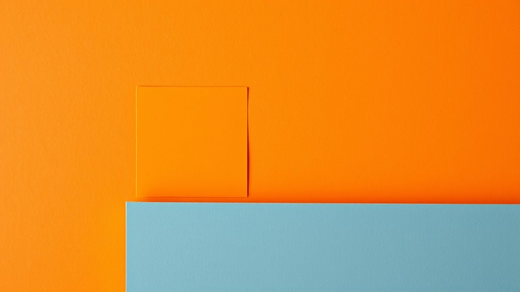
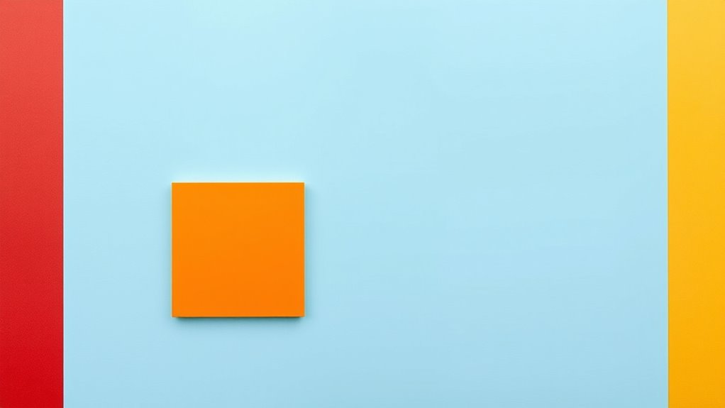
Simultaneous contrast is a fascinating optical phenomenon where the appearance of a color is affected by the colors surrounding it. When you look at an image or a design, you might notice that the same shade can seem brighter or darker depending on its background. This effect highlights how your visual system interprets colors not in isolation but relative to their context. As a result, the perceived brightness of a color isn’t fixed; instead, it shifts based on adjacent hues. This dynamic creates compelling color illusions that can deceive your eyes and challenge your sense of reality. You might see a gray square appear darker on a light background or lighter on a dark one, even though it’s the same shade in both cases. These subtle shifts are what make simultaneous contrast so intriguing and crucial to understanding how your brain processes visual information. Recognizing the role of contextual cues can deepen your understanding of these visual phenomena.
Simultaneous contrast reveals how surrounding colors influence perceived brightness and shade.
You can use this principle intentionally in art and design to evoke specific moods or direct attention. For example, placing a bright color next to a darker shade can make the bright color seem even more vivid, amplifying its visual impact. Conversely, surrounding a color with similar hues can cause it to appear muted or subdued. This manipulation of perceived brightness through color interactions is at the core of many optical illusions, where your brain is tricked into seeing differences that don’t actually exist in the physical properties of the colors. These illusions demonstrate how powerful contextual cues are in shaping your visual experience, often leading you to misjudge the true color or luminance of an object.
Understanding simultaneous contrast can also help you better appreciate how your brain constructs the images you see. It emphasizes that your perception isn’t purely based on the actual colors but on the relationships between them. When you observe a scene, your mind constantly compares neighboring colors to interpret brightness and hue. This comparison can cause certain colors to seem more intense or subdued, depending on their surroundings. Recognizing this can make you more aware of how visual tricks work and how artists and designers exploit these effects to create compelling visual compositions.
Ultimately, this phenomenon underscores the importance of context in visual perception. It reminds you that what you see isn’t just about the objects before you but also about how those objects relate to their environment. By understanding the principles of simultaneous contrast, you gain insight into the fascinating ways your brain interprets color and brightness, revealing the complex interplay behind everyday color illusions.

Color Theory for Artists: Everything you need to know about working with colour
As an affiliate, we earn on qualifying purchases.
As an affiliate, we earn on qualifying purchases.
Frequently Asked Questions
How Does Simultaneous Contrast Influence Color Perception in Art?
When you observe art, simultaneous contrast influences your perception by making colors appear more vibrant or subdued based on neighboring hues. This effect enhances perceived vibrancy and creates dynamic interactions that can emphasize or de-emphasize certain elements. As a result, your eye perceives color harmony or tension within the composition, guiding your emotional response and deepening your engagement with the artwork’s visual impact.
Can Simultaneous Contrast Be Used to Create Optical Illusions?
Yes, you can use simultaneous contrast to create optical illusions that engage your senses. By carefully placing contrasting colors, you trigger color vibration and visual trickery, making objects appear to shift or pulsate. This technique taps into how your eyes interpret color interactions, drawing viewers into a mesmerizing experience. When applied skillfully, simultaneous contrast becomes a powerful tool for illusion, transforming simple hues into captivating visual puzzles.
What Are Common Mistakes When Applying Simultaneous Contrast in Design?
When applying simultaneous contrast, you often make mistakes like choosing incorrect color pairing, which can cause color bleeding and reduce clarity. Avoid overly contrasting colors that clash or create visual fatigue. Also, don’t overlook how surrounding hues influence perceived color, leading to unintended illusions. Keep your palette balanced, test your design in different lighting, and confirm your color choices complement each other to prevent mistakes.
How Does Ambient Lighting Affect Simultaneous Contrast Effects?
Ambient lighting markedly influences your perception of simultaneous contrast because it affects your color sensitivity. Bright or uneven lighting can diminish contrast effects, making colors appear flatter or less vibrant. Conversely, dim or consistent lighting enhances color interactions, emphasizing contrast. When designing, you should consider ambient lighting conditions to guarantee your color choices maintain their intended visual impact, allowing viewers to experience the full depth of the contrast you’ve created.
Are There Psychological Effects Associated With Simultaneous Contrast?
You might notice that when a bright, warm color surrounds a cool, dull hue, your emotional response shifts, showing a psychological effect of simultaneous contrast. This influences your visual perception, making certain colors seem more intense or subdued. For example, in marketing, contrasting colors can evoke feelings of excitement or calmness, demonstrating how simultaneous contrast impacts your mood and perception, shaping your overall experience without you even realizing it.

JimKing Creative Color Wheel, Paint Mixing Learning Guide, Art Class Teaching Tool for Makeup Painting Tattoo,Blending Board Chart Color Mixed Guide Hardboard(9.25inch)
Helps organise colours to make choices and combinations easier;Defines common terms and helps the artist to understand colour…
As an affiliate, we earn on qualifying purchases.
As an affiliate, we earn on qualifying purchases.
Conclusion
Now you see how powerful simultaneous contrast is—it’s like a magic trick that transforms your perception of color instantly. By understanding these interactions, you can make your artwork or design pop more than you ever imagined. Don’t underestimate the impact of tiny shifts in color; they can change the entire mood of your piece. Harness this knowledge, and you’ll wield a visual superpower capable of stunning everyone who gazes upon your creations!
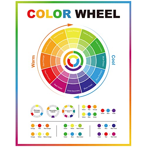
Geyee Color Wheel Poster Circle Chart for Artist Color Wheels 16 x 20 Inch Decorative Theory Knowledge Poster for Back to School Art Educational Classroom Bedroom Room Wall Decorations
Color Wheel Poster: there is 1 piece of color wheel poster, which involves the basic knowledge of color…
As an affiliate, we earn on qualifying purchases.
As an affiliate, we earn on qualifying purchases.
JimKing Creative Color Wheel, Paint Mixing Learning Guide, Art Class Teaching Tool for Makeup Painting Tattoo,Blending Board Chart Color Mixed Guide Hardboard(9.25inch)
Helps organise colours to make choices and combinations easier;Defines common terms and helps the artist to understand colour…
As an affiliate, we earn on qualifying purchases.
As an affiliate, we earn on qualifying purchases.