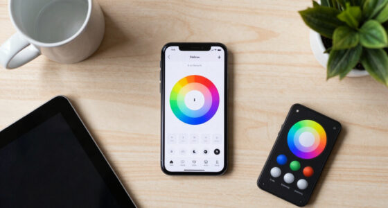

Saturation, hue, and value are key to understanding color in digital images. Saturation refers to the intensity or vividness of a color—more saturation means brighter, more eye-catching colors, while less makes them muted or subdued. Hue is the actual color on the wheel, like red or blue, and changing it shifts the overall mood. Value indicates how light or dark a color is, helping create depth. Mastering these elements lets you communicate mood and focus effectively—explore further to reveal more about their impact.
Key Takeaways
- Saturation describes the intensity or vividness of a color, ranging from muted to highly vibrant.
- Hue indicates a color’s position on the color wheel, shifting between different colors such as red, blue, and yellow.
- Value refers to the lightness or darkness of a color, affecting contrast and depth in images.
- Adjusting these elements influences the mood, emotional impact, and visual harmony of digital visuals.
- Mastery of saturation, hue, and value enables precise color correction and stylistic control in digital imaging.

Have you ever wondered what makes colors look vibrant or muted? Understanding the concepts of saturation, hue, and value is key to grasping how colors behave, especially in digital imaging. When you explore color theory, you learn that colors aren’t just about what you see; they’re about how colors interact and how they can evoke different feelings or focus attention. In digital imaging, these elements become even more essential because screens depend on precise color manipulation to produce the images you see every day.
Understanding saturation, hue, and value reveals how colors influence mood and visual impact in digital imaging.
Saturation refers to the intensity or purity of a color. Think of it as how vivid or dull a color appears. Highly saturated colors are bright and eye-catching, like a fiery red or electric blue. Low saturation, on the other hand, produces more muted, subdued tones—think of pastel shades or earth tones. In digital imaging, adjusting saturation can dramatically change the mood of an image. For example, increasing saturation makes a landscape pop, emphasizing the lush greenery or bright skies, while decreasing saturation can create a vintage or calm effect. Color theory helps you understand how saturation influences emotional responses and visual impact, which is essential when designing graphics or editing photos.
Hue is the attribute that defines a color’s position on the color wheel. It’s what we typically think of as the actual color—red, blue, green, yellow, etc. When you change hue, you’re shifting the color around that wheel. In digital imaging, hue adjustments are common for correcting color casts or creating specific visual styles. Understanding hue also helps you make better color choices, ensuring your design communicates the right mood or message. Color theory guides these choices, showing how different hues work together or contrast to create harmony or tension within an image.
Value is the lightness or darkness of a color. It’s what makes a color appear bright or subdued, and in digital imaging, it’s fundamental for creating depth and contrast. For instance, a dark blue can evoke a sense of calm or seriousness, while a light blue feels airy and fresh. When you manipulate value, you control how elements stand out or recede in your composition. Proper understanding of value allows you to create balanced images that are easy to read and visually appealing. In digital media, subtle shifts in value can draw attention to focal points or establish mood, aligning with principles learned through color theory.

Color Theory for Artists: Everything you need to know about working with colour
As an affiliate, we earn on qualifying purchases.
As an affiliate, we earn on qualifying purchases.
Frequently Asked Questions
How Do Saturation, Hue, and Value Interact in Color Theory?
You influence how colors blend and their emotional impact by adjusting saturation, hue, and value. When you increase saturation, colors become more vibrant, enhancing their emotional power. Changing the hue shifts the color’s identity, affecting mood and style. Modifying value, from light to dark, adds depth and contrast. By balancing these elements, you create dynamic color combinations that evoke specific feelings and visual interest in your artwork.
Can Saturation, Hue, and Value Be Adjusted Independently?
Yes, you can adjust saturation, hue, and value independently in color mixing. This allows you to fine-tune colors to evoke specific emotional responses or achieve a desired visual effect. By changing saturation, you control the intensity; adjusting hue shifts the color itself; and modifying value affects brightness. Mastering these adjustments helps you create balanced, expressive artwork that communicates exactly what you intend to your audience.
How Do These Elements Affect Visual Perception and Mood?
Think of colors as emotional signals in a story. When you adjust saturation, you intensify feelings; high saturation sparks excitement, while low creates calm. Hue shifts evoke cultural meanings—red for passion, blue for serenity. Value influences mood by darkening or brightening scenes, affecting perception and tension. In visual storytelling, mastering these elements helps you guide viewers’ emotions and perceptions, making your message more powerful and engaging.
Are There Digital Tools to Manipulate Saturation, Hue, and Value?
Yes, digital tools exist for manipulating saturation, hue, and value. You can use color grading software like Adobe Premiere Pro, DaVinci Resolve, or Photoshop to adjust these elements easily. These digital color tools let you fine-tune colors, enhance mood, and create visual impact. With a few clicks, you can change the overall tone or specific areas, giving you full control over your project’s color dynamics and emotional expression.
How Do Saturation, Hue, and Value Influence Color Harmony?
You influence color harmony by adjusting saturation, hue, and value to create appealing color contrast and aesthetic balance. Higher saturation makes colors more vivid, catching attention, while lower saturation offers subtlety. Changing hue shifts colors to complement or contrast each other, enhancing harmony. Altering value affects lightness or darkness, adding depth and balance. Mastering these elements helps you craft visually engaging designs with harmonious color relationships that draw viewers in.
photo editing software
As an affiliate, we earn on qualifying purchases.
As an affiliate, we earn on qualifying purchases.
Conclusion
Understanding saturation, hue, and value helps you bring your colors to life. Think of them as the ingredients to your artistic recipe—balance them well, and your creations will stand out. Remember, a picture is worth a thousand words, so mastering these elements lets your work speak volumes. Keep experimenting and trust that, like a painter with a palette, you’ll find the perfect harmony in your colors. Keep practicing, and your art will truly shine.

JimKing Creative Color Wheel, Paint Mixing Learning Guide, Art Class Teaching Tool for Makeup Painting Tattoo,Blending Board Chart Color Mixed Guide Hardboard(9.25inch)
Helps organise colours to make choices and combinations easier;Defines common terms and helps the artist to understand colour…
As an affiliate, we earn on qualifying purchases.
As an affiliate, we earn on qualifying purchases.
digital art supplies
As an affiliate, we earn on qualifying purchases.
As an affiliate, we earn on qualifying purchases.