
Achromatic colors—black, white, and gray—serve as a neutral foundation in design, offering simplicity, sophistication, and balance. They help highlight other colors, create contrast, and set a calm, timeless mood. Black symbolizes elegance and power, while white suggests purity and cleanliness. Gray adds neutrality and subtlety. Using these colors can make your designs feel modern, refined, and versatile. If you want to uncover how to effectively incorporate achromatic palettes, there’s more to explore ahead.
Key Takeaways
- Achromatic colors include black, white, and gray, which lack hue and evoke simplicity and sophistication.
- They create contrast, depth, and focus in visual compositions, enhancing overall design harmony.
- These colors symbolize neutrality, balance, and calmness, supporting minimalist and modern aesthetics.
- Achromatic hues serve as versatile backgrounds that highlight other colors and design elements.
- They are essential in conveying elegance, authority, and timelessness in various design applications.

Have you ever wondered what makes certain colors feel neutral or timeless? It’s often the achromatic colors—black, white, and gray—that evoke a sense of simplicity and sophistication. These hues are more than just shades; they’re fundamental elements in color psychology and design principles. Understanding how these colors influence perception can help you craft spaces, products, or visuals that resonate on a deeper level. Achromatic colors are versatile and serve as a foundation for many design schemes because they don’t distract or compete with other elements. Instead, they provide a neutral backdrop that highlights texture, form, or accent colors.
In terms of color psychology, achromatic colors evoke specific emotions and moods. Black often symbolizes elegance, power, or mystery, but it can also suggest sophistication or seriousness. White, on the other hand, is associated with purity, cleanliness, and simplicity. Gray falls somewhere in between, often representing neutrality, balance, or calmness. Because these colors lack hue, they tend to be less emotionally charged than vibrant colors, making them ideal choices for creating a sense of stability or timelessness. When you incorporate these shades, you’re often signaling a desire for understated elegance or a minimalist aesthetic. Additionally, achromatic colors are frequently used in indoor design to create clean, modern, and harmonious environments.
Design principles heavily rely on achromatic colors for their ability to create contrast, depth, and focus. Using black and white strategically can direct attention or set a mood in a space or visual composition. For example, high-contrast black-and-white photography emphasizes sharpness and clarity, while subtle shades of gray can soften a design, making it more approachable or refined. Gray can act as a transitional color, helping to balance bold elements or to add sophistication without overwhelming the viewer. When you work with achromatic colors, you’re applying fundamental design principles—such as balance, contrast, and harmony—that ensure your overall composition feels cohesive and intentional.
Choosing achromatic colors also simplifies decision-making in your design process. They act as a neutral palette that can be paired with nearly any other hue, making them adaptable and timeless. Whether you’re designing a sleek modern interior, a logo, or a website, black, white, and gray help create a clean, professional look. They also serve as a canvas for other colors to stand out, ensuring your focal points grab attention. By understanding the nuances of color psychology and adhering to core design principles, you can leverage achromatic colors to communicate sophistication, calm, or authority with clarity and style.

Framed Boho Black and White Abstract Wall Art, Set of 6 Modern Canvas Prints Paintings Artwork for Walls, Minimalist Geometric Pictures for Living Room Bedroom Office Bathroom Wall Decor 11×14 Inch
[Framed Wall Art]: A set of 6 black white boho modern abstract wall art, each 11×14 inches. Each…
As an affiliate, we earn on qualifying purchases.
As an affiliate, we earn on qualifying purchases.
Frequently Asked Questions
How Do Achromatic Colors Influence Emotional Responses?
Achromatic colors influence your emotional responses by promoting emotional neutrality and stabilizing mood. When you see black, white, or gray, they often create a calm, balanced atmosphere and reduce emotional intensity. These colors help modulate your mood, making you feel more centered or subdued. They’re useful in environments where you want to minimize distractions and foster a sense of tranquility or focus, allowing your emotions to remain steady and controlled.
Can Achromatic Palettes Be Combined With Vibrant Colors Effectively?
Like a calm lake blending with lively waves, achromatic palettes can pair beautifully with vibrant colors. You can create striking color contrast, making each hue pop, or achieve visual harmony by balancing the neutral tones with bright accents. This combination adds depth and interest to your design, allowing the vivid colors to stand out without overwhelming. Just remember, careful placement guarantees a balanced, eye-catching result.
What Are Common Misconceptions About Black, White, and Gray?
You might think black, white, and gray are dull or lack symbolism, but they actually create powerful monochrome illusions that emphasize contrast and depth. Many believe these colors are emotionless, but in reality, they carry rich color symbolism—black for sophistication, white for purity, gray for neutrality. Don’t underestimate their versatility; they can evoke complex feelings and stunning visual effects when used thoughtfully.
How Do Achromatic Colors Impact Interior Design Aesthetics?
Achromatic colors act like a blank canvas, transforming your space into a showcase of monochrome sophistication and minimalist elegance. They create a calming, timeless backdrop that highlights textures and shapes, making your interior feel sleek and balanced. By using black, white, and gray thoughtfully, you can craft a space that feels both modern and refined, allowing your decor and personal style to truly shine without overwhelming the senses.
Are There Cultural Differences in Interpreting Achromatic Colors?
You’ll find that cultural symbolism heavily influences how you perceive achromatic colors. For example, in Western cultures, white often symbolizes purity and peace, while in some Asian cultures, it’s linked to mourning. Black can represent sophistication or death depending on your background, and gray might evoke neutrality or gloom. Your color perception of achromatic colors is shaped by these cultural differences, affecting how you interpret their emotional and symbolic meanings in various contexts.
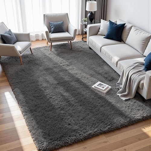
8×10 Area Rugs for Living Room: Ultra Soft Fluffy Shag Grey Rugs for Bedroom, Non-Slip Large Fuzzy Plush Rug Indoor Floor Carpet for Nursery Kids Boys Girls Room, Dorms, Playroom, Modern Home Decor
[Ultra Soft Fluffy Area Rugs for Living Room] 8×10 living room rug treat your feet to cloud-like comfort…
As an affiliate, we earn on qualifying purchases.
As an affiliate, we earn on qualifying purchases.
Conclusion
So, next time you’re feeling adventurous, skip the rainbow and embrace the thrill of black, white, and gray. Who needs color when you can master the art of blending into the shadows or standing out in stark simplicity? After all, life’s too colorful anyway—better to stay safe in your monochrome comfort zone. So go on, be bold in your blandness—because in the world of achromatic hues, you’re never truly boring, just beautifully muted.
![DORESshop LED Night Light, Night Lights Plug Into Wall [2 Pack] with Dusk-to-Dawn Sensor, Dimmable Nightlights, Adjustable Brightness for Bathroom, Hallway, Bedroom,Kids Room,Stairway,Soft White](https://m.media-amazon.com/images/I/31GupTSmkBL._SL500_.jpg)
DORESshop LED Night Light, Night Lights Plug Into Wall [2 Pack] with Dusk-to-Dawn Sensor, Dimmable Nightlights, Adjustable Brightness for Bathroom, Hallway, Bedroom,Kids Room,Stairway,Soft White
AUTO ON/OFF: The decorative night light with special smart light sensor chip will detect the luminance of surrounding…
As an affiliate, we earn on qualifying purchases.
As an affiliate, we earn on qualifying purchases.

Magic Palette Color Mixing Guide 11.5 Inch
Please__contact us to solve the problem w/ name: The Color Wheel 5324CW Magic Palette Personal Mixing Guide New…
As an affiliate, we earn on qualifying purchases.
As an affiliate, we earn on qualifying purchases.