
Addison’s Paradox shows that combining two negatives or dark elements can unexpectedly create a brighter or more vivid color, which challenges your intuition. When dark colors and contrasts are used, your brain interprets them differently, making the foreground seem more luminous. This illusion highlights how contrast and context shape perception rather than just the physical brightness. If you’re curious about how your perception plays tricks on you, there’s more to uncover behind these fascinating visual effects.
Key Takeaways
- Combining negatives or dark elements can enhance perceived brightness due to contrast and context effects.
- Optical illusions demonstrate that adding dark backgrounds can make colors appear more vivid or luminous.
- The brain interprets visual information based on contrast, often making darker surroundings seem brighter.
- Perception of brightness is constructed, not solely determined by physical light levels.
- Addison’s Paradox shows that, under certain conditions, two negatives can create a brighter visual impression.
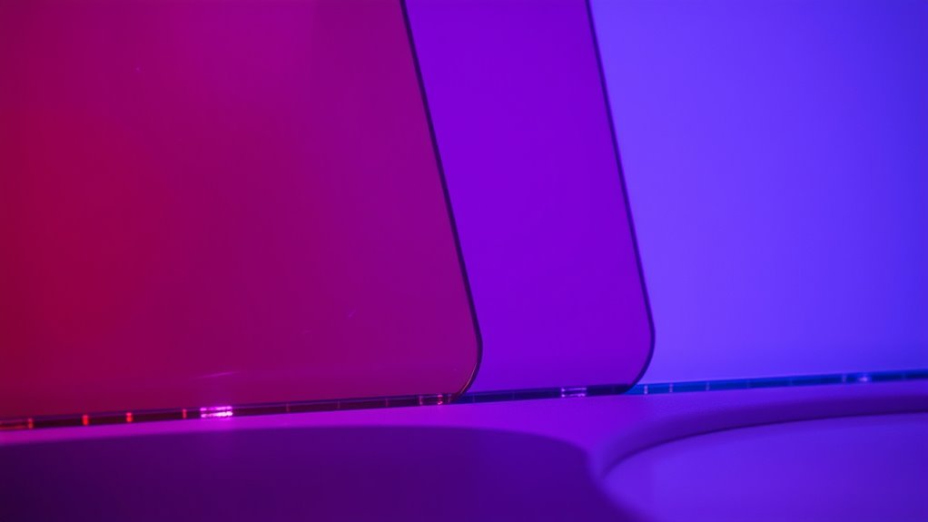
Have you ever wondered how two seemingly opposite ideas can coexist and challenge our understanding of reality? That curiosity leads us into the fascinating world of Addison’s Paradox, a concept that questions how we perceive color and brightness. It’s a mental puzzle where, surprisingly, combining two negatives results in a brighter or more vivid outcome. This idea directly touches on how our brain interprets optical illusions and influences our color perception, often in ways that defy common sense.
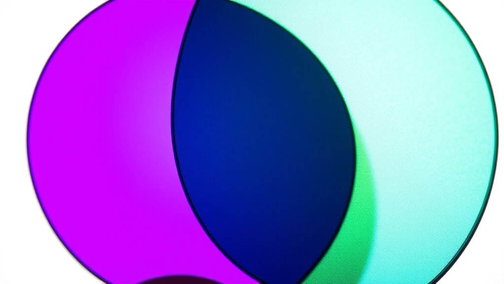
Imagine looking at two dull, dark colors. Intuitively, you’d think mixing them or placing them side by side would produce an even darker result. Yet, in some optical illusions inspired by Addison’s Paradox, adding a darker element can make a color appear brighter or more intense. It’s as if the presence of a negative or dark background enhances the brightness of the foreground color, tricking your eyes and mind into seeing something different from reality. This counterintuitive effect reveals just how flexible and complex our visual system is.
Adding dark colors can make them seem brighter, revealing our visual system’s surprising flexibility and complexity.
Your brain doesn’t simply record what your eyes see; it interprets and sometimes even manipulates visual information to create a coherent picture. Optical illusions that illustrate Addison’s Paradox show how contrast and context can dramatically alter color perception. For example, a gray square may seem to change shade depending on the surrounding colors, and dark borders can make a central color appear more luminous. These illusions demonstrate that our visual system uses relative differences rather than absolute brightness to interpret what it perceives. By doing so, it can produce the surprising phenomenon where two negatives, like dark shades or contrasting backgrounds, result in a brighter appearance.
Understanding this paradox helps you realize that your perception isn’t a perfect reflection of the physical world. Instead, it’s a construct influenced by context, contrast, and the way your brain processes visual cues. When you observe optical illusions inspired by Addison’s Paradox, you’re witnessing firsthand how the mind can turn logical assumptions upside down. It’s a reminder that perception is subjective and that what you see isn’t always what’s truly there. This insight can deepen your appreciation for the complexity of visual processing and inspire you to explore other illusions that challenge your expectations.
In essence, Addison’s Paradox shows that adding negatives or dark elements doesn’t always dim the visual experience; sometimes, it brightens it. This paradox invites you to rethink how contrast and context shape your perception of color and brightness, revealing the astonishing intricacies of your visual system. Understanding the role of visual perception and how our brain interprets contrast can help you better grasp why these illusions work so effectively. It’s a perfect example of how the brain’s interpretation of optical illusions can challenge your assumptions, making you question what’s real and what’s a clever trick of perception.

Celestron StarSense Explorer 150AZ App-Enabled Telescope – 150mm Tabletop Dobsonian with Smartphone Dock & StarSense App – iPhone & Android Compatible – Easy-to-Use for Beginners
SMARTPHONE-POWERED SKY TOUR: No experience needed! Just dock your phone, launch the StarSense Explorer app, and follow the...
As an affiliate, we earn on qualifying purchases.
Frequently Asked Questions
How Does Addison’S Paradox Compare to Other Color Mixing Theories?
You explore how Addison’s Paradox challenges traditional color theory and mixing models. Unlike standard models where combining two negatives dulls or darkens, Addison’s paradox suggests two negatives can create a brighter color. This comparison highlights that some mixing models defy expectations, emphasizing the importance of understanding different color interactions. You see that this paradox adds complexity, encouraging you to rethink classic color theory principles and consider alternative explanations in mixing models.
Can Addison’S Paradox Be Applied to Digital Screens?
It’s interesting how you notice that digital displays often seem brighter with certain negative adjustments. Applying Addison’s Paradox to digital screens involves experimenting with color calibration, where you might combine seemingly opposite tweaks to enhance brightness or color vibrancy. While not a direct scientific principle, this concept suggests that sometimes, adjusting multiple negatives can unexpectedly produce a more vivid result, offering new ways to optimize your display’s visual quality.
What Real-World Applications Utilize Addison’S Paradox?
You might find that Addison’s Paradox influences color therapy and artistic innovation by challenging traditional ideas about colors. In color therapy, combining certain hues can create a more vibrant or calming effect, similar to how two negatives can produce a brighter color. Artists experiment with this paradox to develop new techniques, pushing boundaries and creating eye-catching visuals. This paradox inspires real-world applications that enhance healing methods and inspire creative expression.
Are There Limitations to Achieving Brighter Colors Through Negative Mixing?
You might wonder if negative mixing can truly create brighter colors, but color limitations and perception challenges set boundaries. While combining negatives can sometimes produce vivid hues, it’s not foolproof; factors like display technology, lighting, and individual perception influence outcomes. These limitations mean achieving consistent, brighter colors through negative mixing isn’t always reliable, and you may encounter difficulties in replicating the desired effects across different environments or devices.
How Does Human Perception Influence the Outcomes of Addison’S Paradox?
You see, human perception plays a big role in how you interpret color outcomes. Your visual perception and cognitive biases can cause you to perceive colors differently, sometimes seeing a brighter result than what’s scientifically accurate. This means your brain might interpret mixed negatives as brighter, even if the actual color isn’t. So, your perception influences how you experience color interactions, highlighting the subjective nature of color brightness and the importance of understanding perceptual effects.

Sky-Watcher Classic 200 Dobsonian 8-inch Telescope – Solid-Tube – Simple, Traditional Design – Easy to Use, Perfect for Beginners, White (S11610)
LARGE APERTURE: Get a bright, bold viewing experience at a fraction of other optical designs.
As an affiliate, we earn on qualifying purchases.
Conclusion
So, next time you mix two seemingly dull shades, remember Addison’s Paradox. It’s funny how, by chance, two negatives can create something brighter and more vibrant. Like stumbling upon a hidden gem, these unexpected results remind us that sometimes, the biggest surprises come when least expected. Keep experimenting with your colors—you never know when a simple coincidence might lead to your brightest discovery yet. After all, magic often happens where you least anticipate it.

2Pack Moving Heads dj Lighting 30w Led Moving Head dj Lights for Parties, Mini GOBO Projector Lights for Spotlight Stage Light, Club Dance Spot Light DMX and Sound Activation for Party
Rich color pattern effects: 7 color wheels + white light and 7 gobo wheels + white light, adjustable...
As an affiliate, we earn on qualifying purchases.

YSKE Professional Optical Snoot Attachment - Bowens Mount Spotlight Projector with 35 Metal Gobos, 5 Color Gels & Focus Control | Compatible with Aputure, Godox, Neewer, Profoto LED Video Lights
Full Metal Construction: The spotlight optical snoot is crafted entirely from premium aluminum alloy, ensuring long-lasting durability while...
As an affiliate, we earn on qualifying purchases.