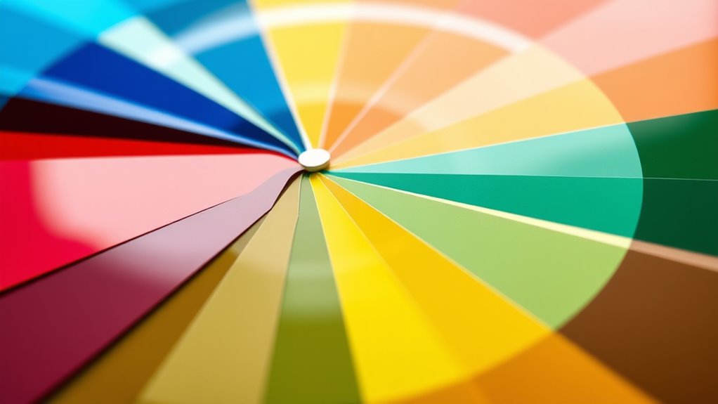

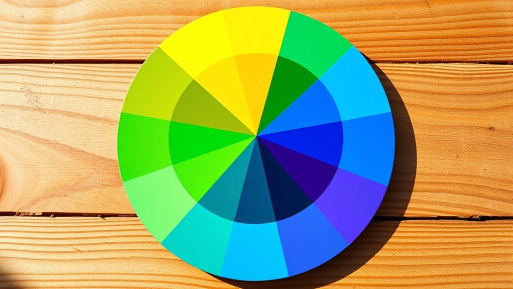
The color wheel helps you understand how colors relate, interact, and create harmony in your artwork. It shows primary colors (red, blue, yellow), secondary colors (orange, green, purple), and their relationships, such as complementary and analogous schemes. Knowing these connections allows you to choose colors that evoke specific moods and create balanced compositions. Mastering the wheel gives you a powerful tool for making visually engaging pictures—exploring more reveals even deeper insights.
Key Takeaways
- The color wheel organizes colors by relationships, showing how primary, secondary, and tertiary colors interact.
- Complementary colors are opposite on the wheel, creating vibrant contrast when paired.
- Analogous colors are adjacent, producing harmonious and cohesive visual effects.
- Understanding color relationships helps in selecting schemes that evoke specific moods or messages.
- Mastery of the color wheel enables precise prediction of color mixing outcomes and enhances artistic expression.
The color wheel is a fundamental tool for artists and designers, helping you understand how colors relate and interact with each other. One of the most essential concepts it teaches is how color mixing works, especially when combining primary colors. Primary colors—red, blue, and yellow—are the foundation of the entire color spectrum. You can’t create these colors by mixing others, but they serve as the building blocks for all other hues. When you blend two primary colors, you produce secondary colors like orange, green, and purple. Recognizing this process is vital because it allows you to predict what colors will emerge when mixing paints or digital colors, giving you control over your palette. Additionally, understanding the concept of color harmony helps you craft visually appealing compositions by selecting colors that work well together. Understanding primary colors also highlights their importance in creating harmony within your artwork. Since these colors are pure and unaltered, they tend to be vibrant and eye-catching. When you use them intentionally, they can serve as focal points or accents. Knowing how primary colors interact through color mixing helps you develop a balanced composition. For example, mixing red and yellow yields orange, a warm and energetic hue, which can evoke feelings of excitement or warmth. Similarly, combining blue and yellow produces green, a color associated with calmness and nature. Being aware of these relationships allows you to create harmonious color schemes that feel cohesive and intentional.
Understanding primary and secondary colors helps predict and control your color mixes for more harmonious artwork.
The color wheel also helps you understand how colors relate through other interactions. Complementary colors, which sit opposite each other on the wheel—like red and green—create vibrant contrasts when paired, making elements stand out. Analogous colors, next to each other on the wheel, such as blue, blue-green, and green, produce harmonious and serene effects. By mastering these relationships, you can craft compositions that are visually engaging and balanced. The color wheel becomes your guide for choosing combinations that evoke specific moods or emphasize certain parts of your work.
In essence, grasping the fundamentals of color mixing and primary colors on the wheel equips you with the tools to make informed choices about color relationships. It empowers you to experiment confidently, whether you’re blending paints or selecting digital hues. The more you understand how colors interact on the wheel, the better you’ll be at creating dynamic, harmonious artwork that communicates your intended message effectively. With this knowledge, you can transform simple color choices into powerful visual statements, elevating your artistic or design projects to new levels of professionalism and impact.

JimKing Creative Color Wheel, Paint Mixing Learning Guide, Art Class Teaching Tool for Makeup Painting Tattoo,Blending Board Chart Color Mixed Guide Hardboard(9.25inch)
Helps organise colours to make choices and combinations easier;Defines common terms and helps the artist to understand colour…
As an affiliate, we earn on qualifying purchases.
As an affiliate, we earn on qualifying purchases.
Frequently Asked Questions
How Do I Create My Own Custom Color Palette?
To create your own custom color palette, start by selecting a base color that resonates with your project. Use color palette creation tools or software to experiment with shades, tints, and tones. Mix complementary, analogous, or triadic colors to develop custom color schemes that suit your style. Adjust brightness and saturation as needed, ensuring your palette expresses the mood you want. Keep refining until your color scheme feels balanced and cohesive.
What Are the Psychological Effects of Different Colors?
Ironically, choosing bold reds might make you feel energized or aggressive, while calming blues can evoke trust or sadness. Color psychology plays a big role in shaping emotional responses, so you should pick your palette wisely. Bright yellows can boost optimism, but too much might cause anxiety. Remember, colors influence feelings more than you think, so use them intentionally to evoke the right mood in your space or design.
How Can I Apply Color Harmonies to Interior Design?
You can apply color harmonies to interior design by using complementary contrast for striking accents, like a bold orange wall with blue accessories, and monochromatic schemes for a calming, cohesive look with varying shades of the same color. Mix these strategies to create visual interest and balance, ensuring your space feels vibrant yet harmonious. Always consider the mood you want to set and choose your color combinations accordingly.
Are There Cultural Differences in Color Perception?
Cultural color symbolism profoundly shapes perception, so yes, there are cultural differences in color perception. You should consider cross-cultural color preferences when designing, as meanings vary—red may symbolize luck in China but danger in the U.S., while white often signifies purity in Western cultures but mourning in some Asian societies. Understanding these cultural cues helps you create culturally conscious, compelling spaces that communicate clearly across diverse audiences.
How Do Digital Screens Affect Color Harmony Choices?
Digital screens impact your color harmony choices because factors like color calibration and screen brightness can alter how colors appear. If your screen isn’t properly calibrated, you might see colors differently than intended, affecting your design decisions. Adjusting screen brightness helps reduce glare and color distortion. Always calibrate your device regularly and consider lighting conditions to make certain your color choices remain consistent and true to your vision.
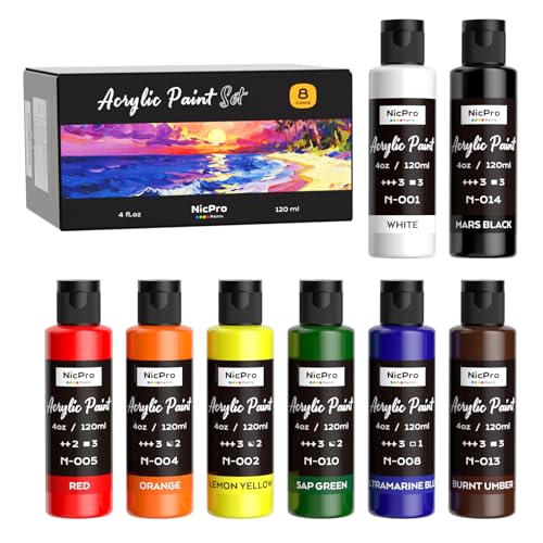
Nicpro 8 Primary Colors Acrylic Paint Set(4 oz, 120 ml), Rich Pigment, Non Toxic Craft Paint for Multi Surface Canvas, Wood, Ceramic, Rock, Fabric, Art Painting Supplies for Beginner & Artist Adult
8 PRIMARY COLORS ACRYLIC PAINT SET – This acrylic paint set contains 8 vibrant primary colors: White, Mars…
As an affiliate, we earn on qualifying purchases.
As an affiliate, we earn on qualifying purchases.
Conclusion
Now that you’ve grasped the color wheel, think of it as a vibrant garden where colors bloom in harmony. Each hue is a flower, perfectly paired and balanced, creating a breathtaking landscape. When you mix and match these colors thoughtfully, you’re painting a masterpiece full of life and emotion. So, let your creativity blossom, using the wheel as your guiding compass through a world of endless, colorful possibilities.
1,500 Color Mixing Recipes for Oil, Acrylic & Watercolor: Achieve precise color when painting landscapes, portraits, still lifes, and more
As an affiliate, we earn on qualifying purchases.
As an affiliate, we earn on qualifying purchases.

Watercolor Mixing Deck: Architecture: Quick Reference Color Palettes to Use at Home or on Location
As an affiliate, we earn on qualifying purchases.
As an affiliate, we earn on qualifying purchases.