
The Helmholtz–Kohlrausch effect shows that as colors become more saturated, they appear brighter, even if their physical light output stays the same. This happens because your visual system interprets high saturation as increased luminosity, making vibrant colors seem more luminous than they actually are. The effect influences how you perceive brightness in everyday life, design, and art. If you’re curious about how this phenomenon impacts your perception, you’ll discover more as you explore further.
Key Takeaways
- The Helmholtz–Kohlrausch effect shows that increased color saturation makes colors appear brighter, regardless of actual luminance.
- Higher saturation enhances perceived brightness, influencing how vivid and luminous a color seems.
- The effect demonstrates that visual perception of brightness is affected more by saturation than physical light levels.
- Understanding this helps in designing visuals and displays that appear more luminous through increased saturation.
- Recognizing the effect prevents misjudging actual light intensity based solely on perceived brightness.

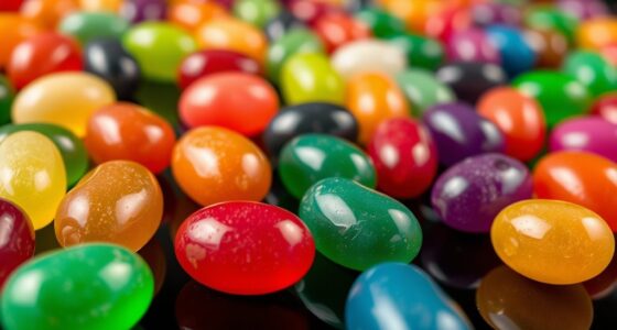
Have you ever noticed that some colors seem to look more vibrant or brighter than others, even when they have the same hue and saturation? This phenomenon is closely tied to what’s known as the Helmholtz–Kohlrausch effect. It reveals that our perception of a color’s brightness isn’t solely determined by the physical properties of the light, but also by how our visual system interprets it. When you look at a bright, saturated color, your eyes don’t just see the wavelength; they also respond to how intensely that color stimulates your retina. This is where color saturation plays a pivotal role. Higher saturation levels tend to amplify the perceived brightness, making colors appear more luminous than their actual luminance values suggest. Fundamentally, the more saturated a color, the more vibrant it seems, regardless of the real amount of light it reflects.
This effect influences your everyday visual experience more than you might realize. For example, a highly saturated red can appear brighter and more eye-catching than a less saturated one, even if both reflect the same amount of light. Your brain interprets the vividness as increased brightness, which is a direct result of the Helmholtz–Kohlrausch effect. It’s important to understand that this isn’t just about aesthetics; it impacts design, advertising, and visual communication. When you choose colors for a website, a logo, or a painting, increasing the saturation can make the colors seem more luminous and appealing, even if their actual brightness remains constant.
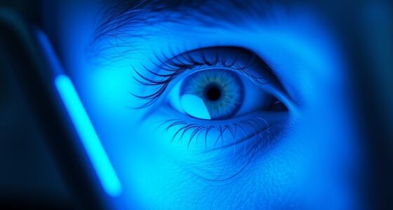
Additionally, understanding the role of color perception can help artists and designers create more impactful visual compositions that leverage perceived brightness to guide viewers’ attention. The effect also explains why bright colors tend to draw more attention. Your perception of visual brightness is heightened by the saturation, making certain hues pop out more against their surroundings. This can be exploited intentionally in visual arts and marketing to grab attention and evoke emotional responses. However, it’s vital to recognize that this perception can be misleading if you’re trying to gauge actual light levels or luminance. The Helmholtz–Kohlrausch effect reminds us that our visual system isn’t always a precise measure of physical reality but is heavily influenced by the interplay of hue, saturation, and perceived brightness.

MyArtscape Oil Paint Set – 24 x 21ml Tubes – Artist Quality – Rich Vivid Oil-based Colors – Lightfast – Heavy Body – Great Saturation – Glossy Finish – Professional Painting Supplies
EXCELLENT COLOR PALETTE OIL PAINT SET: This art set includes 24 vibrant and rich oil paints that deliver…
As an affiliate, we earn on qualifying purchases.
As an affiliate, we earn on qualifying purchases.
Frequently Asked Questions
How Does the Effect Influence Digital Screen Color Calibration?
You need to understand how the Helmholtz–Kohlrausch Effect influences digital screen color calibration. It affects how brightness alters your perception of color saturation and contrast, making some colors seem more vivid or brighter than they truly are. To verify accurate display, you should adjust contrast settings carefully, considering this effect. Proper calibration helps maintain consistent color saturation and contrast, so images look natural and true to life across different devices.
Can the Effect Be Used to Enhance Visual Displays in Advertising?
You can use the Helmholtz–Kohlrausch Effect to boost visual engagement in advertising by enhancing color perception through brightness adjustments. This effect allows you to create more vibrant and eye-catching displays, making your visuals stand out. By leveraging color enhancement, you draw viewers’ attention and improve overall impact. Incorporating this effect thoughtfully can elevate your advertising, making it more memorable and compelling for your audience.
Does the Effect Vary Across Different Lighting Environments?
Imagine a painting shifting with the sunlight — your perception changes. The Helmholtz–Kohlrausch Effect varies across lighting environments because ambient adaptation influences how brightness and color interact. In dim settings, your eyes may interpret colors differently, making the effect more subtle or dramatic. So, yes, your perception of brightness and color shifts depending on the lighting, highlighting how environment shapes what you see and interpret.
Are There Medical or Psychological Impacts Related to Brightness-Induced Color Changes?
You might notice that brightness-induced color changes can affect your mood and contribute to visual fatigue. Bright, vibrant colors can boost your mood, while dull or overly bright environments might cause discomfort or eye strain. These effects can influence your overall well-being, making it important to manage lighting conditions. Recognizing how brightness impacts your perception helps you create a more comfortable space, reducing fatigue and supporting better mood modulation.
How Do Individual Differences Affect Perception of Brightness and Color?
Ever wonder why colors seem to change from person to person? Your perception of brightness and color varies due to perceptual variability and individual sensitivity. These differences mean you might see a color as more vibrant or dull than someone else. Factors like age, eye health, and neural wiring influence your experience. So, your unique visual system shapes how you interpret the brightness and hue around you, creating a personal color world.

Samsung 32-Inch Flat Computer Monitor, 75Hz, Borderless Display, AMD FreeSync, Game Mode, Advanced Eye Care, HDMI and DisplayPort, LS32B304NWNXGO, 2024
ALL-EXPANSIVE VIEW: The three-sided borderless display brings a clean and modern aesthetic to any working environment; In a…
As an affiliate, we earn on qualifying purchases.
As an affiliate, we earn on qualifying purchases.
Conclusion
Just like a painter’s brushstroke can make a simple canvas seem alive, understanding the Helmholtz–Kohlrausch effect reveals how subtle brightness shifts can dramatically change color perception. Imagine walking into a room and noticing how a tiny change in lighting makes a red shirt appear more vibrant—it’s like turning up the volume on color itself. Recognizing this effect helps you see how our perception is shaped by more than just the colors we observe; it’s influenced by light and brightness too.

Color Theory for Artists: Everything you need to know about working with colour
As an affiliate, we earn on qualifying purchases.
As an affiliate, we earn on qualifying purchases.

GBK Tattoo Lighting Lamp Tattoo Work Light Kit with Polarized LED Tattoo Light,Tattoo Vision Glasses,CPL Filter,Adjustable Brightness – Anti Glare for Tattoo Artists, Eyelash Extensions & Nail Art
[PROFESSIONAL POLARIZED LIGHTING SYSTEM] Engineered with 56 high-quality LED beads and a dedicated CPL filter, this lamp delivers…
As an affiliate, we earn on qualifying purchases.
As an affiliate, we earn on qualifying purchases.