The 60‑30‑10 rule is a simple, effective way to balance colors in your interior design, making spaces feel harmonious and vibrant. You use 60% of the dominant color, 30% of a secondary hue, and 10% for accents, creating a natural flow and visual interest. This approach helps you craft cohesive, inviting rooms that reflect your style and mood. If you want to master this technique and elevate your spaces, you’ll find helpful tips and examples ahead.
Key Takeaways
- The 60‑30‑10 rule balances dominant, secondary, and accent colors to create cohesive and visually appealing interiors.
- Using this rule enhances space harmony and prevents overwhelming any one color for a polished look.
- It guides color proportions—60% primary, 30% secondary, 10% accents—ensuring effective contrast and interest.
- Applying the rule thoughtfully influences mood and ambiance, making spaces feel inviting and well-designed.
- Mastering this formula simplifies color selection, elevates interior styles, and promotes aesthetic harmony effortlessly.
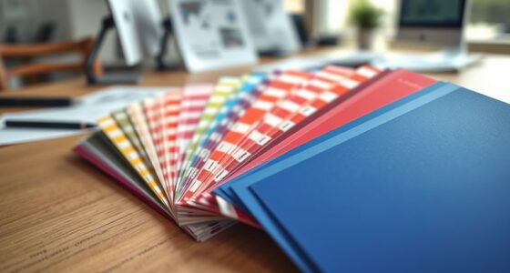
Sherwin Williams Colors collection Deck Complete Paint Colors
As an affiliate, we earn on qualifying purchases.
As an affiliate, we earn on qualifying purchases.
Understanding the Basics of the 60‑30‑10 Rule
The 60-30-10 rule is a simple guideline used to create balanced and visually appealing color schemes in design. It helps you achieve color harmony and guarantees your space feels cohesive. With this rule, you allocate 60% of your room to a dominant color, which sets the overall tone. Then, you add 30% of a secondary color to complement it, adding contrast and interest. Finally, 10% is reserved for an accent color to add pops of vibrancy. This proportionate approach creates visual balance, preventing any one color from overwhelming the others. By following the 60-30-10 rule, you can craft a harmonious color palette that feels natural and well-thought-out, making your interior both inviting and aesthetically pleasing.

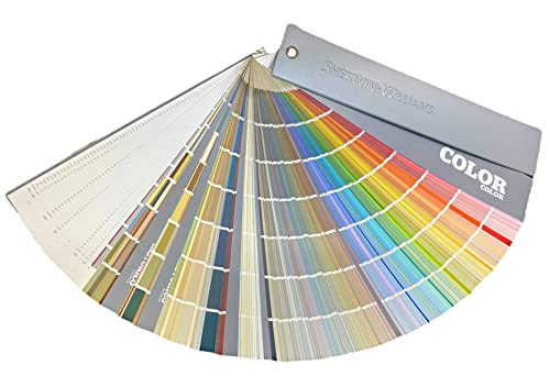
Interior Design Color Wheel Helps You Harmonize Your Interior Design Projects.
manufacturer: Color Wheel
As an affiliate, we earn on qualifying purchases.
As an affiliate, we earn on qualifying purchases.
The Psychology Behind Color Proportions
Colors influence how you feel in a space, shaping your mood and perceptions. When colors are balanced, they create a sense of comfort and harmony that’s easy to relax in. Understanding this psychological effect helps you use proportions intentionally for a more inviting environment.
Emotional Impact of Colors
Since different hues evoke distinct emotional responses, understanding how colors influence mood is essential when applying the 60-30-10 rule. Color psychology reveals that each color carries an emotional resonance that can energize, calm, or inspire. For example, bold reds evoke excitement and passion, while soft blues promote tranquility. When choosing proportions, consider how the dominant color sets the overall mood, with secondary hues enhancing or balancing that feeling. The right color proportions can amplify positive emotions and create a welcoming atmosphere. Recognizing the emotional impact behind color choices helps you craft interiors that not only look appealing but also foster the desired psychological response. Additionally, incorporating vetted color schemes can ensure your palette is both harmonious and emotionally effective. Ultimately, mastering the emotional resonance of colors guarantees your space feels harmonious and inviting.
Balance Creates Comfort
Achieving visual comfort in a space hinges on the careful balance of color proportions, as this directly influences how relaxed or energized a room feels. Color theory guides you in selecting the right mix to create visual harmony, ensuring no single hue overwhelms the senses. When you distribute colors thoughtfully—using a dominant color for 60%, a secondary for 30%, and an accent for 10%—you establish a balanced environment that feels inviting. This proportional approach helps your eye move smoothly across the space, reducing visual stress. By mastering the psychology behind color proportions, you foster a sense of comfort and stability. The right balance not only elevates your interior’s aesthetic but also nurtures emotional well-being, making your space feel just right. Additionally, understanding color psychology can help you choose hues that promote calmness or energy, further enhancing the space’s atmosphere.

Mecatny Set of 4 Velvet Throw Pillow Covers 18×18, Soft Colorful Accent Decorative Couch Pillow Covers for Sofa Living Room, Orange/Yellow
Stylish 4-Color Design: Each set includes four 18×18 pillow covers featuring contrasting edges and sides; The bold yet…
As an affiliate, we earn on qualifying purchases.
As an affiliate, we earn on qualifying purchases.
Choosing the Dominant Color for Your Space
Choosing the dominant color for your space sets the foundation for your entire design. This color influences the overall mood and establishes color harmony, ensuring all elements work seamlessly. To select effectively, consider the atmosphere you want to create—calm, energetic, or sophisticated. Think about how the color interacts with natural light and other hues in your palette. Your goal is to enhance mood and create visual balance. Incorporating self watering plant pots can also add a touch of greenery that complements your chosen color scheme and promotes healthy plants with minimal maintenance.

The Pocket Complete Color Harmony: 1,500 Plus Color Palettes for Designers, Artists, Architects, Makers, and Educators
The Pocket Complete Color Harmony
As an affiliate, we earn on qualifying purchases.
As an affiliate, we earn on qualifying purchases.
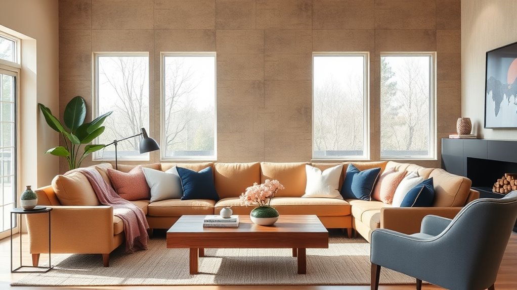
Selecting Complementary Secondary Colors

After selecting your dominant color, the next step is to identify secondary colors that complement it. Focus on achieving color harmony to create a balanced look. Choose colors that are either adjacent or opposite on the color wheel to establish visual contrast, which adds depth and interest. For example, if your dominant color is blue, consider soft oranges or muted yellows as secondary choices. These hues will enhance your space without overwhelming it. Keep in mind that secondary colors should support the primary, maintaining harmony while providing enough contrast to prevent monotony. When selecting, test swatches together to see how they interact in your space’s lighting. This approach assures your color scheme feels cohesive and vibrant, elevating your interior design effortlessly. Incorporating color psychology can also influence the mood and atmosphere of your farmhouse bedroom, making it a cozy and inviting retreat.
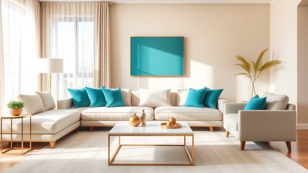
Incorporating Accent Colors for Visual Interest

Incorporating accent colors into your space instantly adds visual interest and personality. By thoughtfully selecting bold or contrasting hues, you create focal points that draw the eye and enhance color harmony. Accent colors should complement your primary palette while providing enough contrast to stand out. Use them sparingly to avoid overpowering the room, but enough to establish depth and dimension. These pops of color add sophistication and keep your space engaging. Paying attention to relationship dynamics can help foster a more harmonious environment, as understanding and communication are key to maintaining a balanced space.
Practical Tips for Applying the Rule in Different Rooms
Applying the 60-30-10 rule varies by room, so start by considering each space’s purpose. In your living room, focus on balancing main furniture colors with accent pieces, while in the kitchen, use bold accents to highlight features. For the bedroom, opt for a calming palette with soothing accents to create a relaxing atmosphere. Incorporating color theory principles can further enhance your design choices and ensure harmonious color combinations.
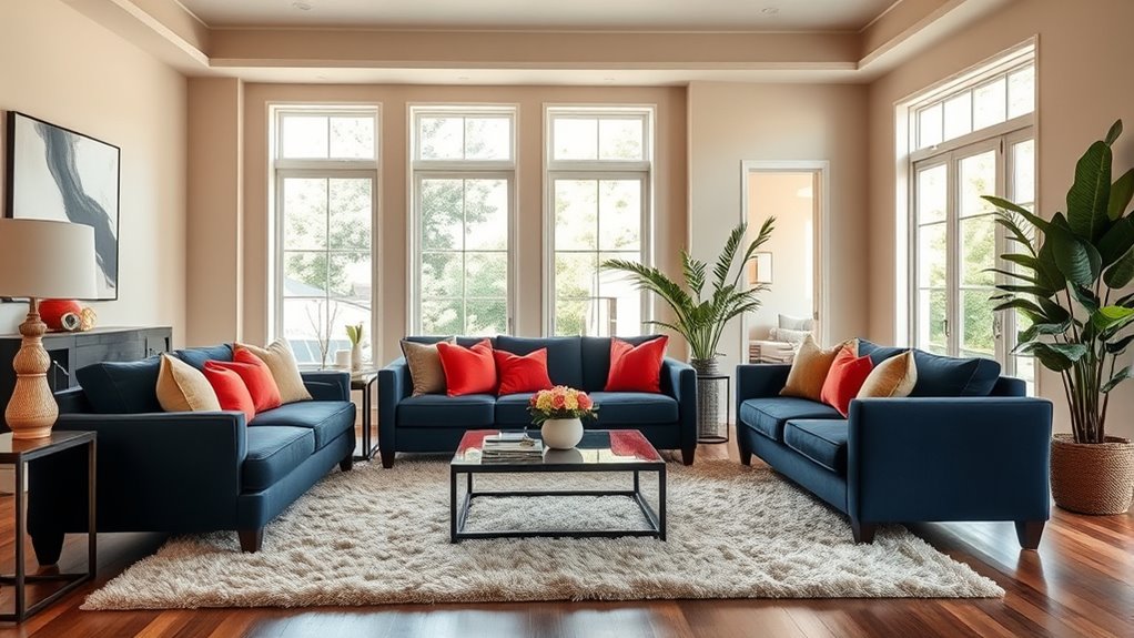
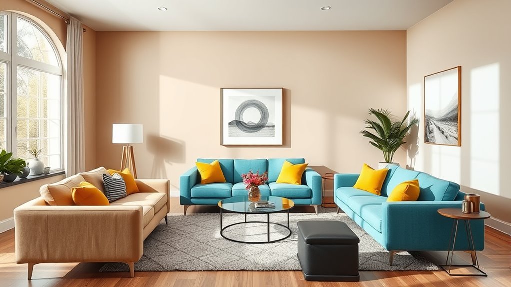
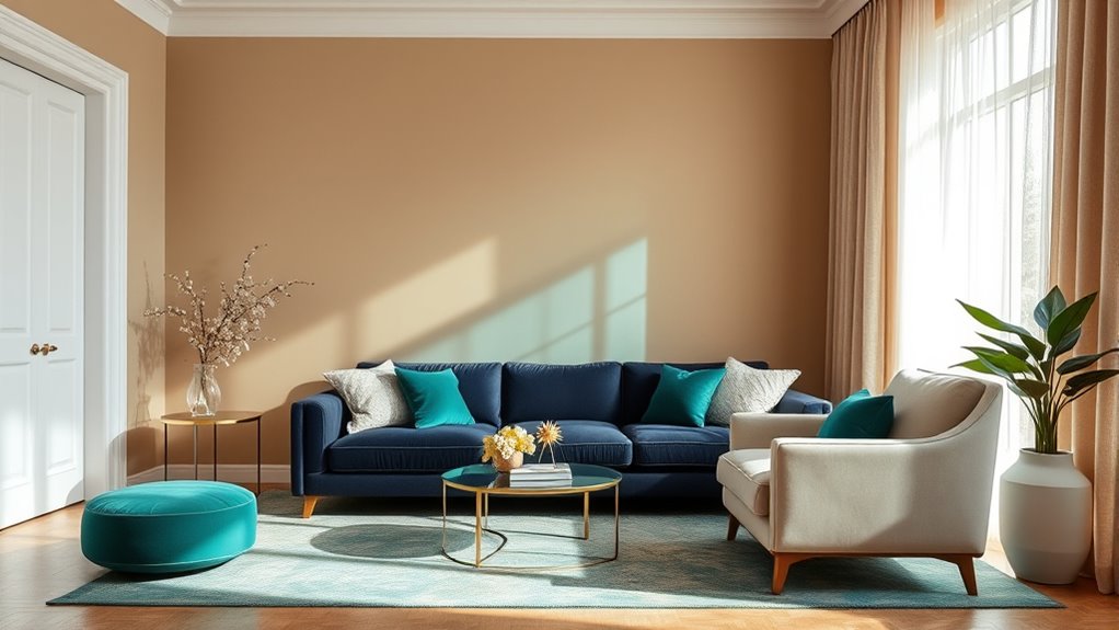
Living Room Color Balance
To create a balanced and inviting living room, focus on using the 60-30-10 rule to distribute colors effectively. This approach guarantees color harmony and enhances visual balance. Use the dominant color for large areas like walls and furniture to set a calm foundation. Incorporate secondary colors through accent chairs, rugs, or artwork to create contrast and interest. Reserve the smallest 10% for bold accents like cushions or decorative objects to add personality without overwhelming the space. Additionally, understanding regulatory compliance can help ensure your interior design choices align with local guidelines and standards.
- Maintain consistency by choosing shades within the same color family for a seamless look
- Use neutral tones to anchor vibrant hues and prevent visual clutter
- Balance warm and cool colors to evoke the desired mood and harmony
Kitchen Accent Tips
Using the 60-30-10 rule in your kitchen can make a big difference in creating a balanced and inviting space. Focus on the dominant color for your walls and cabinets, like a warm neutral, to set a solid foundation. Use the 30% for secondary elements such as countertops or backsplashes, selecting colors that enhance the room’s overall mood through color psychology—calming blues or energizing reds work well. Reserve the 10% for accents like small appliances, decor, or a bold statement piece. These accents add visual interest and contrast, fostering visual harmony. When you thoughtfully apply the rule, your kitchen feels cohesive and dynamic, making it a welcoming place for cooking and gathering. Additionally, incorporating color psychology principles can further enhance the ambiance and mood of your space. This approach guarantees a balanced color distribution that appeals to the senses and promotes harmony.
Bedroom Soothing Palette
In a bedroom, creating a soothing palette means choosing colors that promote relaxation and peace. Using the 60-30-10 rule helps balance these hues for ideal interior harmony. Focus on calming shades for the dominant 60%, like soft blues or gentle greens, which leverage color psychology to reduce stress. The 30% accent can introduce subtle contrast with muted neutrals or warm taupes, adding sophistication without overwhelming. The remaining 10% offers bold touches—think pillows or artwork—that create visual interest. To refine your palette:
- Select a dominant color that fosters tranquility and aligns with your mood.
- Incorporate secondary shades that complement and deepen the overall harmony.
- Use accent pops strategically to elevate the space without disrupting serenity.
- Consider the color psychology of your chosen hues to enhance relaxation and mood.
This approach ensures your bedroom remains a peaceful retreat.
Common Mistakes to Avoid When Using the 60‑30‑10 Formula
One common mistake when applying the 60‑30‑10 rule is misallocating your budget percentages, which can lead to imbalanced interiors and visual chaos. For example, sticking rigidly to monochrome schemes without considering contrast can create a dull, flat look. Similarly, relying solely on seasonal palettes might result in a space that feels out of sync if you don’t adjust colors for the room’s lighting and purpose. Avoid overusing one color or neglecting the importance of the secondary and accent shades. It’s essential to strike a balance and adapt the rule to fit your specific space and style. Properly distributing your color proportions ensures harmony, avoids overwhelming details, and creates a cohesive, inviting environment. Paying attention to visual cues can help you achieve a more balanced and appealing color scheme.
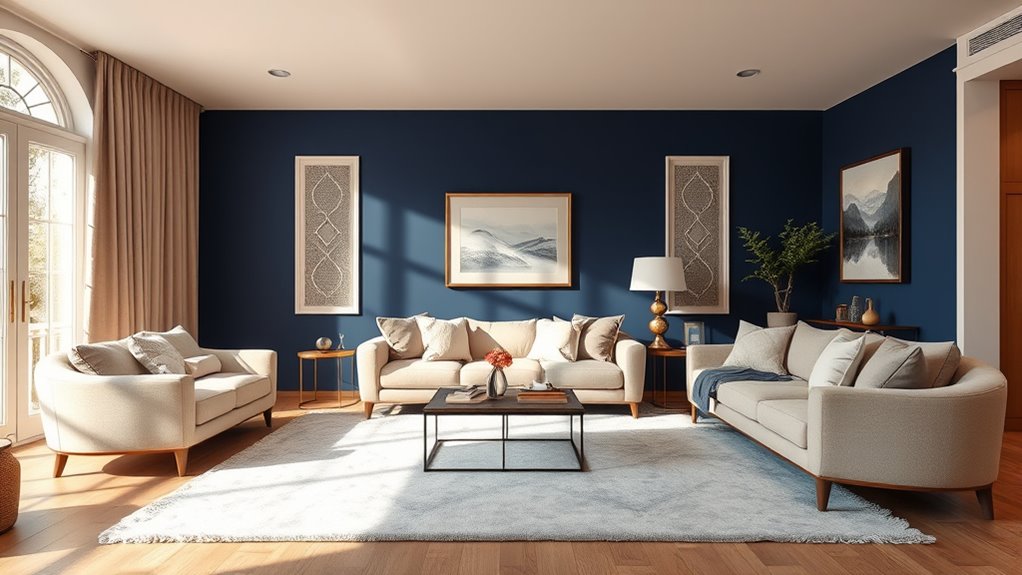
Real-Life Examples of Successful Color Schemes
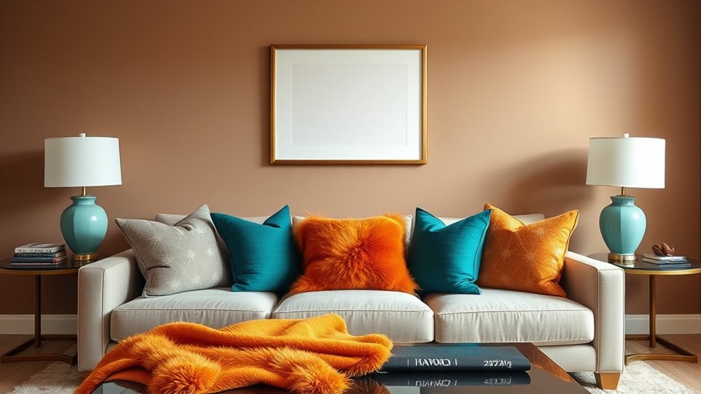
A well-executed color scheme can transform a space into a harmonious sanctuary. Take the example of a modern living room that uses the 60‑30‑10 rule with calming neutrals balanced by vibrant accents. This creates a seamless visual flow and enhances color harmony, making the space inviting. In a bedroom, pairing soft blues with warm beige and subtle gold accents achieves a tranquil yet sophisticated ambiance. A kitchen featuring bold navy cabinets, a light gray backsplash, and sunny yellow accessories exemplifies how the rule fosters balance and visual interest.
- Thoughtful color distribution enhances the overall aesthetic.
- Complementary hues reinforce the sense of harmony.
- Strategic accent use adds depth without disrupting visual flow.
Enhancing Your Interior Design Skills With This Simple Formula
To elevate your interior design skills effortlessly, mastering the 60-30-10 rule offers a practical and effective approach. This simple formula enhances color harmony and establishes a clear visual hierarchy, making your space more appealing. By balancing dominant, secondary, and accent colors, you create a cohesive look that guides the eye naturally. Use the table below to see how proportions work:
| Color Role | Percentage | Example |
|---|---|---|
| Dominant | 60% | Wall colors, large furniture |
| Secondary | 30% | Upholstery, rugs |
| Accent | 10% | Accessories, artwork |
Applying this rule helps you develop a refined eye for color and composition, transforming any room into a stylish, harmonious environment.
Frequently Asked Questions
Can the 60‑30‑10 Rule Be Applied to Small Spaces Effectively?
Yes, you can definitely apply the 60‑30‑10 rule to small spaces effectively. It helps you balance furniture placement and creates a cohesive look. Use the dominant color for larger furniture pieces, the secondary for accents, and the highlight for small details or accessories. Adding texture diversity enhances the space’s depth and prevents it from feeling cramped. This approach makes your small room feel more open, organized, and visually appealing.
How Do Lighting Conditions Affect Color Proportions in This Rule?
Don’t let lighting impact throw off your color balance—it’s a common concern. Natural light tends to enhance true colors, making them appear brighter and more vibrant, while artificial lighting can cast warm or cool tones, shifting your color proportions. To keep your palette consistent, adjust your color choices based on lighting conditions, and consider layered lighting options. This way, your interior remains balanced, no matter the natural or artificial light sources.
Is It Suitable for Both Modern and Traditional Interior Styles?
You might wonder if this color rule fits both modern and traditional styles. The answer is yes, because it promotes color harmony and aesthetic balance across various designs. By adjusting the proportions slightly, you can create a sleek, contemporary look or a timeless, classic feel. Its flexibility makes it a versatile tool to elevate any interior, ensuring your space looks cohesive and visually appealing regardless of your style choice.
Can the Rule Be Adapted for Outdoor or Mixed-Use Spaces?
Imagine your outdoor patio or lively mixed-use space bursting with color, where durability meets versatility. You can adapt the 60-30-10 rule by choosing outdoor-appropriate paints and materials, ensuring durability against weather. For mixed-use areas, blend bold accents with neutral bases to create flexibility and cohesion. This approach lets you elevate both outdoor and multi-purpose spaces, making them vibrant yet resilient, just like your dynamic lifestyle demands.
How Do Personal Color Preferences Influence the Rule’S Application?
Your personal taste and understanding of color psychology play a big role in applying color schemes. While the 60‑30‑10 rule provides a balanced framework, you should tailor it to reflect what makes you feel comfortable and inspired. Trust your preferences, and consider how different colors influence mood and perception. By blending your taste with color psychology insights, you create spaces that truly resonate with your personality.
Conclusion
Don’t worry if it feels overwhelming at first—you’ll get the hang of the 60‑30‑10 rule quickly. Just remember, it’s a flexible guideline, not strict rules etched in stone. Have fun experimenting with colors, and trust your instincts. With a little practice, you’ll create stunning interiors that feel balanced and inviting. So go ahead, embrace the formula, and watch your space transform effortlessly into a stylish haven you love.