When designing with monochromatic palettes, you focus on shades, tints, and tones of a single hue to create a cohesive and elegant space. Use subtle variations in color, texture, and materials to add depth and interest without overwhelming the senses. Good lighting enhances the nuances and makes the design come alive. By balancing these elements, you achieve a calm, sophisticated environment that feels effortless and harmonious—keep exploring to discover how to perfect this timeless approach.
Key Takeaways
- Focus on shades, tints, and tones of a single hue to create depth and visual interest.
- Vary textures and materials to add richness and prevent flatness in the design.
- Use lighting strategically to highlight subtle differences and enhance the monochromatic palette.
- Select a base color that sets the mood and build the design around its variations.
- Maintain consistency across walls, furniture, textiles, and accessories for a cohesive, sophisticated look.
Have you ever wondered how to create a cohesive and harmonious design with just one color? When you focus on a monochromatic palette, you’re leveraging the power of color harmony to produce a unified look that feels intentional and balanced. This approach simplifies your color choices, making it easier to achieve visual simplicity while still creating depth and interest. The key lies in understanding how different shades, tints, and tones of a single hue can work together seamlessly, guiding the eye smoothly across your space or design.
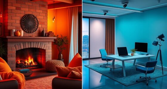
Using a monochromatic palette minimizes the risk of clashing colors or visual chaos. Instead, it allows you to play with variations within one color family, emphasizing subtle differences that add texture and dimension. For example, a room painted in varying shades of blue—from a soft, pale sky to a deep navy—can evoke calmness and sophistication. The contrast between these shades creates visual interest without disturbing the overall harmony. In this way, your design remains clean and uncluttered, maintaining that essential quality of visual simplicity that appeals to the eye.
A monochromatic palette uses subtle shade variations to create calm, balanced, and visually interesting designs.
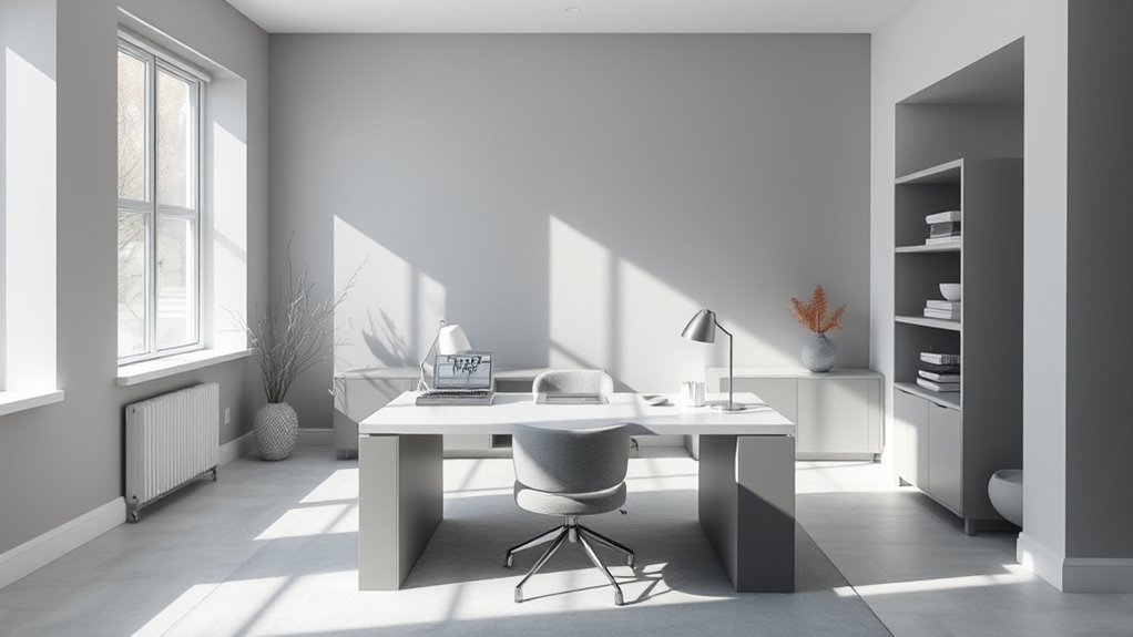
To master this technique, start by choosing your base color carefully—consider the mood or atmosphere you want to evoke. Once you’ve selected your main hue, experiment with different shades and tones. Lighter tints can brighten the space and add a sense of airiness, while darker tones can bring depth and coziness. Incorporate these variations into different elements such as walls, furniture, textiles, or accessories. This consistency ensures a cohesive look, but the subtle differences prevent monotony.
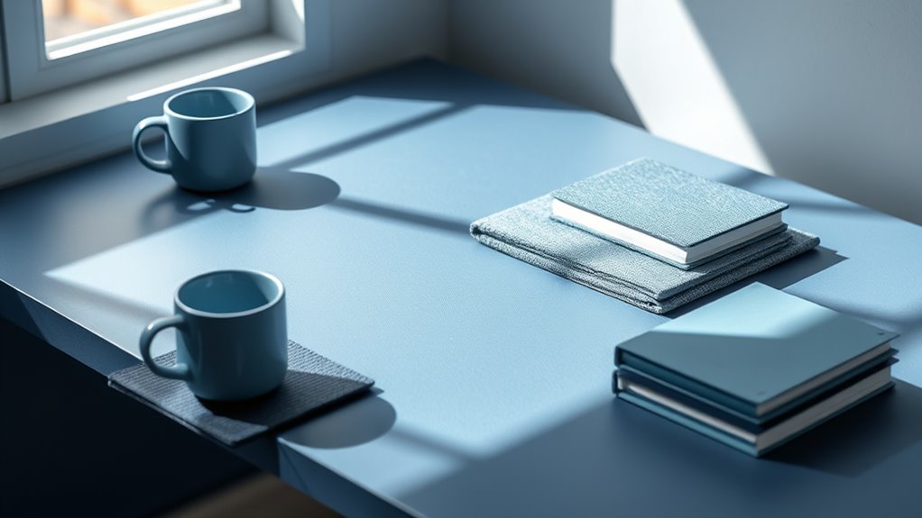
Texture also plays an indispensable role in monochromatic designs. Since the color remains constant, varying textures help create visual interest and prevent the design from feeling flat. Think about mixing matte, glossy, and textured surfaces or layering fabrics with different weaves. These tactile differences add richness and complexity without introducing new colors, preserving the simplicity of your palette. Additionally, incorporating natural materials like wood or linen can further enhance the authenticity and warmth of the space.
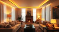
Lighting is another essential factor. Proper lighting can enhance the nuances within your monochromatic scheme, casting shadows and highlights that bring out the subtle variances. Natural light, in particular, can change how shades appear throughout the day, adding a dynamic element to your design. By carefully considering how light interacts with your chosen color, you deepen the sense of harmony and visual cohesion.
In essence, designing with a monochromatic palette is about embracing simplicity while exploring the depths of one color. It’s an elegant way to craft spaces or visuals that feel unified, calm, and sophisticated. With attention to shades, textures, and lighting, you can achieve a balanced composition that’s both visually appealing and effortless to manage.

Celestron - NexStar 127SLT Computerized Telescope - Compact and Portable - Maksutov-Cassegrain Optical Design - SkyAlign Technology - Computerized Hand Control - 127mm Aperture
COMPUTERIZED STAR LOCATING TELESCOPE: The Celestron NexStar 127SLT offers a database of more than 40,000 stars, galaxies, nebulae,...
As an affiliate, we earn on qualifying purchases.
Frequently Asked Questions
How Do I Prevent Monochromatic Designs From Feeling Flat?
To prevent monochromatic designs from feeling flat, you should add depth through contrast by varying shades, tints, and tones within your color palette. Incorporate different textures, patterns, or subtle color shifts to create visual interest. Use contrasting elements like light and dark or matte and glossy finishes to add dimension. These techniques help your design feel dynamic and engaging, avoiding a dull or monotonous appearance.
What Are the Best Tools for Selecting Monochromatic Color Schemes?
You should use tools like Adobe Color, Coolors, or Paletton to select monochromatic color schemes. These tools excel at palette generation and help you explore color harmony, ensuring your palette stays cohesive and appealing. They allow you to experiment with different shades, tints, and tones effortlessly, making it easier to create dynamic monochromatic designs that avoid flatness while maintaining visual interest.
How Can I Incorporate Textures Into Monochromatic Palettes Effectively?
You can incorporate textures into monochromatic palettes effectively by leveraging texture contrast and material layering. Experiment with different surface qualities like matte, gloss, rough, and smooth to add visual interest. Layer materials such as fabric, wood, and metal to create depth and richness. This approach enhances the monochromatic scheme, making your design more engaging and dynamic without overwhelming the cohesive color story.
What Are Common Mistakes to Avoid When Designing With Monochrome?
When designing with monochrome, you should avoid poor color contrast, which can make your design look flat or hard to read. Be mindful of saturation balance; too much saturation can feel overwhelming, while too little can seem dull. Also, steer clear of overusing textures without considering how they interact with shades and contrast. Keep these in mind to create a harmonious, visually engaging monochromatic design.
How Do I Adapt Monochromatic Palettes for Different Moods or Themes?
Imagine a chameleon changing colors to match its surroundings—you can do the same with monochromatic palettes. To adapt for different moods or themes, focus on color psychology; darker shades evoke sophistication or mystery, while lighter hues feel airy and cheerful. Adjust saturation and brightness to intensify or soften the mood. This approach lets you seamlessly shift themes, making your design versatile and emotionally resonant.

Sky-Watcher EQ6-R – Fully Computerized GoTo German Equatorial Telescope Mount – Belt-driven, Motorized, Computerized Hand Controller with 42,900+ Celestial Object Database
PRECISE ACCURATE GOTO: Computerized, motorized GoTo German equatorial telescope mount capable of accurately tracking astronomical objects for both...
As an affiliate, we earn on qualifying purchases.
Conclusion
By choosing a monochromatic palette, you create a cohesive and sophisticated look that’s easy to modify. Did you know that monochromatic schemes can increase visual harmony by up to 60%? This approach simplifies decision-making and ensures your design feels balanced and unified. So next time you’re designing, consider sticking to one color family—it’s a powerful way to make your project stand out while maintaining harmony and elegance effortlessly.
Two-Armed Moving Head Lights with RGBW 4-in-1 Stage Lighting Effect and Starry Effect Controlled by Remote,DMX512,AUTO,Sound-Activated and Master-Slave in DJ Party Concert Church Wedding Theater
【Stunning Integrated Effects】A perfect blend of beam, red-green laser, magic ball, and colorful light strip effects creates an...
As an affiliate, we earn on qualifying purchases.

2PCS 60W LED Moving Head Light Stage Lights with Remote Control 8 GOBO 8 Colors Spotlight by DMX Controlled 11 Channel with Sound Activated for Disco Club Party Stage Lighting Shows
Moving DJ lights new design: All modes of the light can be easily controlled by remote, bring your...
As an affiliate, we earn on qualifying purchases.