Choosing between warm and cool gray tones is your secret weapon to shaping your space’s emotional vibe. Warm grays create cozy, inviting environments that feel grounding, perfect for relaxing rooms. Cool grays, on the other hand, bring a sleek, calm atmosphere, ideal for modern or workspaces. Your choice influences comfort or clarity, so understanding these tones helps you craft the perfect mood. Keep exploring to discover even more ways to make your design truly exceptional.
Key Takeaways
- Warm grays create cozy, inviting atmospheres, ideal for relaxing spaces like bedrooms and living rooms.
- Cool grays promote calm, spaciousness, and modernity, perfect for workspaces and minimalist interiors.
- Choosing between warm and cool gray influences the emotional tone—comfort vs. clarity—of a room.
- Warm grays pair well with wood tones and soft textiles, enhancing a sense of familiarity and ease.
- Cool grays reflect light better, making spaces appear larger and more refined, ideal for contemporary design.

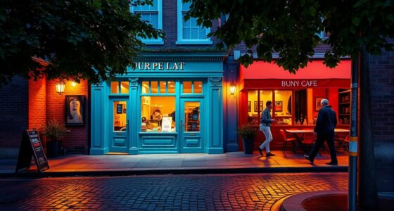
Gray is a versatile neutral, but choosing between warm and cool shades can substantially impact your space’s vibe. The key lies in understanding color temperature and how it influences your emotional response. Warm grays have undertones of beige, taupe, or brown, creating a cozy, inviting atmosphere. They tend to evoke feelings of comfort and relaxation, making them perfect for living rooms, bedrooms, or spaces meant for unwinding. When you select a warm gray, you’re leaning toward a hue that feels grounding and soft, fostering a sense of familiarity and ease. This warmth can subtly make a room feel more intimate, especially when paired with warm lighting and textured fabrics.
Warm gray tones create cozy, inviting spaces that evoke comfort and relaxation.
On the other hand, cool grays carry undertones of blue, green, or violet, producing a sleek, modern vibe. The cool color temperature of these shades often brings a sense of calm and clarity, making them ideal for workspaces, bathrooms, or minimalist interiors. When you choose a cool gray, you’re opting for a tone that can feel crisp and invigorating, helping to create a sense of spaciousness and order. The emotional response to cool gray is often one of alertness and focus, which is why it’s popular in contemporary designs. It pairs beautifully with cooler palettes or metallic accents, enhancing the feeling of sophistication and cleanliness.
Your choice between warm and cool gray ultimately depends on the ambiance you want to cultivate. Warm grays tend to make a space more inviting, fostering a cozy environment that encourages relaxation. They work well with wood tones, warm metals, and soft textiles to amplify their comforting effect. Conversely, cool grays can make your space feel more open and refined, especially when combined with white, black, or metal finishes. They tend to reflect light well, making rooms appear larger and more airy. The emotional response you aim for should guide your decision—whether it’s comfort and intimacy or calm and clarity.
Understanding the influence of color temperature on emotional response helps you tailor your space to suit your mood and purpose. Additionally, attention is crucial in creating intentional design choices that enhance the desired atmosphere. Warm and cool grays aren’t just color choices; they’re tools to shape how a room feels and how you experience it. When you pick the right shade, you’re not just decorating—you’re crafting an environment that resonates with your desired emotional tone. Recognizing the subtle differences gives you a designer’s secret weapon to transform any space into exactly what you envision.
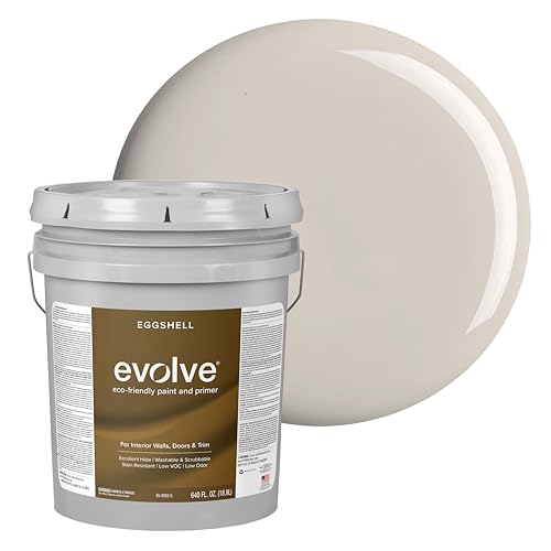
EVOLVE Interior Paint & Primer, Eggshell (Warm Gray), 5 Gallon – One-Coat Coverage, Excellent Hide, Low VOC, Low Odor, Washable Paint for Walls, Doors & Trim
PAINT + PRIMER IN ONE: Evolve’s paint-and-primer formula helps you get great coverage from the start, sealing your…
As an affiliate, we earn on qualifying purchases.
As an affiliate, we earn on qualifying purchases.
Frequently Asked Questions
How Do I Determine if a Gray Is Warm or Cool?
To determine if a gray is warm or cool, focus on its shade temperature and undertone identification. Hold the gray next to known warm or cool colors—like a warm beige or cool blue—to see how it interacts. Warm grays often have hints of beige or brown, while cool grays lean toward blue or green undertones. Trust your eye and compare side-by-side for the best assessment.
Can Warm and Cool Grays Be Used Together Effectively?
Think of warm and cool grays as dance partners in a color mixing ballet. When paired thoughtfully, they create harmony, balancing contrasts like yin and yang. Using paint formulas that blend warm and cool tones allows you to craft a nuanced palette, adding depth and sophistication. Yes, they can work together effectively—just like a well-choreographed duet—if you understand how to balance their undertones and embrace their unique personalities.
What Lighting Conditions Influence Gray Color Perception?
Lighting conditions markedly influence how you perceive gray colors. When lighting temperature is warm, like incandescent bulbs, grays may appear softer or warmer. Cool lighting, such as daylight or LED lights, enhances the gray’s cool undertones, making them appear crisper. Sunlight impact varies throughout the day; in the morning or late afternoon, it’s warmer, while midday sunlight is cooler. Understanding these factors helps you choose the right gray for your space.
Are There Popular Brands Known for High-Quality Warm or Cool Grays?
Did you know that over 60% of designers prefer certain paint brands for their reliable color palettes? When choosing warm or cool grays, brands like Benjamin Moore, Sherwin-Williams, and Farrow & Ball stand out for their high-quality options. These brands offer precise shades that help you attain the perfect ambiance. Exploring their collections guarantees you find the ideal gray to match your vision, whether warm or cool.
How Do Warm and Cool Grays Affect Room Ambiance?
You might notice that warm grays create a cozy, inviting atmosphere, while cool grays evoke calmness and sophistication. Color psychology shows that warm tones can boost comfort and friendliness, whereas cool tones promote serenity and focus. Your choice impacts the emotional impact of a room, influencing how you feel in it. By understanding these effects, you can select the gray shade that best supports your desired ambiance and mood.

CozyLux Queen Comforter Set Dark Grey – Bed in a Bag Queen Size 7 Pieces, Luxury Soft Bed Set for All Seasons, Bedding Set with Comforter, Sheets, Pillowcases & Shams, Dark Gray, Queen
SOFT & BREATHABLE FABRIC FOR ALL-DAY COZY SLEEP:This queen comforter set features premium breathable, sweat-absorbent microfiber fabric and…
As an affiliate, we earn on qualifying purchases.
As an affiliate, we earn on qualifying purchases.
Conclusion
Now that you know the secret difference between warm and cool gray, you hold the key to transforming any space. Think of warm gray as a cozy hug, wrapping your room in comforting embrace, while cool gray acts as a crisp breeze, invigorating and modern. With this knowledge, you’re wielding a painter’s brush, ready to craft a masterpiece that whispers your personality. Embrace the gray, and let your design dreams come alive like a vivid sunrise.

MIULEE Pack of 2 Decorative Throw Pillow Covers Soft Thick Solid Textured Chenille Throw Pillows Neutral Farmhouse Modern Home Decor for Couch Sofa Bedroom Living Room 20×20 Inch,Charcoal Gray
Durable Fabric: Made of solid thick durable chenille, Which combines the softness and cozy of chenille with the…
As an affiliate, we earn on qualifying purchases.
As an affiliate, we earn on qualifying purchases.

8×10 Area Rugs Washable Rug: Anti-Skid Abstract Modern Living Room Rug Soft Thin Carpets Indoor Floor Non-Shedding Carpet for Bedroom Dining Farmhouse Nursery Home Office (White Gray, 8'x10')
Experience Unmatched Comfort – Ultra-Soft Low Pile Rug: The Crority living room rugs 8×10 combines durability with a…
As an affiliate, we earn on qualifying purchases.
As an affiliate, we earn on qualifying purchases.