In art history, chromophobia refers to the fear or avoidance of using vibrant colors, often linked to notions of purity, morality, or spiritual restraint, while chromophilia signifies a strong love or fascination with bright, intense hues. These attitudes reflect societal values, cultural beliefs, and artistic preferences over time. Understanding their influence helps you see how artists expressed or suppressed emotion, status, or morality through color choices. Continue exploring to uncover how these contrasting views shaped artistic movements and masterpieces.
Key Takeaways
- Chromophobia refers to the fear or avoidance of vibrant colors, often linked to cultural taboos or social norms in art history.
- Chromophilia denotes an attraction or preference for vivid, intense colors, reflecting periods of artistic experimentation and emotional expression.
- Historically, chromophobia influenced the use of color, leading to subdued palettes or symbolic restrictions in certain eras and contexts.
- Chromophilia emerged alongside movements embracing bold color, such as Impressionism and Fauvism, emphasizing emotional and sensory impact.
- The interplay of chromophobia and chromophilia reveals shifts in societal attitudes toward color, symbolism, and artistic innovation.
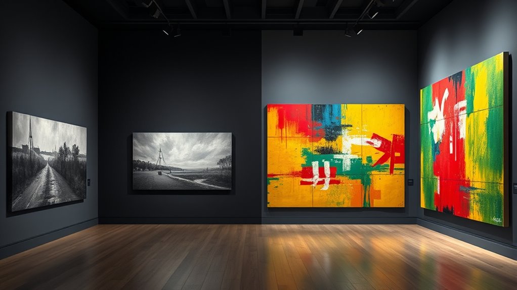
Throughout art history, colors have served as powerful symbols that reveal societal attitudes and aesthetic preferences. When you examine artworks, you’ll notice that colors aren’t just decorative; they carry deep meanings rooted in cultural symbolism and emotional impact. The symbolism of color guides your understanding of a piece’s message, while the psychological effects of hue influence your emotional response. For example, red can evoke passion, anger, or energy, depending on the context, while blue often signifies calmness, spirituality, or melancholy. Recognizing these associations allows you to interpret an artist’s intent and the emotional tone they aim to convey.
Colors in art symbolize societal values and emotional states, shaping your understanding of a work’s message and mood.
As you explore the history of art, you’ll see that certain colors have been favored or avoided based on societal norms and beliefs. During the Middle Ages, for instance, the color purple was reserved for royalty and divine figures, symbolizing power and spiritual authority. Conversely, the use of bright, vivid colors like yellow or orange became associated with joy and vibrancy, but only in specific cultural contexts. This interplay between the symbolism of color and societal attitudes reveals how artists and patrons manipulated color palettes to communicate status, morality, or religious devotion. The psychological effects of hue also played a role; artists used color to manipulate viewers’ emotions, creating works that could inspire awe, evoke sorrow, or instill hope.
You’ll also notice that the perception of color has shifted over time, influenced by advances in science and changes in aesthetic preferences. For example, in the Renaissance, artists started experimenting with brighter, more naturalistic hues, aiming to evoke realism and human emotion. Meanwhile, in the 19th century, the advent of new pigments expanded the palette, allowing artists to explore a broader range of psychological effects. The symbolism of color became more nuanced, reflecting complex social and political themes. Understanding how specific hues evoke psychological responses helps you appreciate why artists chose certain colors for particular themes or characters. A dark, muted palette might evoke somberness or introspection, while vibrant reds and yellows can energize a scene. Additionally, the development of new pigments expanded artists’ options and influenced the psychological impact of their work.
Ultimately, your engagement with color in art hinges on recognizing its layered meanings—both societal and psychological. Colors are more than visual elements; they’re tools of expression that reveal societal values and influence your emotional experience. By paying attention to the symbolism of color and the psychological effects of hue, you gain a deeper insight into the complex dialogue between artists, their cultural contexts, and viewers like you. This awareness enriches your appreciation of art, helping you see how color choices shape the stories and emotions conveyed across different periods and styles.

JimKing Creative Color Wheel, Paint Mixing Learning Guide, Art Class Teaching Tool for Makeup Painting Tattoo,Blending Board Chart Color Mixed Guide Hardboard(9.25inch)
Helps organise colours to make choices and combinations easier;Defines common terms and helps the artist to understand colour…
As an affiliate, we earn on qualifying purchases.
As an affiliate, we earn on qualifying purchases.
Frequently Asked Questions
How Did Chromophobia Influence Art Movements Across Different Cultures?
You see that chromophobia shapes art movements by reinforcing cultural taboos around bold colors, often associating them with chaos or moral danger. This influences artists to avoid certain hues or use them cautiously, especially in political symbolism where color choices carry deep meanings. Across cultures, chromophobia can suppress vibrant expression or inspire subtle, muted palettes, reflecting societal fears or moral values that restrict artistic freedom and shape creative choices.
What Psychological Factors Contributed to Chromophilia in Artists?
You’re drawn to chromophilia because of your color preference and emotional symbolism. Artists often develop a love for vibrant hues due to positive associations, personal experiences, or cultural influences that evoke feelings of joy, passion, or hope. These psychological factors deepen your connection to color, inspiring you to explore bold palettes and express emotion vividly through your art, reflecting an innate desire to communicate powerful, uplifting messages visually.
Are There Modern Examples of Chromophobia Affecting Contemporary Art?
Yes, chromophobia still influences contemporary art, especially through digital colorism and aesthetic minimalism. You might notice artists deliberately limit color palettes to evoke subtle emotion or focus on form, avoiding vibrant hues that could be overwhelming. This modern chromophobia reflects a desire for restraint and clarity, contrasting with more colorful traditions. It’s a way artists express sophistication or challenge viewers to find meaning beyond bold, chromophilic expressions.
How Did Religious Beliefs Shape Color Preferences in Historical Art?
You might find that religious beliefs deeply influenced color preferences in history. Religious symbolism often dictated which colors were sacred or taboo, shaping artists’ choices. For example, white symbolized purity, while black carried somber connotations. Cultural taboos also restricted certain hues, affecting artwork. This interplay of faith and societal norms guided artists, ensuring that colors conveyed spiritual meaning and adhered to religious and cultural expectations across different eras.
What Role Did Trade and Access to Pigments Play in Color Choices?
You see that trade and access to dyes greatly influenced color choices in art. The pigment trade, especially for rare and vibrant pigments like ultramarine and crimson, determined what colors artists could use. When access to dyes was limited or expensive, artists often prioritized certain hues, shaping artistic styles and symbolic meanings. Your understanding of how trade routes and pigment availability shaped color palettes reveals their essential role in art history.
JimKing Creative Color Wheel, Paint Mixing Learning Guide, Art Class Teaching Tool for Makeup Painting Tattoo,Blending Board Chart Color Mixed Guide Hardboard(9.25inch)
Helps organise colours to make choices and combinations easier;Defines common terms and helps the artist to understand colour…
As an affiliate, we earn on qualifying purchases.
As an affiliate, we earn on qualifying purchases.
Conclusion
Understanding chromophobia and chromophilia reveals how color preferences shape art history, influencing artists’ choices and viewers’ perceptions. Did you know that during the Renaissance, only about 10% of paintings used vivid colors, reflecting a preference for subdued tones? Recognizing these trends helps you see beyond the surface, appreciating how societal attitudes towards color impact artistic expression. As you explore further, you’ll notice these color philosophies continue to influence contemporary art and design choices.

Art: The Definitive Visual Guide (DK Definitive Cultural Histories)
As an affiliate, we earn on qualifying purchases.
As an affiliate, we earn on qualifying purchases.

55PCS Acrylic Paint Set of 36 Colors 2fl oz 60ml Bottles 12 Brushes,Non Toxic 36 Colors Acrylic Paint No Fading Rich Pigment for Kids Adults Artists Canvas Crafts Wood Painting
🎨Safety guarantee & High quality- Made of premium paint material, conforming to ASTM D-4236 and EN71 standards,HissiCo acrylic…
As an affiliate, we earn on qualifying purchases.
As an affiliate, we earn on qualifying purchases.