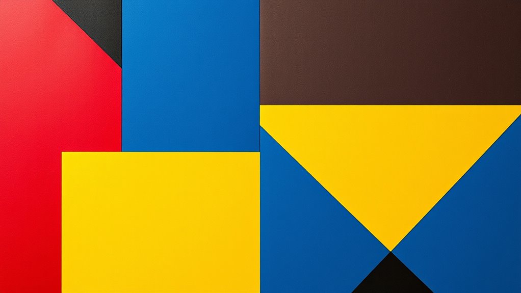
Bauhaus masters challenged traditional color norms by experimenting with bold, pure hues and unexpected combinations, free from symbolic constraints. They broke rules by mixing vibrant reds with cool blues or bright yellows with deep blacks, creating striking contrasts. Their rebellious spirit pushed artistic boundaries, proving that breaking conventions can lead to powerful, timeless designs. This innovative approach still influences modern aesthetics, and exploring their techniques can inspire your own creative projects.
Key Takeaways
- Bauhaus masters challenged traditional color symbolism by experimenting with bold, pure hues focused on visual impact and harmony.
- They combined unexpected colors like vibrant reds with cool blues to create striking contrasts and energetic designs.
- Rejecting conventional norms, they prioritized form and color relationships over cultural or symbolic meanings.
- Their fearless color experiments influenced modern design, emphasizing emotion, clarity, and visual harmony.
- This rebellious approach remains effective today, inspiring innovative, minimalistic, and expressive visual solutions.
Challenging Traditional Color Norms in Bauhaus
While traditional color norms relied on realistic and symbolic uses, Bauhaus masters actively challenged these conventions by experimenting with bold, pure hues. They questioned established ideas of color theory, which often linked specific colors to emotional or symbolic meanings. Instead, they explored how color could be used for visual impact and harmony, disregarding cultural symbolism that dictated conventional palettes. By employing vibrant, unmixed colors, they pushed boundaries and created striking contrasts that captured attention. The Bauhaus approach emphasized functional design over tradition, encouraging artists and designers to think freely about color’s role in shaping perception. Their innovative use of color contrast, which involved manipulating the relationships between hues, further transformed how we comprehend color, opening the door for new and expressive combinations and a more experimental aesthetic.
Bold Color Choices and Unexpected Combinations
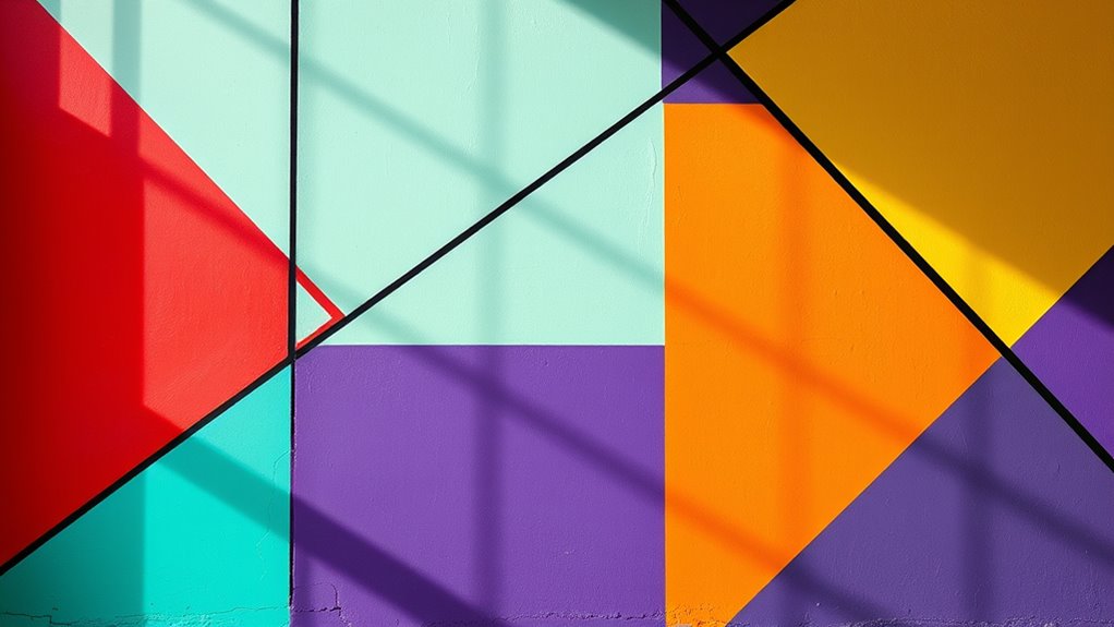
Bauhaus masters broke away from conventional color schemes by making bold choices and combining unexpected hues. They experimented with striking color contrast to create visual impact, often pairing vibrant reds with cool blues or bright yellows with deep blacks. These daring combinations defied traditional harmony, yet achieved a compelling sense of visual harmony through careful balance. They understood that contrasting colors could energize a design and draw viewers’ attention without overwhelming the senses. By intentionally mixing unexpected colors, they challenged norms and showcased how boldness could elevate simplicity into expressive art. This approach not only broke rules but also proved that, with intentional contrast, even unconventional combinations can work harmoniously to produce dynamic, memorable visuals. Incorporating concepts like visual harmony helps to clarify how such bold choices can still achieve a cohesive aesthetic.
The Rebellious Spirit: Breaking Artistic Conventions
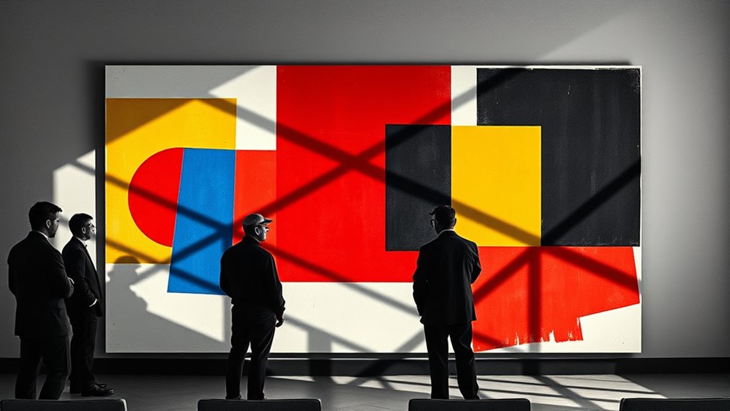
The Bauhaus masters embraced a rebellious spirit that challenged artistic conventions and reshaped design principles. They questioned traditional ideas of color symbolism, refusing to adhere to rigid meanings assigned to hues. Instead, they experimented boldly, blending colors regardless of cultural influences or established norms. This defiance was rooted in their belief that art should serve functional purposes, not follow outdated aesthetic rules. By breaking conventions, they opened new possibilities for visual expression, emphasizing form and color relationships over symbolic constraints. This spirit of defiance became a hallmark of Bauhaus design, proving that breaking rules can lead to groundbreaking and enduring artistic achievements. Additionally, their approach challenged established norms, encouraging innovation and bold experimentation in art and design.
Timeless Impact of Bauhaus Color Experiments

The bold color experiments initiated by Bauhaus masters have left an indelible mark on modern design, proving their lasting influence across generations. Their innovative use of color challenged traditional norms and tapped into color psychology to evoke specific emotions and responses. You can see how this approach still shapes contemporary aesthetics, as designers leverage color to communicate meaning and create visual harmony. Understanding the historical context highlights how Bauhaus masters broke rules not just for rebellion but to explore new possibilities in perception and function. Their experiments proved that color could be both functional and expressive, transcending time. For example, their work often incorporated color theory principles to achieve desired visual effects and emotional responses. This enduring impact continues to inspire modern design, making Bauhaus’s color choices not just revolutionary but timeless in their relevance.
Lessons From Bauhaus for Modern Design
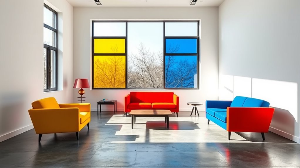
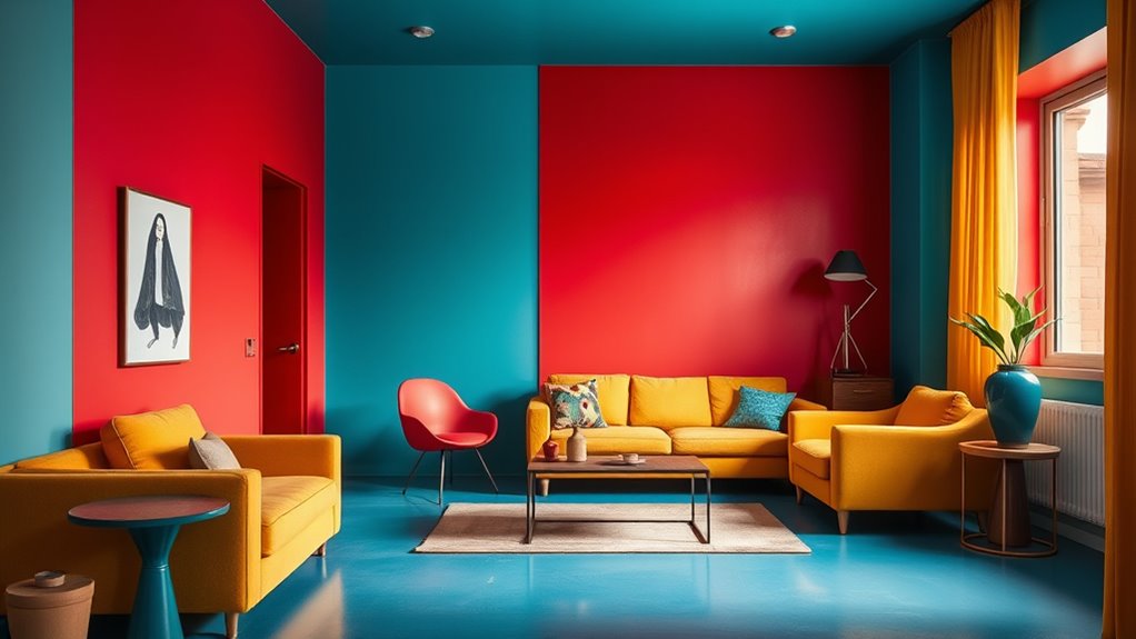
Learning from Bauhaus means embracing simplicity and functionality in your designs. In interior design, this approach encourages clean lines, minimal clutter, and a focus on essential elements that maximize space and usability. By applying Bauhaus principles, you create environments that feel open and purposeful, resonating with modern tastes. When developing branding strategies, consider bold, uncomplicated visuals that communicate your message clearly without unnecessary embellishments. Bauhaus teaches you to experiment with color and form, breaking traditional rules to develop distinctive identities. The movement’s emphasis on visual harmony shows that balancing elements can lead to more effective and appealing designs. The key lesson is that less is often more—prioritizing clarity, efficiency, and purpose. Modern design benefits from these lessons by fostering innovative, visually striking, yet straightforward solutions that appeal to contemporary audiences.
Frequently Asked Questions
How Did Bauhaus Masters Select Their Unconventional Color Palettes?
You see, Bauhaus masters chose their unconventional color palettes by experimenting with color theory and focusing on visual harmony. They often used bold, contrasting colors to create striking effects, trusting that their understanding of color relationships would produce balance. This approach allowed them to break traditional rules, making their designs vibrant and dynamic while maintaining a cohesive look that still resonates today.
What Psychological Effects Did Bauhaus Color Combinations Aim to Evoke?
Imagine colors as emotional sparks, igniting feelings in your mind. Bauhaus masters carefully chose their palettes to harness color psychology, creating an emotional impact that energizes or calms viewers. They aimed to evoke clarity, innovation, or harmony through bold, unconventional combinations. This strategic use of color influences your perception and mood, proving that their daring choices still resonate today by tapping into universal emotional responses.
Did Bauhaus’s Color Experimentation Influence Other Art Movements?
Your curiosity about Bauhaus’s influence on other art movements highlights their role in artistic innovation. Their experimental approach to color theory challenged conventions, inspiring movements like De Stijl and Constructivism. You see how their bold use of color broke traditional rules, proving that innovation in color can evoke new emotional responses. This legacy shows that Bauhaus’s daring spirit continues to shape modern art, emphasizing the power of creative experimentation.
How Have Bauhaus Color Techniques Evolved in Contemporary Design?
Imagine a palette that keeps evolving—today’s design embraces Bauhaus’s bold spirit. You see, contemporary designers tweak color theory, blending vibrant hues with subtle shades to create visual harmony that catches the eye. They use digital tools to experiment freely, making color more dynamic and accessible. This evolution keeps Bauhaus’s revolutionary approach alive, proving that breaking rules with color can still inspire fresh, compelling visuals that resonate today.
Can Bauhaus Color Principles Be Adapted for Digital and Multimedia Art?
You can definitely adapt Bauhaus color principles for digital and multimedia art. Embrace bold, contrasting colors to create striking visuals, and use digital tools for precise color control and experimentation. Incorporate multimedia integration by combining vibrant palettes with interactive elements, dynamic animations, and layered compositions. This approach keeps Bauhaus’s emphasis on simplicity and functionality alive while leveraging modern technology to enhance visual impact and audience engagement.
Conclusion
By embracing bold color choices and defying conventions, you can create designs that captivate and inspire. Think of a modern office space that uses unexpected color combinations—like vibrant teal with warm orange—to energize the environment. Just like Bauhaus masters broke traditional rules to forge timeless art, your willingness to experiment with color can lead to innovative, memorable results. Don’t be afraid to challenge norms; your boldness can transform ordinary into extraordinary.