
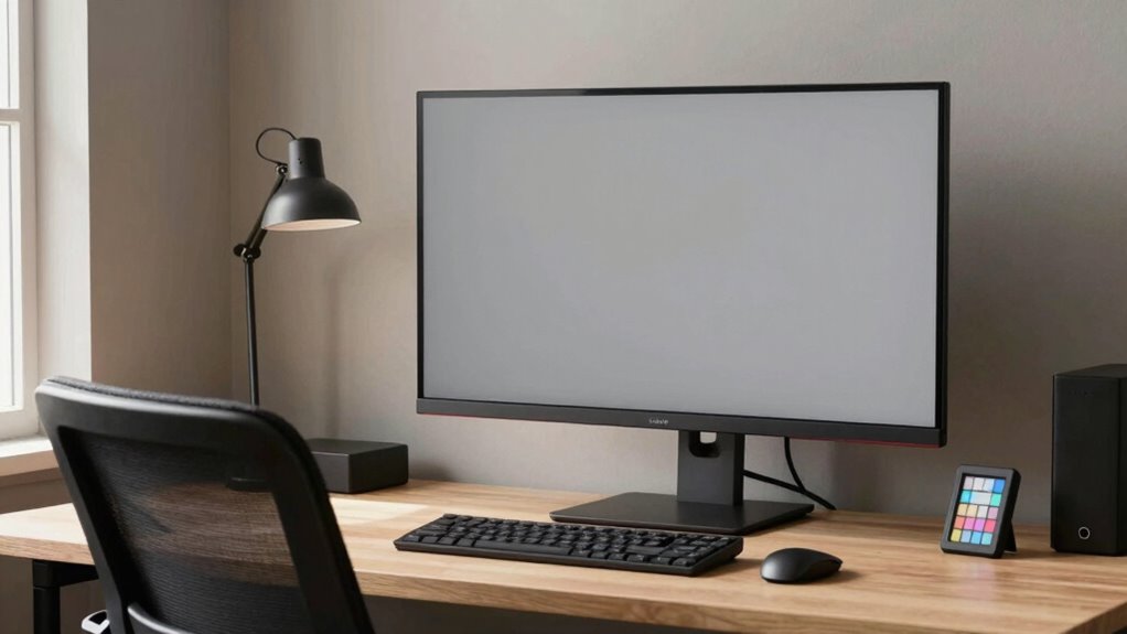
To set up a color-critical workspace, start by ensuring your lighting has a color temperature between 5000K and 6500K to mimic daylight. Choose neutral, matte wall colors like soft gray or beige to prevent color bias. Position diffuse, ambient lighting to reduce glare, and add task lighting on your workspace. Regularly calibrate your environment with tools like gray cards. If you keep these tips in mind, you’ll create a stable, accurate color environment—more helpful details are just ahead.
Key Takeaways
- Ensure lighting has a neutral color temperature (5000K–6500K) to accurately render colors.
- Use matte, neutral-colored walls to prevent color casts and reflections.
- Position diffuse overhead lighting and task lights to minimize glare and shadows.
- Calibrate room environment with gray cards and adjust wall and lighting surfaces for consistency.
- Regularly reassess and modify lighting and wall conditions to maintain a stable, accurate color workspace.

dalattin 24 Pack LED Bulbs Daylight White 5000K, 60 Watt Equivalent A19 Standard Bulbs, E26 Base, 800 LM, Efficient 9W Energy Saving, Non-Dimmable, 80+ CRI, 120V, UL Listed, for Living Room, Office
【Efficiency Meets Comfort】 Dalattin's A19 engergy saving LED bulbs replace 60W incandescents with just 9W while delivering full…
As an affiliate, we earn on qualifying purchases.
As an affiliate, we earn on qualifying purchases.
Evaluate Your Room’s Lighting and Wall Colors for Accurate Color Perception
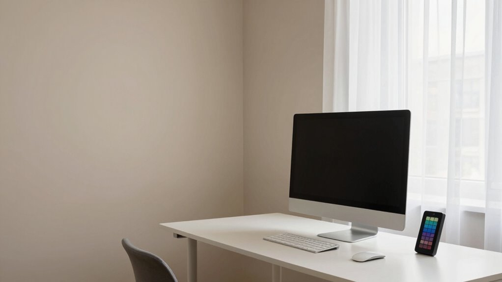
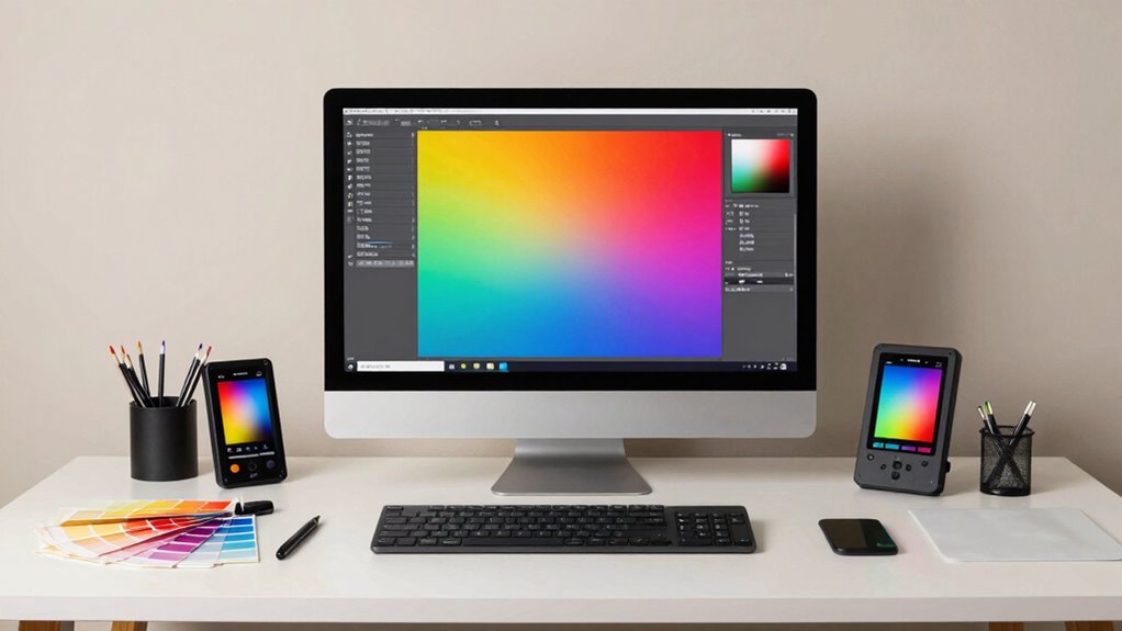
To guarantee you see colors accurately, start by evaluating your room’s lighting and wall colors. The key is understanding how color temperature impacts perception; a cool, bluish light can make colors appear colder, while warm lighting adds a yellowish hue. Check the wall reflectance—darker walls absorb more light, which can distort color accuracy, whereas lighter walls reflect more light, helping colors appear truer. Ideally, choose a neutral wall color with low reflectance to prevent biasing your perception. Adjust your lighting so it mimics natural daylight, around 5000K to 6500K, to ensure consistent color viewing. Taking these steps helps create a balanced environment, reducing color shifts caused by surrounding light and wall tones. Additionally, investing in quality workspace and tech gear can greatly enhance your overall setup and improve productivity.
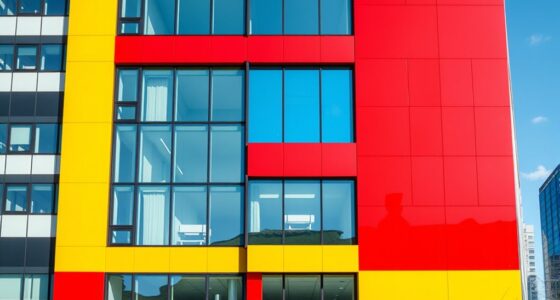
matte wall paint soft gray
As an affiliate, we earn on qualifying purchases.
As an affiliate, we earn on qualifying purchases.
Set up a Neutral Environment With Proper Walls and Lighting
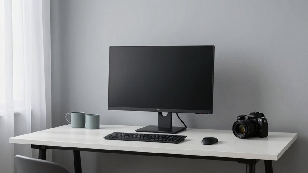
Creating a neutral environment begins with selecting the right walls and lighting that support accurate color perception. Choose wall textures that are matte and smooth, avoiding glossy or textured surfaces that can reflect light and distort colors. Neutral-colored walls, like soft grays or beiges, help prevent color cast interference. Acoustic treatments are also essential; they absorb sound reflections, reducing visual distractions caused by noise or echo. Proper acoustic panels or soft furnishings can improve focus and stability in color judgment. Ensuring your workspace has a calm, uniform background minimizes color distortions and creates a consistent viewing environment. By carefully selecting wall textures and incorporating acoustic treatments, you set a solid foundation for true color assessment and maintain the integrity of your workspace. Additionally, an adaptable digital structure can enhance your workspace by allowing for dynamic adjustments to both layout and lighting as your needs evolve.

24 Pack Black 12 x 12 x 2 Inches Pyramid Designed Acoustic Foam Panels, Sound Proof Foam Panels for Walls, High Density and Flame-Retardant Acoustic Panels, Sound Panels for Recording and Home Studio
Exceptional Sound Absorption:These pyramid acoustic panels are engineered to effectively absorb sound waves, reducing echo and reverberation. With…
As an affiliate, we earn on qualifying purchases.
As an affiliate, we earn on qualifying purchases.
Choose and Position Lighting to Support True Color Viewing
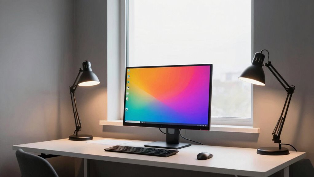
Choosing the right lighting setup is crucial for accurate color viewing, as improper illumination can distort or wash out colors. To support true color perception, position your lighting to minimize glare and shadows. Use natural light when possible, complemented by wall color palettes that reflect daylight evenly. Incorporate accent lighting carefully to highlight artwork or specific workspace areas without affecting overall color accuracy. Proper placement ensures light hits your workspace uniformly, reducing color shifts.
| Lighting Type | Ideal Positioning |
|---|---|
| Ambient | Overhead, diffuse |
| Task | Directly on work surfaces |
| Accent | Adjacent walls for subtle highlights |
| Natural | Near windows, indirect |
| Wall Colors | Light, neutral hues to reflect light evenly |

Macolink White Balance Grey Cards 18% Gray Cards Custom Color Calibration DSLR/SLR/Evil Camera Checker for Digital Photography Video (3.35" X 2.2")
The gray card can let you get right white balance in seconds and always have the perfect exposure.
As an affiliate, we earn on qualifying purchases.
As an affiliate, we earn on qualifying purchases.
Test and Calibrate Your Room for Consistent, Accurate Colors
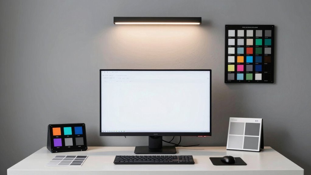
Before you start working with your colors, it’s essential to test and calibrate your room to guarantee consistent accuracy. Begin by evaluating the color temperature of your ambient lighting; ideally, it should match your workspace’s intended color profile, around 5000K to 6500K. Next, evaluate wall reflectance—light-colored, matte walls help diffuse light evenly, reducing color shifts and glare. Use a calibration tool or gray card to check how your room’s lighting affects color perception. Adjust your environment as needed, such as changing wall paint or adding neutral-colored surfaces, to minimize color contamination. Proper calibration ensures that your room’s lighting conditions are stable, creating a controlled environment where colors remain true across different projects.
Troubleshoot and Adjust Your Room Setup for the Best Results
If you notice color inconsistencies or flickering lights, it’s time to troubleshoot your room setup. Start by checking the color temperature of your environment; if it’s too warm or cool, it can skew your color perception. Adjust your lighting to achieve a neutral, balanced tone—preferably around 5000K to 6500K. Next, examine ambient reflections that might impact your workspace. Bright reflective surfaces or nearby windows can cause color shifts on your screen. Use matte finishes or reposition your monitor to reduce glare and ambient light interference. Consistent, controlled lighting minimizes color temperature fluctuations and ambient reflections, ensuring your colors stay accurate. Regularly reassess your room’s lighting conditions to maintain a stable environment for precise color work.
Frequently Asked Questions
How Often Should I Recalibrate My Monitor for Color Accuracy?
You should recalibrate your monitor for color accuracy every four to six weeks. This guarantees your monitor calibration stays consistent, maintaining ideal color consistency for your work. Regular calibration accounts for shifts in display performance over time, helping you avoid color inaccuracies. If you notice colors look off or your display seems inconsistent, recalibrate sooner. Consistent monitor calibration is essential for precise color work and maintaining a reliable workspace environment.
What Are the Best Wall Colors for a Color-Critical Workspace?
Choose wall paint in neutral or muted shades, like soft grays, beige, or cool whites, to reduce color reflections and distractions. Consider color psychology—blues and greens promote calmness and focus, ideal for color-critical work. Avoid overly bright or saturated colors that can distort your perception. A well-chosen wall color helps create a stable, consistent environment, ensuring your monitor’s color accuracy remains reliable and your work stays precise.
How Can I Prevent Ambient Light From Affecting Color Perception?
Imagine you’re editing photos and notice color shifts. To prevent ambient light from affecting your perception, focus on glare reduction and ambient light control. Use blackout curtains or adjustable blinds to block out sunlight, and install bias lighting behind your monitor to create consistent lighting conditions. These steps help minimize reflections and stray light, ensuring your color perception stays accurate for critical work.
Are There Specific Lighting Brands Recommended for Color-Critical Work?
You should look for lighting fixtures with adjustable color temperature, ideally between 5000K and 6500K, to guarantee accurate color perception. Brands like BenQ, Philips, and Lume Cube offer reliable options tailored for color-critical work. These fixtures help you control ambient light, reducing color shifts. Always opt for flicker-free, CRI 95+ lighting to maintain consistency, and position your lights to minimize glare and reflections in your workspace.
Can Room Size Impact Color Accuracy in My Workspace?
Your room size is like the canvas for your color work—bigger isn’t always better. A spacious room can create echoes and uneven lighting, impacting color accuracy. Focus on room acoustics and furniture placement to tame reflections and control light sources. By shaping your environment carefully, you’ll turn your workspace into a harmonious space where colors stay true, and your work shines with precision, no matter the size of your room.
Conclusion
Remember, nearly 70% of color inaccuracies stem from poor room setup rather than the monitor itself. By evaluating your lighting and wall colors, choosing neutral tones, and calibrating your space, you can considerably improve color accuracy. Don’t blame your monitor—fix your room first. A well-optimized workspace not only enhances your visual experience but also boosts productivity and creativity. Take these steps, and you’ll see colors truly as they’re meant to be seen.