
To create instant brand recall using color theory in logo design, you should choose colors that evoke the right emotions and align with your brand identity. Think about how specific hues like red or blue can communicate excitement or trust, and use color harmony principles to balance contrasting or analogous colors for visual appeal. Properly applying these concepts helps your logo stand out and stay memorable. Keep exploring further to discover more ways to harness color for powerful branding.
Key Takeaways
- Use color psychology to select hues that evoke desired emotions and align with your brand identity.
- Choose harmonious color schemes (analogous or complementary) to create visually appealing and memorable logos.
- Leverage contrasting colors to enhance visibility, draw attention, and improve brand recall.
- Maintain consistency in color usage across all branding materials for stronger recognition.
- Consider cultural associations and subconscious color responses to communicate effectively and leave a lasting impression.
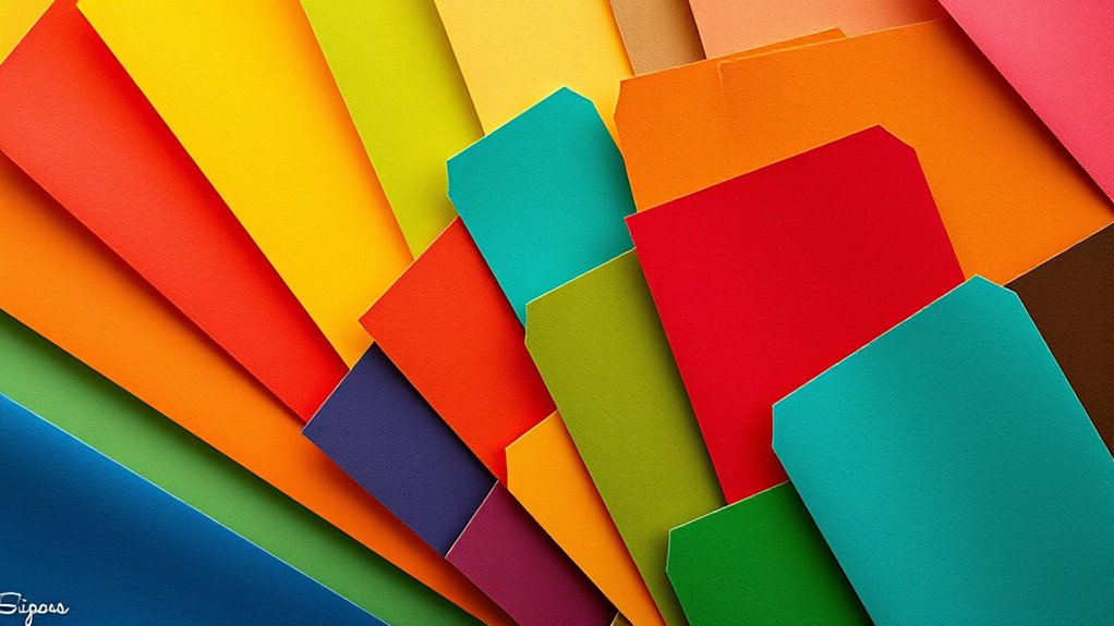
Have you ever wondered how the right colors can make a logo instantly memorable and impactful? It’s all about understanding the principles of color theory, particularly color psychology and color harmony. When you select colors thoughtfully, you tap into subconscious associations and emotional responses that make your brand stick in people’s minds. Color psychology plays an essential role—you might choose red to evoke excitement and passion or blue to communicate trust and professionalism. Recognizing how different hues influence perceptions helps you craft a logo that resonates on an emotional level, which is indispensable for brand recall. Additionally, employing a methodical approach to color selection ensures consistency and effectiveness in your branding efforts. But just choosing the right colors isn’t enough; you also need to take into account color harmony. This concept involves the way colors work together to create a balanced, pleasing visual effect. When your colors are harmonious, they complement each other, preventing visual clutter and making your logo easier to process. For example, using analogous colors—those adjacent on the color wheel—creates a sense of unity and calmness. On the other hand, complementary colors, which are opposite each other on the wheel, generate vibrant contrast and energy. Understanding these relationships helps you design logos that are not only attractive but also memorable.
Frequently Asked Questions
How Does Color Psychology Influence Consumer Behavior?
You might notice that color psychology influences your consumer behavior by triggering emotional responses. Bright reds can evoke excitement, while calming blues promote trust. When you see a brand’s colors, they shape your perception of that brand’s personality and values. This effect impacts how you feel about products and whether you trust or prefer a brand, ultimately guiding your purchasing decisions based on these subconscious cues.
Can Color Choices Vary Across Different Cultures?
You might find that your color choices subtly shift depending on cultural symbolism and regional preferences. Different cultures often interpret colors uniquely, so what feels inviting in one area could be misread elsewhere. By being mindful of these nuances, you guarantee your logo resonates universally. Adapting your palette to reflect local meanings demonstrates respect and awareness, helping your brand communicate effectively across diverse audiences without losing its core identity.
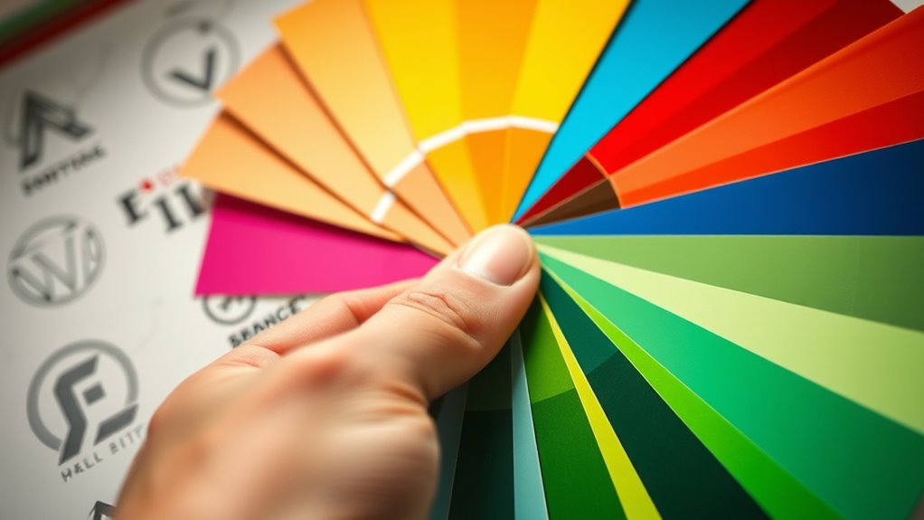
How Many Colors Should Be Used in a Logo?
When deciding how many colors to use in a logo, you should focus on maintaining strong color contrast and appropriate color saturation. Typically, 2-3 colors work best to keep your design simple and memorable. Using too many colors can create visual clutter, making it harder for people to recognize your brand instantly. Keep it clean, balanced, and guarantee your colors complement each other to make a lasting impression.
What Are Common Color Mistakes in Logo Design?
When designing a logo, avoid common color mistakes like causing a color clash, which makes elements hard to distinguish, and falling into monochrome pitfalls that lack visual interest. You might also overuse bright or too many colors, reducing clarity. Stick to a balanced palette with harmonious hues, ensuring your logo stands out without overwhelming. A thoughtful color choice enhances brand recognition and creates a memorable impression.
How Do I Test Color Effectiveness in My Logo?
Imagine testing your logo’s color effectiveness by viewing it on different backgrounds. You’d check color contrast to guarantee the logo stands out clearly, whether on a website or print. To assess color consistency, view it across various devices and materials. This helps you see if your colors remain vibrant and true to your brand. Testing like this ensures your logo communicates effectively and stays memorable in all settings.
Conclusion
By understanding color theory, you can craft logos that instantly resonate and stick in people’s minds. The theory isn’t just about choosing pretty colors—it’s a powerful tool to evoke emotions and reinforce your brand identity. When you select colors intentionally, you create a visual language that speaks directly to your audience, making your brand memorable. Trust the science behind color theory; it’s the secret to designing logos that leave a lasting impression.