
Warm colors like reds, oranges, and yellows can energize your space and make you feel more lively and inviting. Cool colors such as blues and greens promote calmness and relaxation, helping you focus or unwind. Your choice influences emotions—warm hues boost social interaction, while cool tones foster tranquility. Keep in mind that cultural meanings also play a role in how these colors affect you. If you want deeper insights on creating the right mood, continue exploring these color dynamics.
Key Takeaways
- Warm colors evoke energy, excitement, and social interaction, making spaces feel lively and inviting.
- Cool colors promote relaxation, calmness, and focus, ideal for tranquil or meditative environments.
- Warm hues like reds and oranges stimulate activity, while cool hues like blues and greens encourage serenity.
- Cultural perceptions influence emotional responses to warm and cool colors, affecting design choices globally.
- Combining warm and cool tones strategically enhances emotional impact and creates balanced, inviting spaces.
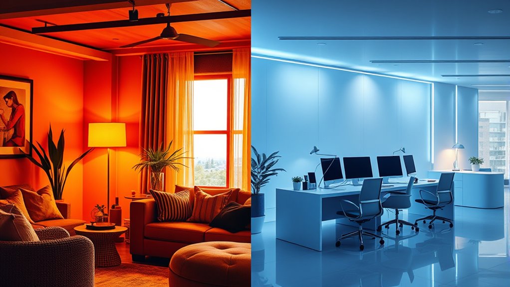
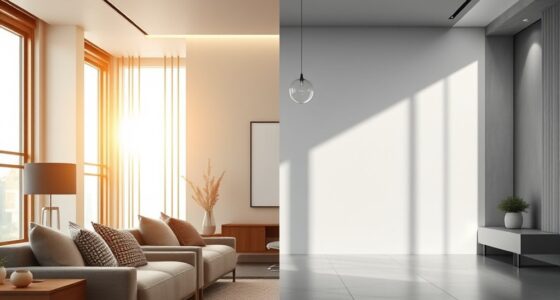
Colors can evoke strong emotions and set the mood in any space, but understanding the difference between warm and cool colors is key to creating the atmosphere you want. At the heart of this distinction lies the concept of color temperature. Warm colors, like reds, oranges, and yellows, are associated with heat and sunlight, giving a space a lively, inviting feel. Cool colors, such as blues, greens, and purples, evoke a sense of calm, serenity, and even professionalism. Recognizing color temperature helps you choose hues that align with your desired emotional impact, whether you’re designing a cozy living room or a tranquil office.
Understanding color temperature helps create the perfect mood in any space.
However, the emotional effect of colors isn’t just about their temperature; cultural associations also play a significant role. For example, in many Western cultures, red is linked to passion, danger, or excitement, while in parts of Asia, it symbolizes luck and prosperity. Blue often represents trust and stability in business contexts, but in some cultures, it can be associated with mourning or spirituality. These cultural nuances influence how people perceive and respond to different colors, so it’s essential to contemplate your audience when selecting hues for a space.
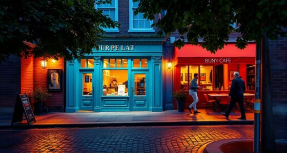
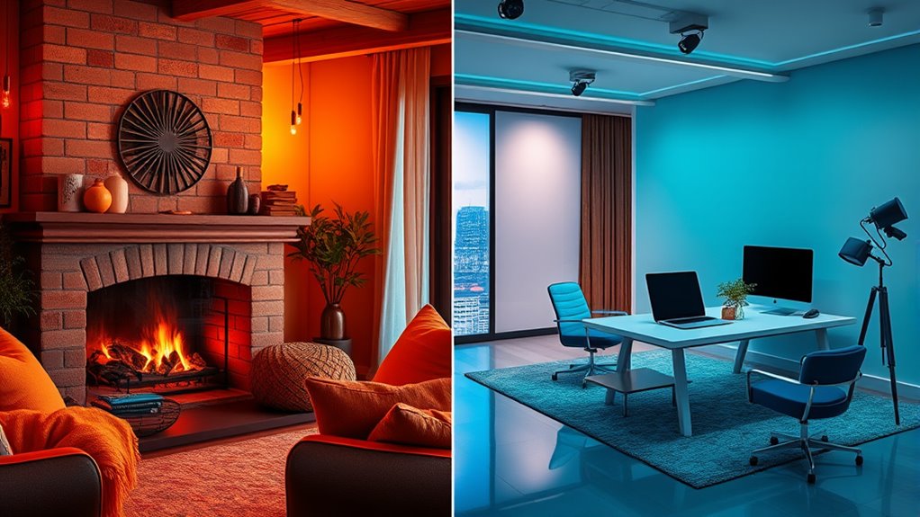
When you choose warm colors, you’re likely to foster feelings of warmth, comfort, and energy. They tend to stimulate activity and are perfect for social areas or spaces where you want to encourage interaction. Think about how a vibrant orange accent wall can energize a room or how soft yellows can make a kitchen feel welcoming. On the other hand, cool colors promote relaxation and focus, making them ideal for bedrooms, study areas, or meditation rooms. A calming blue can help reduce stress, while a muted green can create a soothing environment conducive to concentration.
Your goal should be to balance these elements based on the mood you aim to cultivate. Don’t forget, cultural associations may influence how these colors are received. For instance, a bright red might energize a space in one culture but be seen as aggressive or inauspicious in another. Similarly, cool tones like green and blue are almost universally calming but may carry specific symbolic meanings depending on context. By understanding both the universal principles of color temperature and the cultural associations attached to different hues, you can craft environments that evoke the right emotional response and resonate meaningfully with your audience. Additionally, considering the psychological impact of colors can help fine-tune your design choices for maximum emotional effectiveness.

DJXFLI COB Stage Lights with Barn Doors, COB Par Light 200W LED RGBWAUV DMX512 Master-Slave Sound DJ Lighting Spotlight Fresnel for Church Concert Wedding (6-Colors Style, 2)
♬【HIGH-QUALITY AND LONG LIFESPAN】 With durable and high temperature resistance plastic shell and high quality COB, the lifespan...
As an affiliate, we earn on qualifying purchases.
Frequently Asked Questions
How Do Cultural Differences Influence Color Perception?
You should know that cultural differences greatly influence your perception of color through cultural symbolism and perception variations. In some cultures, red symbolizes luck and prosperity, while in others, it signifies danger or warning. These meanings shape how you interpret colors, affecting emotional responses and design choices. By understanding these cultural nuances, you can create more effective, culturally sensitive designs that resonate positively with diverse audiences.
Can Warm and Cool Colors Be Effectively Combined?
Yes, you can effectively combine warm and cool colors to achieve color harmony. By balancing these contrasting tones, you create visual contrast that adds interest without clashing. Use warm colors as focal points or accents, and cool colors as backgrounds or secondary elements. This approach enhances the overall design, making it engaging and cohesive while leveraging the emotional impact of both color types.
What Are the Psychological Effects of Neutral Colors?
You might find that neutral colors promote emotional neutrality, helping you feel calm and balanced. A neutral palette often creates a sense of stability, sophistication, and subtlety, making it easier for you to relax or focus. These colors don’t evoke strong emotions, allowing other design elements to stand out. Using neutral tones can also make your space feel open and inviting, providing a versatile backdrop that supports your emotional well-being.
How Do Lighting Conditions Alter Color Perception?
Lighting conditions are like a magic wand that changes how you see colors. When you adjust the color temperature and lighting ambiance, colors can appear warmer or cooler, affecting mood and perception. For example, warm lighting makes reds and oranges more inviting, while cool lighting enhances blues and greens, creating a calming effect. So, you can manipulate lighting to craft the perfect atmosphere and influence emotional responses in any space.
Are There Specific Colors Associated With Certain Emotions Universally?
You’ll find that certain colors are universally linked to specific emotions through color psychology. For example, red often evokes passion or urgency, while blue tends to promote calmness and trust. These emotional associations are widely recognized, but cultural differences can influence perception. By understanding these common emotional responses to colors, you can effectively use them in design to evoke the desired feelings and connect with your audience.

DJXFLI Zoom Stage Light with Barn Doors, 200W COB Par Light, Warm White & White 2in1 Fresnel LED DJ Spotlight Wash 3500K-7500K DMX512 Sound Activated for Church Theater Event Wedding
【ZOOM COB PAR LIGHT】This led stage light has a zoom range of 5-50 degrees and can be easily...
As an affiliate, we earn on qualifying purchases.
Conclusion
Now that you understand the emotional punch of warm and cool colors, you’re ready to channel your inner Da Vinci and craft designs that evoke the right vibes. Remember, choosing the right palette can turn your project into a true masterpiece—no need for a crystal ball, just your keen eye. So go ahead, mix those hues with confidence, and let your creativity run wild—your masterpiece awaits, even if it’s not on a Renaissance canvas!

BETOPPER Stage Spotlights with/Barn Door, 200W COB Stage Lights, Warm & Cold White LED DMX Lights, Master-Slave Spot Light Strobe Lighting, Fresnel Light for Church Wedding Theater Photo Studio(4)
★[BETOPPER 200W COB Lights]New COB Technology Stage Light:Based on the newest COB (Chip on Board) technology,the church stage...
As an affiliate, we earn on qualifying purchases.

ADJ Products, Encore FR50Z, LED Fresnel Spot/Wash Light with Adjustable 8-50 Degree Beam Angle ENC846
STAGE AND THEATER LIGHTING: The Encore FR50Z lighting fixture is equipped with a 6-inch Fresnel lens and powered...
As an affiliate, we earn on qualifying purchases.